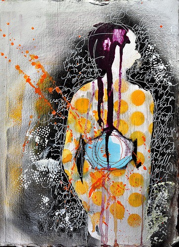
by Debbie Hodge | Apr 15, 2011 | Art Journaling, Color, Design Principles, DinaWakley
By Dina Wakley I love contrast. If you want a page element to be powerful, contrast it with its opposite and you have mega-impact. Contrast is what makes a piece of art surprising, or interesting, or even just plain good. Contrast is essentially the use of opposites...

by Debbie Hodge | Apr 14, 2011 | Digital / Photoshop Techniques for Scrapbooking, Paper Techniques for Scrapbooking
By Amy Kingsford Do you love finishing a page and the accompanying sense of accomplishment? One memory down; hundreds more to go! If you want to be a more productive scrapbooker, check out these ideas for making the most of your scrapbooking time. 1. Speed up your...
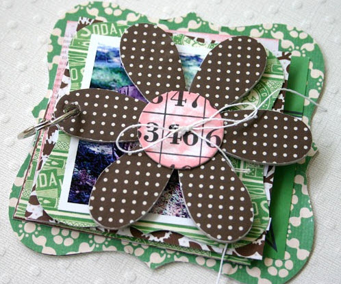
by Debbie Hodge | Apr 12, 2011 | Crafty Projects, Doris Sander, Ideas via Product & Technique
By Doris Sander You might think I’m a little odd, but . . . when I buy new scrapbooking supplies I always look to the product packaging for inspiration. Yes, the product packaging! I love the idea of recycling and, well, who doesn’t love the idea of...
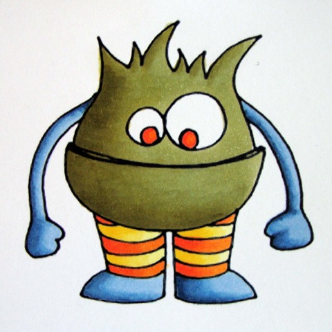
by Debbie Hodge | Apr 8, 2011 | Copic Markers
By Michelle Houghton A brand new image for you this week to color along on. I have been inspired by all the cute little monsters out there on the different collections so I figured I better create a few of my own. I have a second one that will appear and possibly...
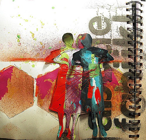
by Debbie Hodge | Apr 7, 2011 | Art Journaling, Composition, Design Principles, DinaWakley
By Dina Wakley I always say that one of the reasons I love art journaling is that there are no rules. Anything goes. You can do what you want. The process of putting paint on the page is more important than the finished outcome. So, why care about composition? I...

