by Debbie Hodge
Sometimes I like a little help getting ideas when I start my scrapbook pages. I don’t always want to use a sketch or a template because I want to play with design myself — and, yet, I’d like a starting place.
The following are three approaches you can use as starters for 3-photo pages.
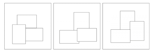
1. Make a grid
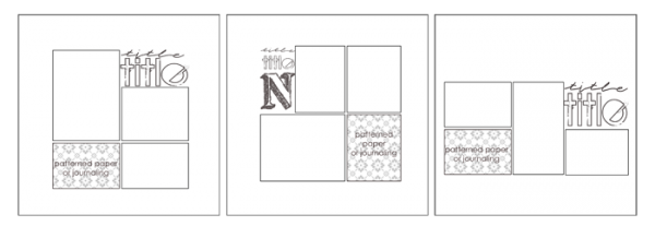
Begin with three photos all smaller than 4″ x 6″ and place them in a grid. Commonalities in height and or width in at least two of the photos will help you put this together quickly (for example, in the first example below all three photos are 4″ wide). Arrange your photos in a grid and fill in the blank spots of the grid with title, journaling, and/or patterned paper.
In these examples, the title is placed right on the canvas — thus one corner isn’t explicitly defined as the others are. The viewer’s eye will complete the rectangular shape that the entire block makes. What’s more, the viewer becomes more actively engaged in viewing your design when he or she is required to make this closure.
Notice that the shape of the overall block varies on these pages. The first is a portrait rectangle. The second is close to square and the third is a landscape rectangle.
2) Use one large photo and two small photos
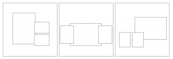
In these starters, one photo is large – preferably 5″ x 7″ on a 12″ x 12″ page. If your prints are all 4″ x 6″ and you don’t want to mess with getting an enlargement, just put the 4″ x 6″ photo on a 5″ x 7″-ish mat.
The two smaller photos are both of the same size–thus you have contrast, something that always goes toward adding interest on a page. In these examples, the two smaller photos are oriented the same way as each other BUT different than the focal point photo — which, again, gives contrast. For example, the focal point photo on the first example is of portrait orientation while the smaller photos are of landscape orientation.
A big part of the design interest with this design has to do with what you back the photos up with. Will you use a mat to contain the photos? Will you block the background? Will you run strips behind the photos? It’s up to you.
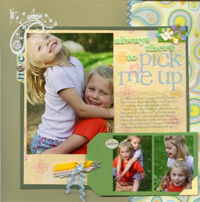
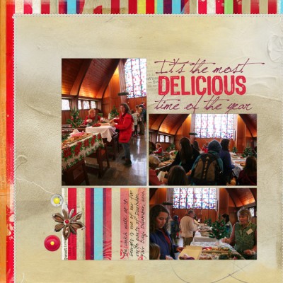
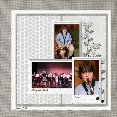
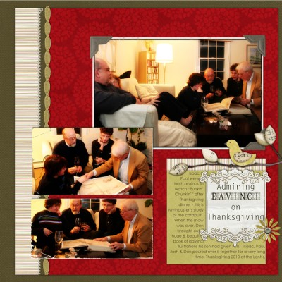 Layouts by Debbie Hodge. “Admiring daVinci” with supply list is here.
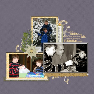
3. Make a triangle
Arrange three photos of approximately the same size in a triangular shape on the page. In all of these examples, the triangle is asymmetrical. Since all photos are of similar sizes, you can add interest and emphasis by using matting, framing and/or embellishing on the various photos.
The challenge with this design is to work with visual balance as you incorporate your title, journaling and embellishments to create an appealing page. Learn more about balance: Where Scrapbook Ideas Come From: Balance and Basic Design Principles with Debbie Hodge: Balance.
Are you interested in learning more about page design. Check out our membership site, Masterful Scrapbook Design. For $10/month you’ll study focus topics in depth with top scrapbook page designers.

