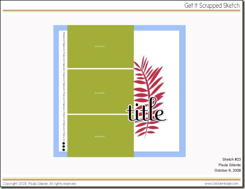
Sketch #23 by Paula Gilarde
You can find a new sketch every Friday in the Get It Scrapped Sketch Gallery.
This week’s sketch is a fun columnar design, that offers a few spaces for some full-sized photos, a large title and a bold focal element. Paula has also had a bit of fun with the journaling and added a matted border to make all of that beautiful white space pop!
Click Here to Download Printable PDF
Don’t forget to upload your layouts to our Sketch Gallery so the rest of us can see what you’re up to! In the meantime, let’s take a look at how Linda Bizjak was inspired by this week’s sketch!

Layout by Linda Bizjak
[lovesketches]


