by Debbie Hodge
Double Up is a new regular column at Get It Scrapped. In each Double Up, I will share:
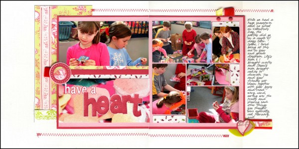
- a two-page layout
- design analysis of what makes this two-page design work
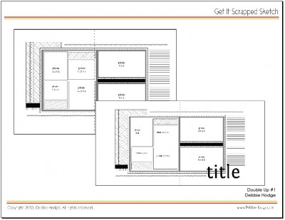
- sketch
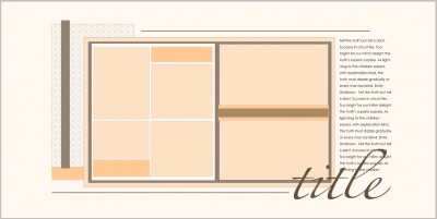
- layered template
(I’d love to feature readers’ pages in this column, contact me if you’re interested in getting a sketch ahead of time!)
Check out how the following are implemented on “Have A Heart” and then try these strategies for your two-page layout designs:
- Create an inner canvas custom-sized to your photo grouping. The pink-matted canvas here has the exact size and proportions my photos need. It sits solidily across both pages, uniting them and making clear that the entire layout is one rectangle rather than two side-by-side squares.
- Draw the eye into your canvas with white space. Leaving planned, empty space around your page’s content reduces clutter and makes it easier to look at and understand.
- Use a grid to organize cropped 4×6 photos. Fill in the empty spots with patterned paper cut to fit.
- Use a variety of horizontal lines to lead the eye across both pages. Here, the zigzag stitching at top and bottom are the most obvious lines. Just as important and effective is the broken line that begins with the strip between the large photo and title and ends beneath the journaling. Because these two partial lines use the same colors, ribbon, and papers, the eye jumps across the gap from left to right.
- Imply an outline of the inner canvas with papers, stitching, and embellishments outside of it. Leaving parts of this outline incomplete makes the page more energetic as the viewer’s eye mentally completes the shape.
- Save time by printing 8×10 blocks that need only edge trimming and mounting. In “Have A Heart,” the two photos on the left and the title are all one unit. Paper strips layered over the break between the two photos make them look like separate pieces, and drop shadows and texture added to the title give it dimension.
- Balance the visual weight of each page. The large photo carries the same visual weight as the group of smaller photos.
Download pdf of sketches with measurements – for 12×12 and 8.5×11

Download layered template – for 12×12 only

[lovesketches]


