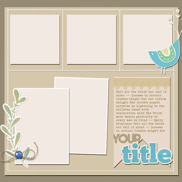
 This free scrapbook page sketch comes from a page made by Debbie Hodge for the Scrapbook Coach: Balance class.
In the Get It Scrapped Membership, members have access to a library of over 150 layered templates and page sketches just like this one, searchable by # of photos and layout type.
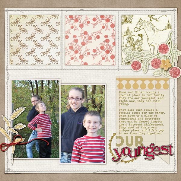
Our Youngest by Debbie Hodge | Supplies: Old Farm Kitchen, Backyard Expedition, Farmer Joe, Big Sky by Lynn Grieveson; Straight Line Stitched White, Border Stitches White by Anna Aspnes; Borders, Old School Alphas by Jenni Bowlin; My Tribe by Gennifer Bursett; Banner Library Cards by Robyn Meierotto; Colbie Solids by Maplewood Studio; Gold Essentials by Katie Pertiet; True North, Bohemian Typewriter fonts
download sketch & template.
Get over 150 more sketches and templates with a GIS membership
[hr]
More inspiration…
Looking for more examples of how you might use this sketch/template to inspire your next page? Here are a few inspired pages from our Get It Scrapped Creative Team.
Ronnie Crowley says, “Templates which have room for lots of pictures always attract me and this one was no different! It provided a great starting point for a page for my daughter’s college album about her latest service project. The template had a great spot for journaling, instead of using a journaling card I chose to add a screen grab of her facebook post at the end of the day. Another advantage of doing this was I got to add another picture.”
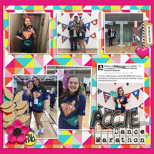
Aggie Dance Marathon by Ronnie Crowley | Supplies: Get It Scrapped – Scrapbook Coach 18 Layout 1 Template; APennington – Currently, Playful Stitches; Amanda Yi Designs – You Are Fabulous; T for M Designs – Every Day Matters
Nicole Mackin says, “I liked that this sketch provided for a larger number of photos and was very photo focused. This page is about my girls meeting Princess Elena of Avalor at Disneyworld, specifically about how this was a dream come true for my youngest daughter. The sketch has a very linear feel to it and to make it more my style I put multiple layers under each individual photo to give it a more layered, messy look.”
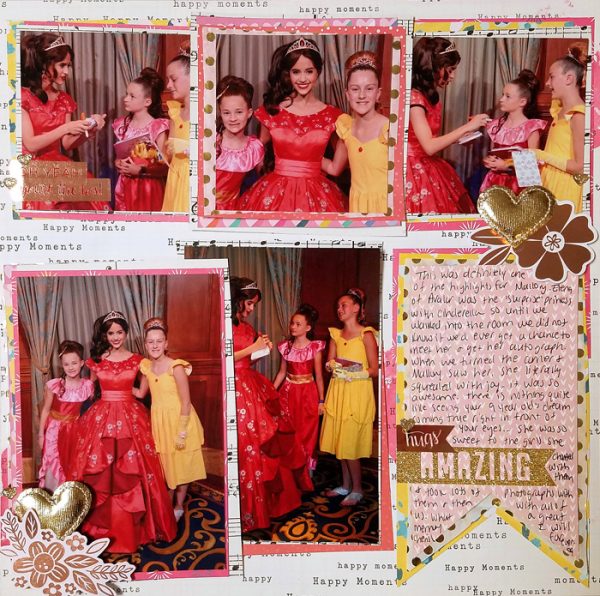
Amazing by Nicole Mackin | Supplies: Patterned Paper: American Crafts, Pink Paislee; Tissue Paper: BrotherSister Design Studio; Gold Heart Emebellishments: American Crafts; Stickers: Pink Paislee, Heidi Swapp; Die Cuts: Pink Paislee; Glitter Heart Stickers: American Crafts; Color Shine: Heidi Swapp.
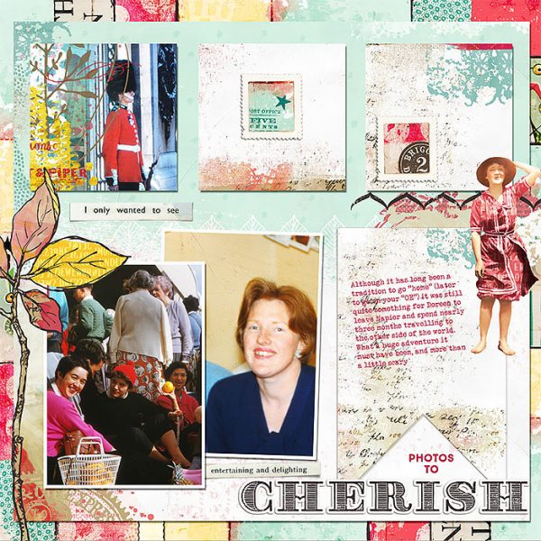
Lynn Grieveson says, “This sketch was fun to use as it is so flexible, allowing me to opt to use two of the top squares for paper and the third for a photo. I used it to scrap some of the cherished photos of my mother-in-law’s travels to the other side of the world which was a huge (and lengthy) adventure at the time.”
“The tilted photos on the left add energy to the page and they were perfect for the less than perfect photos, especially having one peeking out from behind the other. That tilting inspired me to tilt my journaling as well. And the layers allowed for lots of patterned paper, which meant I was able to complement the colors in the photos with the colors on my page.”

