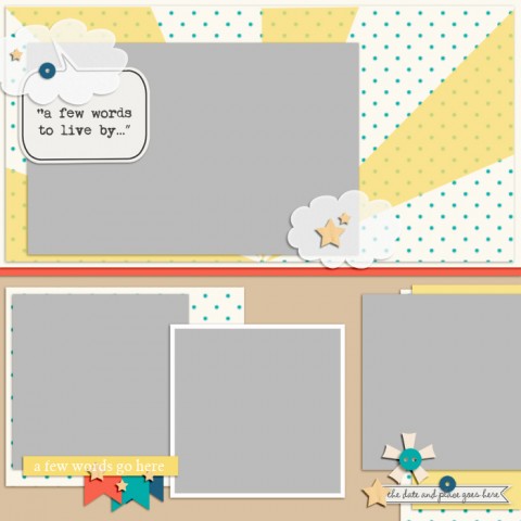
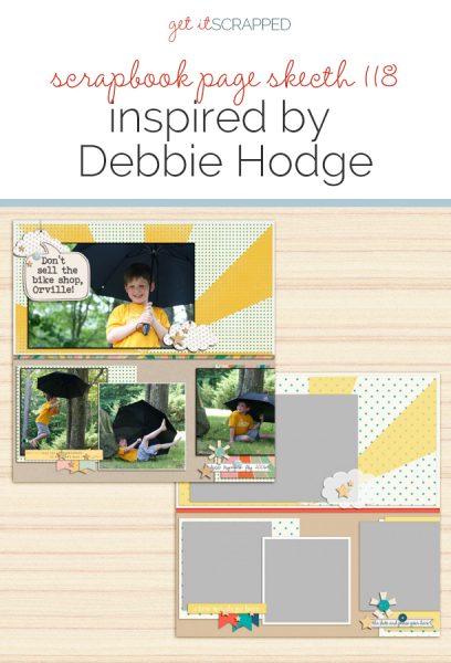
 This free scrapbook page sketch comes from a page made by Debbie Hodge for the Scrapbook Coach Class Half and Half.
In the Get It Scrapped Membership, members have access to a library of over 150 layered templates and page sketches just like this one, searchable by # of photos and layout type.
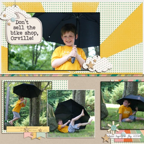
Don’t Sell the Bike Shop, Orville by Debbie Hodge | Supplies: Acorn Ave by Crate Paper; 5th and Frolic by Dear Lizzie; Stargazer, Rise and Shine by One Little Bird; Kraft Essentials by Karla Dudley; Stencils 2 by Creashens; Word Label Template by Anna Aspnes; Bohemian Typewriter font
download sketch & template.
Get over 150 more sketches and templates with a GIS membership
[hr]
More inspiration…
Looking for more examples of how you might use this sketch/template to inspire your next page? Here are a few inspired pages from our Get It Scrapped Creative Team.
Devra Hunt says, “I’m drawn to multi-photo sketches that can incorporate differently sized photos and orientations.”
“One of our last stops on our cross-country journey was the first Starbucks store where we met our realtor to get the keys to our new house, and of course, coffee as well. I had three photos to use for this story, all of them 4×6 in size. I saw one of the photo placements could be use as a journaling block. This allowed me to use 2 slightly larger photos in a vertical orientation.”
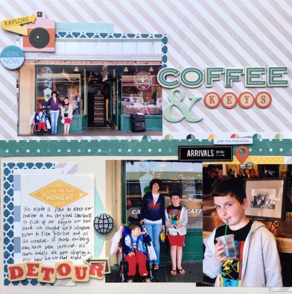
Coffee & Keys by Devra Hunt | Supplies: PP, die cuts-PinkPaislee, chipboard-Pink Paislee, Freckled Fawn, WRMK, flair-A Flair for Buttons, Alphas-Thickers y American Crafts, pen and adhesive-EK Success
Kelly Prang says, “I like this sketch because it uses multiple photos, and I had many adorable photos of my daughter as a unicorn for Halloween this fall.”
“This year my daughter Mollie is 12, and she wasn’t sure if she would trick-or-treat again after she starts middle school next fall. I wanted to capture the fun she had for what might be her last year going trick-or-treating, as well as show how cute she looked as a unicorn. At first glance, the sketch is made up of horizontal or square photos, but it was easy to substitute 3″x4″ vertical photos for the square photos, and I used two 3.5″x5″ photos in the place of the larger horizontal photo.”
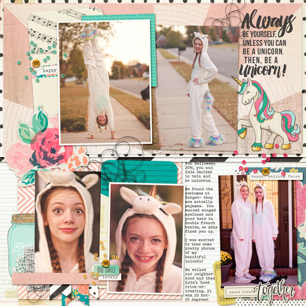
Always be a Unicorn by Kelly Prang | Supplies: Scrapbook Coach 7 template/sketch; American Craft Digitals- Maggie Holmes- Confetti- papers and elements; Valorie Wibbens- Sprinkles v9- beads, sequins, doily corner; More Thread Please- threads; Kate Hadfield- Over the Rainbow- unicorn; Fonts: Bohemian Typewriter, Amelian Script, Bebas Neue
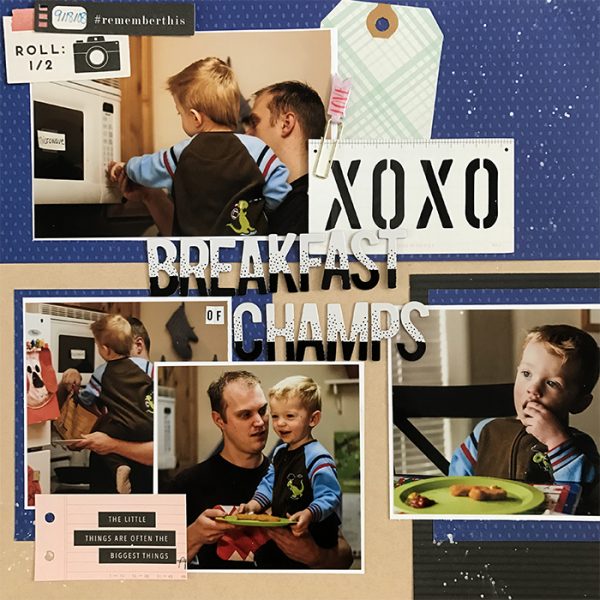
Megan Blethen says, “The thing I liked about this sketch was that the photos weren’t all right next to each other, and I could use one full 4″x6″ photo at the top. My layout is about when my middle son wanted chicken nuggets for breakfast one morning and how happy it made him.”
“I love scrapbooking these everyday moments that I’d never remember otherwise! I realized how much I really like to have at least one paper behind the photos as a mat. The sketch didn’t call for a mat behind each photo, but I changed that on my layout. I like how the white makes the photos stand out.”

