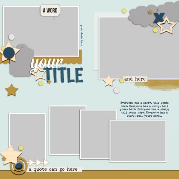
 This free scrapbook page sketch comes from a page made by Debbie Hodge for the Scrapbook Coach Class Product Play.
In the Get It Scrapped Membership, members have access to a library of over 100 layered templates and page sketches just like this one, searchable by # of photos and layout type.
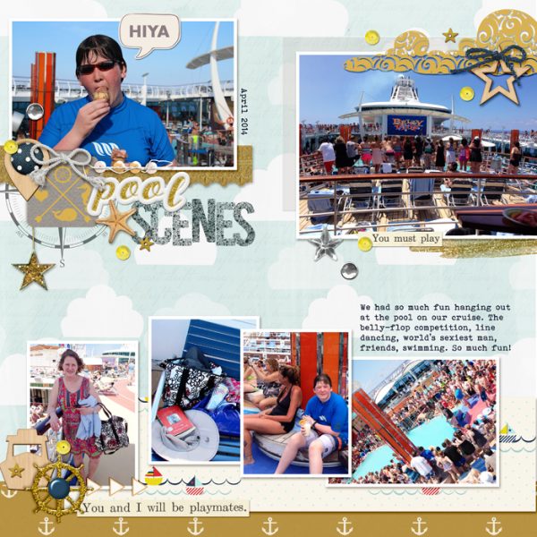
Pool Scenes by Debbie Hodge | Supplies: Follow the Stars by Happy Box; Drift Away by Sahlin Studio; Ship Shape, Glitter Mess by Gina Cabrera; Oiselet Rouge by Katie Pertiet; Tag You’re It by Valerie Wibbens; Built for Two, Everybody Dance Now by Allison Pennington; 5th and Frolic by Dear Lizzie; Misted Alpha by Just Jaimee;
download sketch & template.
Get over 150 more sketches and templates with a GIS membership
[hr]
More inspiration…
Looking for more examples of how you might use this sketch/template to inspire your next page? Here are a few inspired pages from our Get It Scrapped Creative Team.
Kelly Prang says, “I loved the sketch’s use of multiple photos of both landscape and portrait orientations. In these days of phone cameras I find myself usually taking most photos in portrait orientation, but still do take landscape from time to time and wanted to use both on the same page.”
“This page is about our newest family member, our puppy, Toby. He loves exploring his new world (in our backyard) and I love taking lots of photos of a willing (albeit distracted and not really posing) subject. As a kind of Easter egg or nod to our family, I added leaves around this page. Toby LOVES playing with, catching, and eating leaves, and he will probably lose his everloving mind when Autumn kicks in here in the South and the leaves fall off of all our trees. I spread the accent colors of yellow and red around the page to help the viewer’s eye flow through all the photos and journaling.”

Golden Life by Kelly Prang | Supplies: Template: Get it Scrapped Scrapbook Coach Product Play; Fonts- MIssion Script, American Purpose Stripe, Remington Noiseless; Crisp collab kit from The DIgital Press- all papers, journal card and word snips; Sahlin Studio: Sweet Storytelling-wordart; One Little Bird: Memory Collector- heart flair, This and That- wordart; Kim Jensen: Our Story- sequin star; Allison Pennington: IBTFY- white background paper; S. Jones: 95 days- red brad
Megan Blethen says, “My favorite thing about this sketch was the number of photos included on a one-page layout. This layout showcases some of my favorite photos from our annual trip to the zoo for a special night they put on every year for handicapped children.”
“I was able to make one layout with photos I had thought would need to go on 3 layouts. I love being able to save space in my albums and still tell stories.”
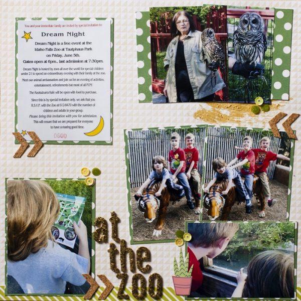
At the Zoo by Megan Blethen | Supplies: Papers – Adornit ‘Together is Home – Family Path’, My Minds Eye Jubilee Collection ‘Mint Julip Wild Tribal’ paper, Shimelle True Stories collection ‘Cappucino’; Embellishments – Spiegelmom Scraps Cork Confetti Chevrons, Spiegelmom Scraps ‘A Day in the Woods’ Sequin Mix, We R Memory Keepers ‘Honey, I’m Home’ accent stickers (the cactus), American Crafts Thickers ‘Daiguiri’; Mixed Media Products – Shimmerz Paints Textures in ‘Gold Mine’
Ronnie Crowley says, “I always look for templates which use more than one picture, and this one fitted the bill perfectly for my page which is about us fishing on our vacation recently. We didn’t actually catch a fish!”
“When I’m making a page it’s important to me to consider where people are looking in the pictures when I place them. The three pictures of my husband at the bottom had him looking all in one direction and it drew the eye off the page. Luckily there was no text so I was easily able to flip the picture using photoshop making the flow much better. The added benefit was now the rod he’s holding reflects that in the title.”
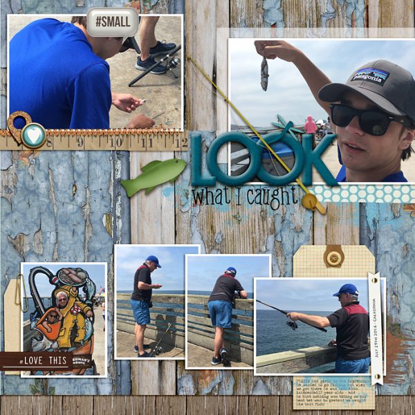
Look What I Caught by Ronnie Crowley | Supplies: Anna Aspnes – ArtPlay Saffron Villa; Meredith Cardall – Dock of the Bay; Amanda Yi Designs – You Are Fabulous; Connie Prince – Hook Line Sinker, Teenboy; Creahsen – Penny Stitch; Etc Deb – Gentle Rain; Diane Rigdon – Just Be; Gennifer Bursett – Chipster, Far and away, Hand Made, Office Tags; H Roselli-Miles of Smiles; Mye De Leon – Falling Softly; One Little Bird – Worn; ScrapbookCoach – Get It Scrapped Product Play 04 Template
Marcia Fortunato says, “I was drawn to this sketch because it allowed for several photos split into three clusters. I also liked the placement of the title below the top left cluster.”
“One day each month everyone in my family sends me a photo of what they’re doing that day. This layout shows our photos for August. The placement of the photo clusters gave a great starting point for my layout. Then although the sketch showed six photos, by splitting each of the top clusters in two I was able to fit all eight of my photos on the page. I also resized the bottom photos slightly to better accommodate the photos I had.”
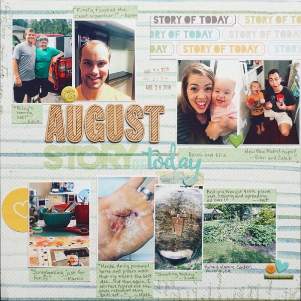
August by Marcia Fortunato | Supplies: Patterned Paper: Little Butterfly Wings for Cocoa Daisy, Arleigh for Cocoa Daisy; Letters: Leah R (Cocoa Daisy), Pinkfresh Studio, Jillibean Soup, Studio Calico; Embellishments: Ali Edwards, Pink Paislee, Fancy Pants Designs; Stamp: Smash (ki design); Ink: VersaFine (Tsukineko); Pen: LePen (Marvy).

