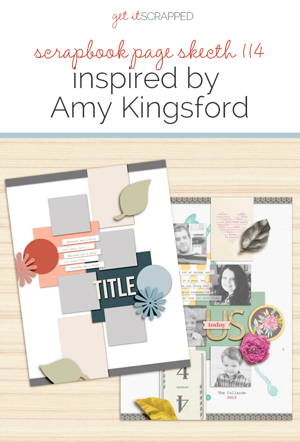
 This free scrapbook page sketch comes from a page made by Amy Kingsford for the Rule Play class in the Get It Scrapped Membership, where members have access to a library of over 100 layered templates and page sketches, searchable by # of photos and layout type.
This 8.5 x 11″ design can easily be converted to other page sizes and offers a fun spin on the conventional band design.
[hr]
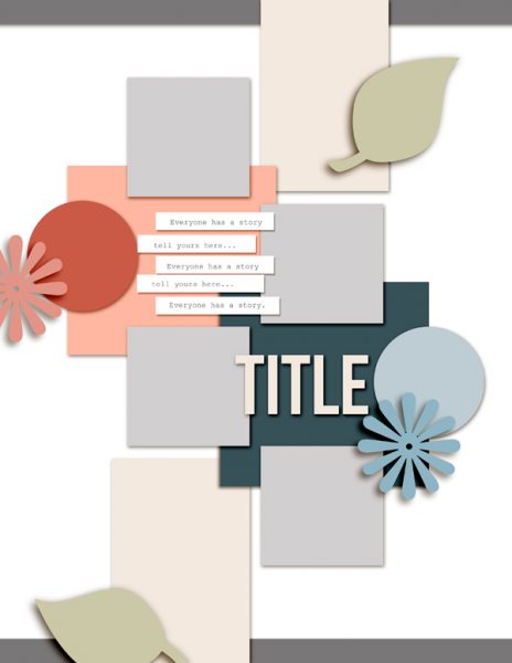
Sketch and Layered Template based on a layout by Amy Kingsford for the GIS Membership Class Rule Play
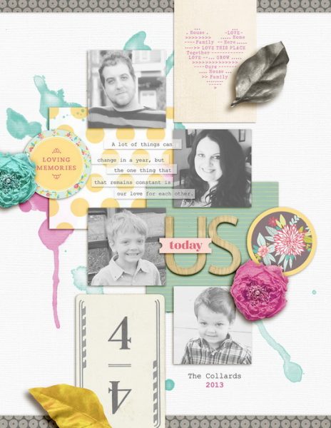
Us Today by Amy Kingsford | Supplies: American Crafts + Dear Lizzy: 5th and Frolic Digital Collection; Creashens: Hello Kit; Amy Wolffe: Beach Cottage Alpha; Celeste Knight: Watercolor Splatters
Amy says, “Since I planned to use four square photos on my page—one for each of my family members—using doubles of everything was a natural approach. However when things are presented in aligned pairs the eye quickly groups them and can even scan over them. Thus, the key to using doubles here was about shaking things up visually. I staggered all of my pairs and added variance in each set’s colors, patterns, and shapes.”
“My foundation is made up of two overlapping patterned squares and two rectangular cards. I’ve layered my four square photos over top, and doubled up on each embellishment cluster.”
download template and previews
Get over 150 more sketches and templates with a GIS membership
[hr]
More inspiration…
Looking for more examples of how you might use this sketch/template to inspire your next page? Here are a few inspired pages from our Get It Scrapped Creative Team.
Nicole Mackin says, “Because I almost always scrapbook 12″x12″ pages using 4″x6″ photos, the smaller photos on an 8.5 x 11″ layout appealed to me as a way to do something a little different. This page is about the role dance plays in a friendship of my daughter’s, and I highlighted the four dances they were in together.”
“I loved that the photos were intermixed with paper and embellishment layers and that it was not a typical design as it called for even numbers-an even number of photos, embellishment clusters, even background blocks of paper. While I used color to bring in the triangular visual design, I stayed fairly true to the sketch by including two tags, two flair, two phrases, etc. It was a challenge, but I love the result!”
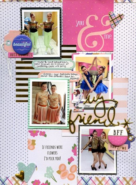
My Friend by Nicole Mackin | Patterned Paper: Fancy Pants; Flair: Fancy Pants; Puffy Stickers: Fancy Pants; Tags: Fancy Pants; Labels and Phrases: Fancy Pants (all Millie & June).
Lynn Grieveson says, “I loved the flexibility of this sketch, with the spaces that could be used for either photos, journaling cards, or paper. I used it for the first page of my daughter’s chronological album, with the photos from her birthday. There was no one ‘stand out’ photo but lots of photos showing all her different expressions so the sketch was perfect.”
“It was very easy to transform it from a portrait format into a square 12 x 12 format (so it fits with the rest of her album) and the extra space was perfect for layering paint and transfers behind the photos.”
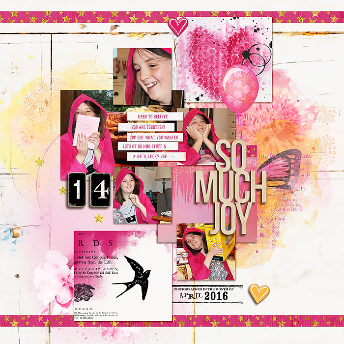
So Much Joy by Lynn Grieveson | Supplies: Lynn Greiveson: Glitz Girl kit, Glitz Girl Journal Cards, Blue Skies Ahead Papers, Shine On kit, Belle Rosa Kit, Parisian Dates; Sahlin Studio: Celebrate Elements, Worn Scuffed Chipboard Alpha; Jacque Larsen; Launchpads Vol30 Pippi’s Papers; (All from The Lilypad);Font: Local Market
Kelly Sroka says, “In this sketch, I was drawn to the use of multiple small photos on the page. This layout documents my family’s recent trip to the small fair we have in our town each year. When I chose the photos to use on this page, I selected ones that were fairly simple and but would also represent the various things we did while at the fair. I knew the pictures would be small, so I knew each one would need to have a big impact on the page.”

Fair Fun by Kelly Sroka | Supplies: Patterned Paper: American Crafts, Jillibean Soup, October Afternoon; Rub On: My Mind’s Eye; Wood Circle: Jillibean Soup; Ribbon: May Arts; Brad: My Mind’s Eye; Letter Stickers – American Crafts; Label Sticker: October Afternoon; Phrase Wood Circle: Maya Road; Flag: Pretty Little Studio.
Megan Blethen says, “I loved that the photos were small in the sketch. Since I was going to make my layout a 12″ x 12″, instead of 8.5 x 11”, I felt I had enough room to add a few more pictures than the sketch called for.
“My page is about my middle son having fun at swimming lessons. I love that you can see the progression of the photos cascading down the layout. If I had only added 3 photos the progression of him in his swimming might not have been so evident.”
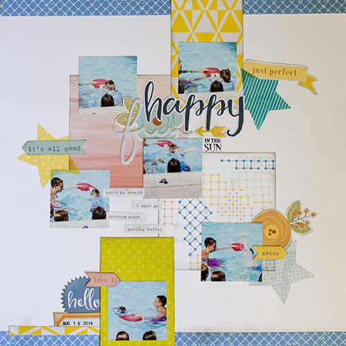
Happy Fun in the Sun by Megan Blethen | Supplies: Patterned Papers; Citrus Twist Kits exclussive ‘Isle of Capri’ & Criss Cross, Maggie Holmes ‘Bloom’ Afternoon, Pink Paislee ‘Fancy Free’ #6, Pink Paislee ‘Fancy Free’ #2/ Embellishments; Fancy Pants ‘Life is Beautiful’ Puffy Design Stickers, Cocoa Vanilla Studio ‘Life is Beautiful’ Die Cut Ephemera

