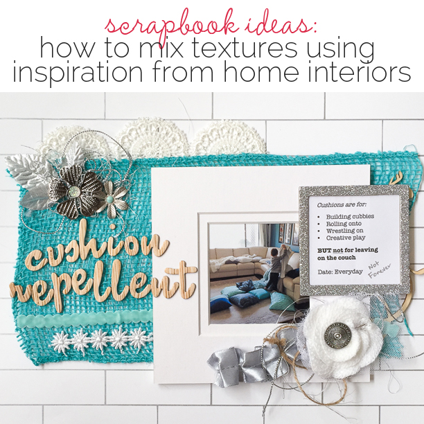
 Texture refers to the surface characteristics of a material. Is it rough or smooth? Plush or gritty? Texture is a powerful art element because it can quickly evoke memories and emotions.
Here, our team took inspiration from home interiors and incorporated a generous mix of contrasting textures for strong visual and emotional impact. Check out their pages below (and if you’re looking for home interior inspiration, we’ve got a Pinterest board for you here.)
[hr]
Sian Fair says, “This page is about my nephew’s costume for World Book Day. I’ve used wood, cork, fabric ribbons, hard shiny buttons, a tassel, loose threads, matte black and chalkboard. I’ve taken inspiration from pictures of fairy-tale themed nurseries to create a storybook feel.”
“I chose a story which I knew I could tell with my use of embellishments and decided on a theme to pull it all together, so that I didn’t simply have a random collection of textures on my page: each piece adds to the whole of my story.”

Muse Boy by Sian Fair | Supplies: Supplies: Patterned Paper: Fancy Pants; Alpha: Crate Paper; Buttons: October Afternoon; Puffy Stickers and tassel: Crate Paper; Wood Veneer: Pinkfresh Studio; witches cut with The Slice
[hr]
Stefanie Semple says, “I am often amazed at cat logic, that a box is preferred to a pillow and bed confounds me. Our upstairs room is a storage space and is filled with children’s legos, sewing odds and ends as well as files and papers. This story of an unusual mix of household textures and a sleek furry feline in a cardboard box of dusty files and papers went well with so many of the items my digi stash. I kept loading and layering, and I really love the outcome, even though it is busier than my usual style.”
“Contrast is great for mixing textures, something flat like paper with dimensional gesso, paper clips and wires with pearls and lace, is unusual and a feast for the eyes.”
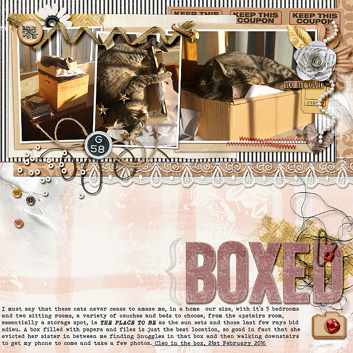
Boxed by Stefanie Semple | Supplies: Debbie Hodge: ScrapBook Coach Top Heavy Template; Pink Reptile Designs: Velveteen Alpha (recoloured); The Nifty Pixel: Gesso Goodness v1; Valorie Wibbens: Sprinkles v29; LDrag Designs: Can’t fight this feeling (retired); Jady Day Studio, Shawna Clingerman & Studio Basic: Our journey together kit. One little Bird Designs: Shadow Styles, Charmbox Studio’s resize for web action.
[hr]
Gretchen Henninger says, “Every year I do a layout about where I am at right now. I used various textures to capture some of my personality: a doily to capture my feminine side, splashes of gold to bring in brightness, torn corrugated cardboard because I am definitely a bit fraught around the edges, and lots of wood grain, trees, and leaves to represent my love for the outdoors.”
“I added a new texture into each layer, allowing some to sit quietly in the background (doily and woodgrain), while others such as the leaves and the gold elements move into the foreground.”
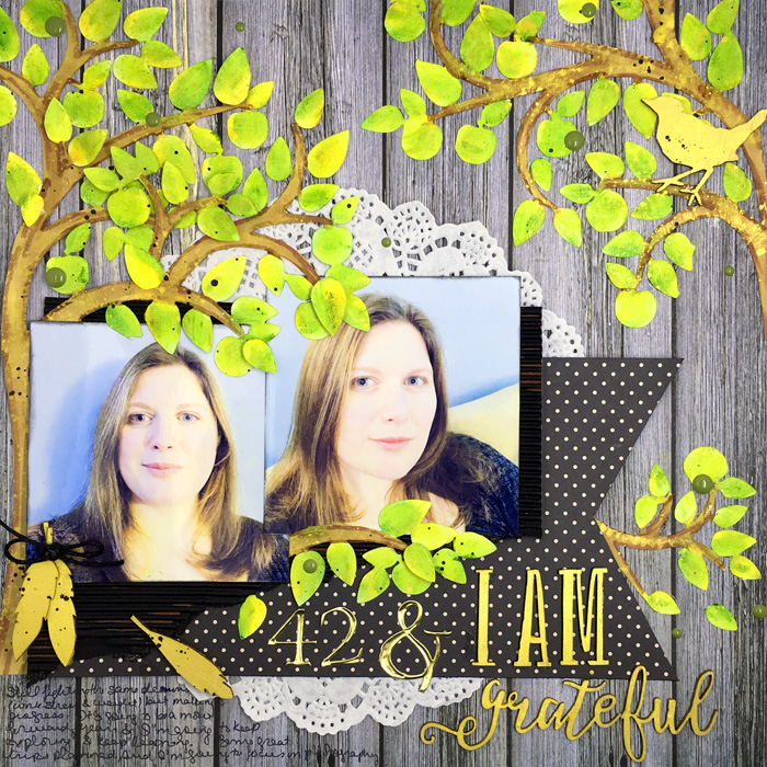
42 & I Am Grateful by Gretchen Henninger | Supplies: Paper: Simple Stories (Homespun), My Mind’s Eye, miscellaneous cardboard; Wood Veneer: Simple Stories (I Am); Cut File: Dragon Crossing; Dies: Cuttlebug; Paint: Liquitex, Gelatos; Metal: Karen Foster; Twine: Stampin’ Up!; Doily: Bo Bunny; Enamel Dots: Simple Stories (So Rad)
[hr]
Deborah Wagner says, “The photos are of my niece and m having fun with the camera on a beautiful summer’s day.”
“When paging through home décor magazines, I am usually attracted to rooms decorated in black and white with a lots of bling and that’s the inspiration I used here. When using neutrals or a limited color palette, it is easy to layer varied textures without overwhelming your viewer.”
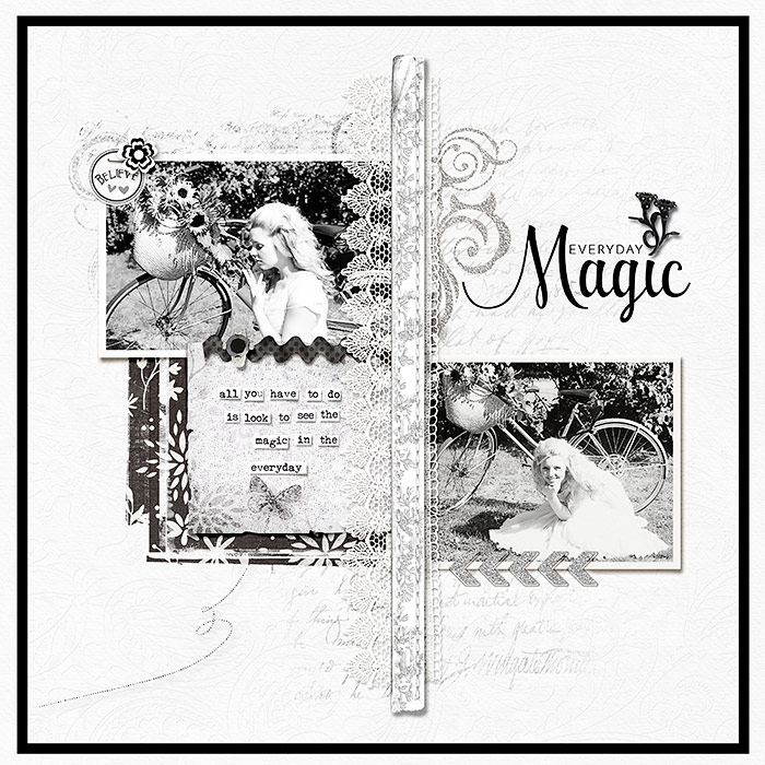
Everyday Magic by Deborah Wagner/Supplies: Shabby Miss Jenn – White Diamonds, BlackTiger; Valorie Wibbins – Autumn’s Magic; Creations – Just Believe; Inside Pixels – Winter Wonderland; Gennifer Bursett – Miss Molly; Jana Morton – Painter’s Paper; SugarPlum – This is the Year; KimB – EnPointe, Vintage Text; Lynn Grieveson – WornStrips No. 11; Erica Zwart – Best of Brushes #2; Anna Aspnes – Foto Blendz
[hr]
Kristy T says, “This page documents the never-ending number of times the cushions need to be put back on the couch at our house. Although it drives me a bit crazy having to pick them up all the time, I know that as my children grow up it won’t always be this way.”
“I have used a mix of burlap, wool, tulle, lace, threads, velvet ribbon, metal, plastic and faux-glass beads and woodgrain alphas on a handmade, subway-tile-inspired background to represent our home and the different colors and fabrics within it. A simple color scheme works well when using lots of textures – the colors keep the page cohesive and the textures make it interesting.”
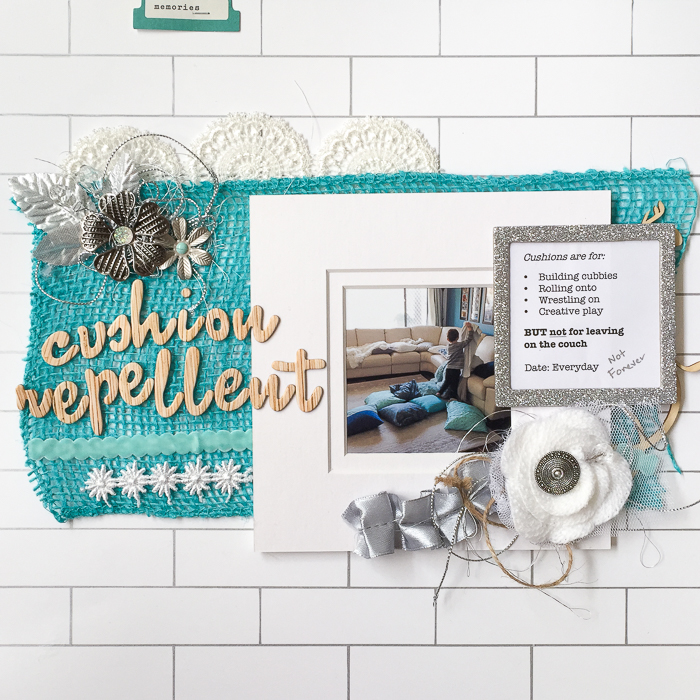
Cushion Repellent by Kristy T | Supplies: Cardstock: Artee; Pen: Sharpie; Burlap: Unknown; Alphas: American Crafts; Laves: Green Tara; Crystal pin; Maya Road; Metal Flowers: TIm Holz; Finnibair; Lace: Prima; Ephemera: Simple Stories
[hr]
Amy Kingsford says, “This page is about stepping in front of the camera and seeing myself and my family from a new perspective.”
“I often aim to include a good mix of textures on my scrapbook pages as it lends depth to my digital designs. However I like to try and select textures that echo my page’s sentiment while adding a polished look. Here, I’ve used a variety of charming and soft textures that compliment the tender feeling created by my photo and journaling. Then I’ve throw in a few sparkles to finish things off.”
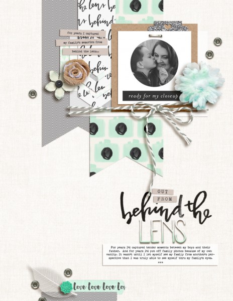
Out From Behind the Lens by Amy Kingsford | Supplies: Creashens: Goodness Papers and Elements, Sugarfoot Papers and Elements; Paislee Press: Behind the Lens; LilyPad Designers: MPM Status; Karla Dudley: Bestie Glitter Styles; Sahin Designs February 2016 Templates; Fonts: Remington Noiseless.
[hr]
Christy Strickler says, “My son used to imitate me by taking a book down off the shelf and pretending to read.”
“When I choose textured items for my page, I take into consideration how I want them to support the story. Since this is a fun page, I started off with bright colors and slick, smooth embellishments. I feel like anything shiny and smooth conveys excitement and newness. However, because this was also a page about reading (something I consider a cozy activity) I incorporated cork and wood elements onto the layout as well. The round, lace doilies serve to soften the page up a bit.”
“Everything is layered in a haphazard way to feel fun but still cozy. It might be hard to see, but the cardstock and patterned paper alternate between smooth and textured pieces. It was important for me to blend the smooth pieces with softer ones as I don’t want the page to feel cold or hard. Using texture with color and/or shape also helps me lend more significance to each embellishments supporting role. For example, square shapes are harder than round ones. Circles can help soften a page,but adding the lace doilies makes it feel even softer. Placing one gold doily amidst the others adds that hint of excitement back again.”

Been Caught Fake Reading Once When I was 3! by Christy Strickler |Supplies Patterned Paper: Amy Tangerine, Fancy Pants; Cardstock: Bazzill: Letters: American Crafts, October Afternoon; Acrylic, Wood Veneer: Freckled Fawn; Die Cuts: Evalicious; Metal: Heidi Swapp; Button: Webster’s Pages; Other: Doilies

