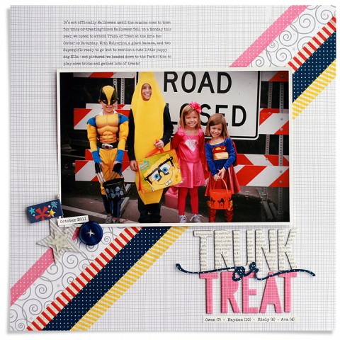
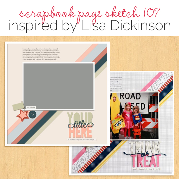
 This free scrapbook page sketch comes from a page made by Lisa Dickinson for the Color 2 class in the Get It Scrapped Membership, where members have access to a library of over 100 layered templates and page sketches, searchable by # of photos and layout type.
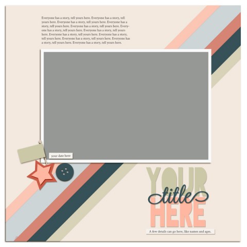
Sketch and Layered Template made by Amy Kingsford based on a layout by Lisa Dickinson for Masterful Scrapbook Design Color 2.
Lisa Dickinson says, “After I’d been scrapbooking a few years, I found it increasingly difficult to stay motivated to scrap the major holidays in our life: Christmas, Easter, Valentine’s Day and Halloween. I realized I was hung up on the traditional color schemes for these events and that I dislike working with these color combos, so I gave myself permission to break the rules.”
“On Trunk or Treat I’ve pulled colors directly from the kids’ costumes, using pink, red, yellow, and navy instead of the expected orange and black for Halloween. To keep the multiple colors from becoming overwhelming, I used white liberally–as a crisp contrast to the bright colors. Even though there is no pumpkin orange to be found, it’s obvious this a Halloween page based on the photo and my title.”
download template and previews
Get over 150 more sketches and templates with a GIS membership
[hr]
More inspiration…
Looking for more examples of how you might use this sketch/template to inspire your next page? Here are a few inspired pages from our Get It Scrapped Creative Team.
Kelly Prang says, “This page is about a funny memory of my son’s first week of kindergarten. I was drawn to the diagonal strips of washi or papers especially since I usually don’t use a diagonal composition that goes from top right to bottom left. I used two vertical photos together to fill up the horizontal photo spot. These photos were not from the day that the story happened, but they are from the same time frame.”
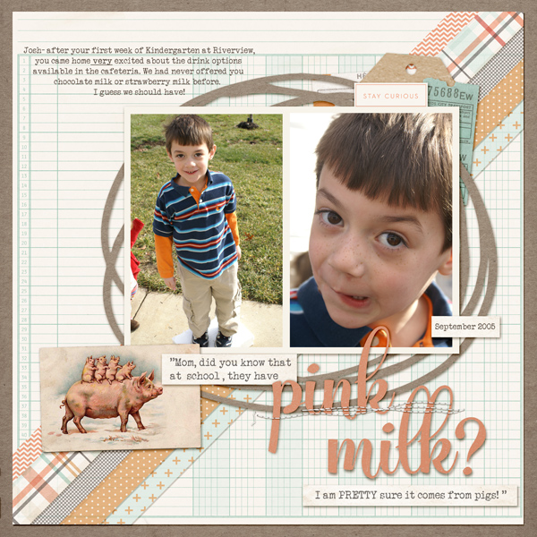
Pink Milk by Kelly Prang |Supplies: Lisa Dickinson Template, One Little Bird- Artisan- papers and elements, Allison Pennington- Autumnal – papers and stitches, Sara Gleason- Family Almanac- elements, Val WIbbens,- Sprinkles N.29- elements,Vintage Pig Illustration purchased from Etsy, Circle Cut File- Jen Schow
Margareta Carlsson says, “This is a story about my niece and her dad (my brother). I love the diagonal design in this sketch and took the opportunity to stash bust a bit of my beautiful washi tape supply. I changed the sketch up a bit, by switching places for the title and journaling, and sprinkling the embellishments over the page.”
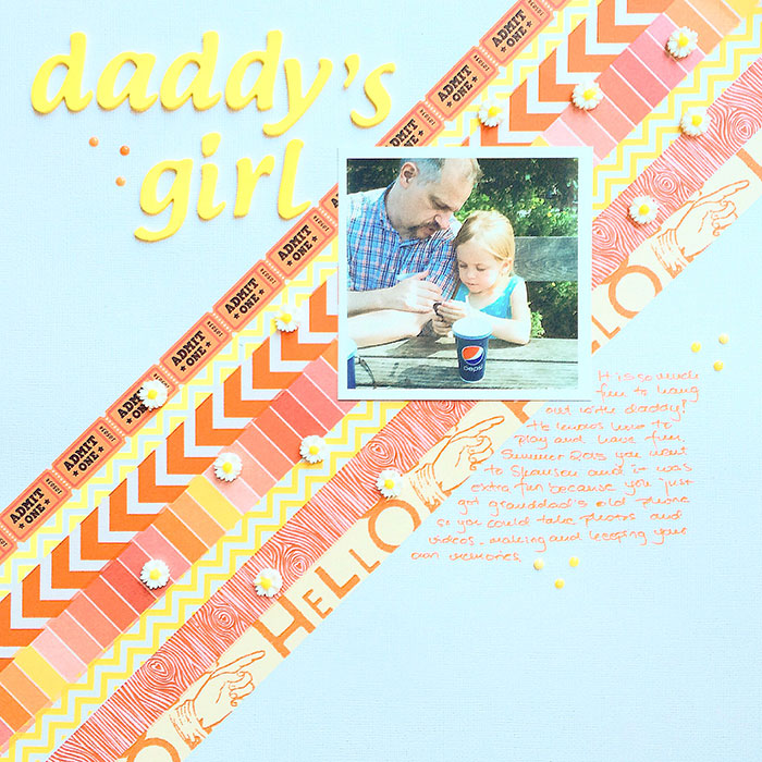
Daddy’s Girl by Margareta Carlsson | Supplies: Cardstock: American Crafts; Washi tapes; Studio Calico and no specific brand; Letters: Pink Paislee Expressions; Resin flower: no specific brand; Enamel dots; no specific brand.
Amy Kingsford says, “This page is about my youngest son and how quickly he’s growing up. I was drawn to the fun angles and the layered title in this sketch. The simplicity of the design puts the emphasis on this beautiful photo of my son and I, but the diagonal strips of washi and the layered title offered wonderful opportunities to add a bit of oomph to my page. I made a few alterations to prepare this sketch for my 8.5 x 11″ canvas, but for the most part I stuck pretty closely to the design.”
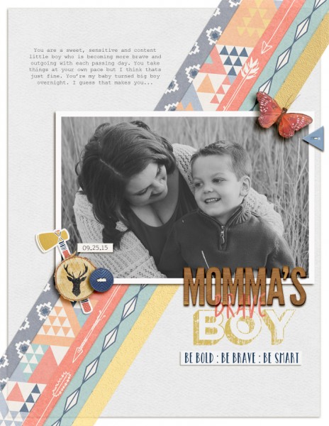
Momma’s Brave Boy by Amy Kingsford | Supplies: Kim Brodelet: Be Brave; Allison Pennington: Home Alpha, November Nights; Digital Design Essentials: Good Eats Alpha; Get It Scrapped: Color 2 Template Inspired by Lisa Dickinson. Photo by Megan Fisher Photography.

