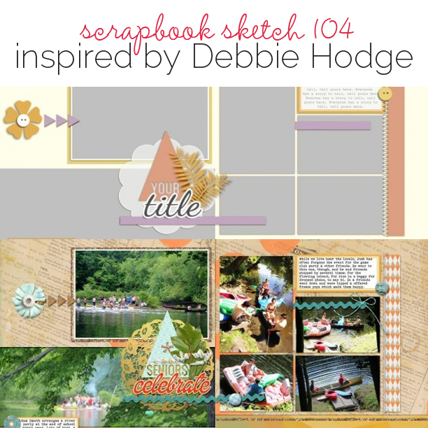
 This free scrapbook page template and sketch comes from a page made by Debbie Hodge for the Product Play class in the Get It Scrapped Membership, where members have access to a library of over 150 layered templates and page sketches, searchable by # of photos and layout type.
This double page sketch allows for lots of photos as well as plenty of design punch though the use of borders, clusters and visual triangles.
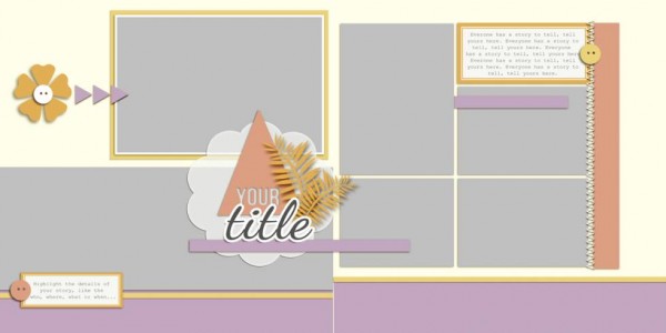
Sketch and Layered Template made by Amy Kingsford based on a layout by Debbie Hodge for Masterful Scrapbook Design Product Play.
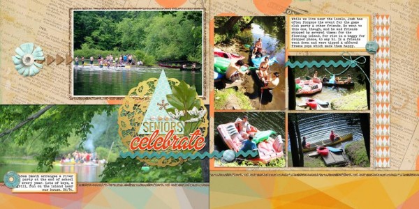
Seniors Celebrate by Debbie Hodge | Supplies: Make A Wish by Allison Pennington; Glittered Frames by Valerie Wibbens; Happies, Sundrifter, Front Porch by Laurie Ann; Driftaway by Sahlin Studio; Sunny Days by Paislee Press; This is My Story by Little Butterfly Wings; For Cute by Splendid Fiins; Oswald, Dollie, Bohemian Typewriter fonts.
Debbie says, “The bulk of the space on this two-page layout is given to photos. Patterned paper backs them up but the papers have the right contrast in value to let the photos pop. The embellishments are placed purposefully for flow — and mostly in small amounts—with just one cluster having lots of eye appeal. That cluster also includes the title and functions as the page focal point. The other elements repeat colors and shapes from the focal point to guide the eye through the photos and story.”
download template and previews
Get over 150 more sketches and templates with a GIS membership
[hr]
More inspiration…
Looking for more examples of how you might use this sketch/template to inspire your next page? Here are a few inspired pages from our Get It Scrapped Creative Team.
Kelly Prang says, “I was drawn to the design of this sketch, however I took the double page layout and condensed it into one back-to-school themed page. The groupings on the original sketch inspired the groupings here. There is a row of photos across the bottom, a large photo to the top left and then a gathering of elements on the right. I added interest with vintage bits and scraps, including a map, tickets, a milk cap, and manila envelope.”
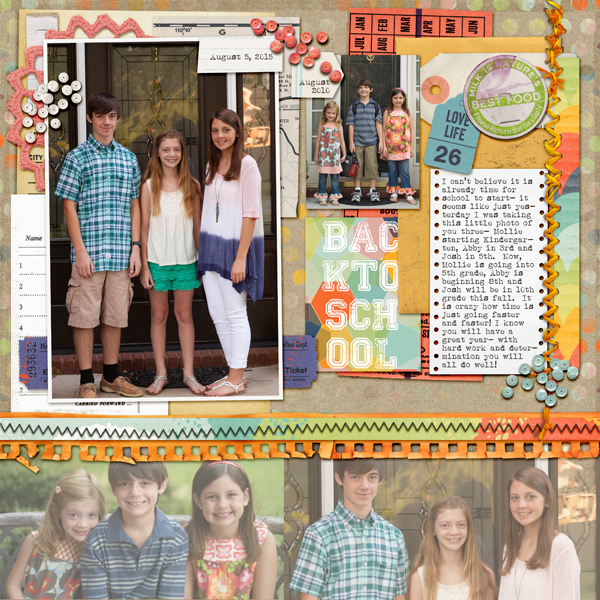
BackToSchool 2015 by Kelly Prang| Supplies: Gennifer Bursett- Love You- sequins, Still-sequins; DBD- Right Now- Staple; Amanda Yi Designs- Home is where We are- tab; 3 Paper Posies- Tag it-Notebook Paper Tab/tag; Cluster Queen Creation- Little Things- Milkcap, Ticket Strip, Envelope, Ticket; Bella Gypsy- Fall in Love- Stitches; Penny Springman- The Little Things- tag; Michelene Martin- Little Things- Patterned paper strip, Laurie Ann HGD- Today’s Story- tag; Julianne Kneipp- Truly Madly Deeply- doily, paper map; Jen Barette- That’s Life- Party game Paper; Just Jaimee- Facebook freebie- Painted Boards; Kim Jensen- Ragged Edges- notebook paper and zigzag stitch. Fonts: Collaged, Alberthal Typewriter.
[hr]
Karen Poirier-Brode says, “I like this template because it let me arrange multiple photos in readable linear lines. I found it an easy template to use, I’d already used it to scrapbook a story about my husband and his garden. Here, The title is a major point of interest. It immediately cues my story which is supported by the photos and journaling.”
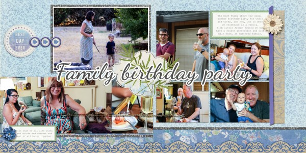
Family Birthday Party by Karen Poirier-Brode | Supplies: Kimeric Kreations: Summertime Blues; Get It Scrapped: ProductPlay Template – Debbie Hodge
[hr]
Gretchen Henninger says, “This sketch was perfect for displaying views of Paris taken from the top of Notre Dame, the Arc de Triumph, and the Musee d’Orsay. It helped me incorporate a large number of landscape photographs. In the original sketch, the title and embellishment cluster overlapped the panoramic photo, so I cropped my photo to create a lot of white space on the right-hand side.”
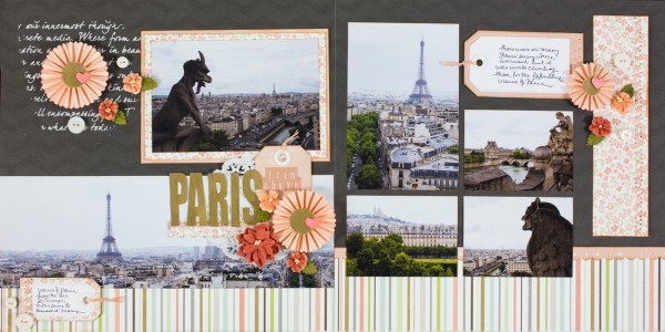
Paris From Above by Gretchen Henninger | Supplies: Paper and Alphas: Carta Bella (Rustic Elegance); Stamps: Technique Tuesday (Big Timber); Dies: Tim Holtz (rosettes), Simon Says Stamp (hearts); Die-Namics (tags); Punches: EK Success; Flowers: Petaloo; Ink: Tim Holtz Distress Ink (tea dye); Stencil: The Crafter’s Workshop; Other: modeling paste, embroidery floss; buttons, doily

