 Designer bundles like those at The Hungry Jpeg offer up a big selection of fonts and digital art at a heavy discount for a short time (usually a month). Over the last year, many of the scrapbookers spending time at the Get It Scrapped forums have linked up bundles they love and gotten more of us on board with this approach to gathering supplies.
In this post, paper/hybrid scrapbooker Christy Strickler and digital scrapbooker Celeste Smith work along with me as we share our thoughts on working with designer bundles. Stuart over at The Hungry Jpeg gave us each a copy of their latest offering, The Floral Super Bundle, and we went to work.
The bundle
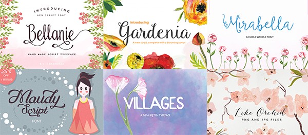
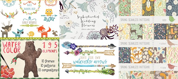
All three of us worked with The Floral Super Bundle from The Hungry Jpeg – it includes over 1900 illustrations and 17 fonts all made by more than 15 designers. You really have to see it to believe it.
There are fonts. These are just a few.
There are illustrations and patterns in a variety of styles. These are just a few.
Celeste Smith on working with designer bundles
This is not my first time working with a bundle, but most of the bundles I’ve worked with were primarily comprised of fonts, and the fonts are what typically draw me to a bundle. I did end up using a lot of the papers in this bundle from The Hungry Jpeg, though. This first page, James, is a good example of using the designer prints on a scrapbook page.
There were so many adorable designs in the Wee Woodland Bundle it was hard to choose which to include on the page. The prints all had fairly large-scale motifs, so I resized most down to the smaller scale that I prefer.
make embellishments by adding styles to illustrations and elements
I applied digital styles (by Mommyish) to many of the elements on the page to add dimension. A sticker style was added to the fox illustration, an epoxy style was combined with the bundle’s Maudy Script font, and a wood veneer style was added to an arrow from the set. I made my own flair by creating a circle, filling it with the light blue color, and adding a flower from the kit. Then I applied a flair style to the circle.
add mixed media effects with textures
The paint behind the block is from the bundle’s “Spring Collection.” That set includes a folder of textures. I recolored a texture then used a soft brush to erase some of the hard edges for a subtle painted background.
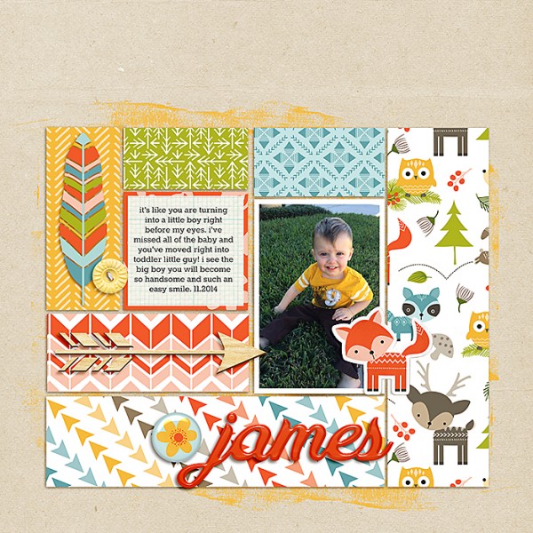
James by Celeste Smith | Supplies: Hungry JPEG Floral Bundle: Wee Woodland Bundle, Spring Collection; Amy Wolff: Pixie Dust Elements; One Little Bird: Pagekraft Cardstock; Mommyish: Styln’ 148 Wood Veneer; Styln’ #48 Gel; Stylin’ #157 Chip & Stick, Stylin #74 Flair; Kaye Winiecki: All About that Grid papers; Fonts: Maudy Script, Rokkit.
When working with bundles, I would suggest downloading and then culling through to get rid of anything you won’t use. I don’t install the fonts. I use the font management program NexusFont. In the program, I create a category with the Bundle name and categorize the fonts into that folder, but also into others like Script, Brush, Handwritten, Display, etc. Also, to get more bang for my buck, I print out the previews of the fonts and files and keep that on my desk. I try to use each font at least once and the same goes for files.
Designer bundles are a great way to add premium fonts to your font collection inexpensively. I also love trying to incorporate the fonts into my pages. I see it as a challenge to use all the fonts in the bundle!
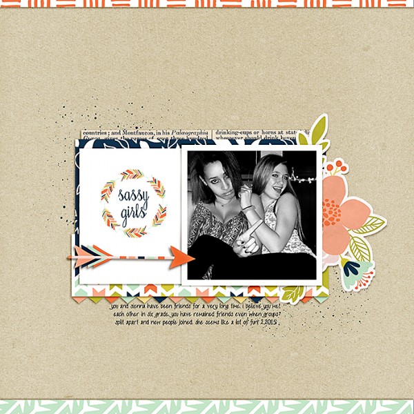
On this page, I used both fonts and illustrations from the bundle to make a custom journaling card.
There are many elements in the Floral bundle that you can use to make custom journal cards. Here I used one of the wreaths from Wilderness Mega Pack and the Bellamie font to create a title card. I used a rubber style (Mommyish) on the arrow to give it dimension. I turned the large floral from the bundle into a sticker using a style as well.
The patterned paper here comes from Wilderness Mega Pack, and the paint splatter behind the block is from the Spring Collection. There is a folder of textures in that bundle. I recolored the texture then I used a soft brush to erase some of the hard edges from the texture to give a subtle splattered background to the block.
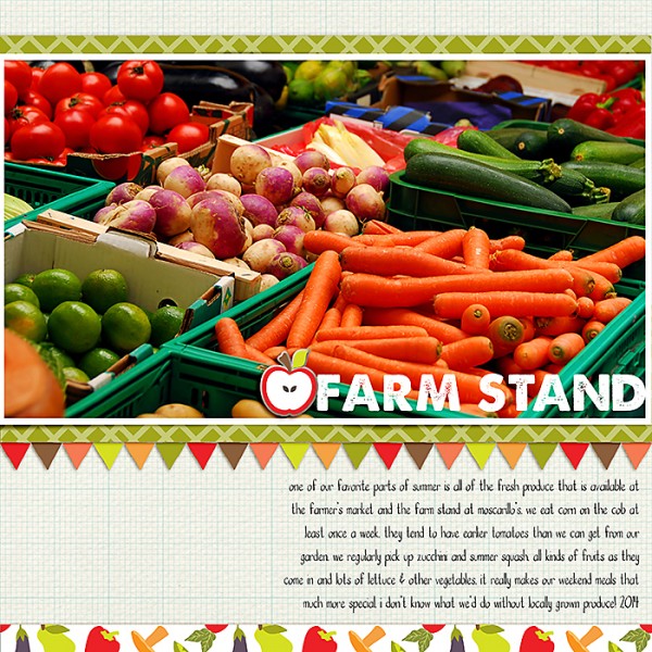
I really enjoyed the fonts in this bundle. The patterned papers were a nice surprise and I incorporated them into my pages as much as possible. This page is a great example of all you can do
I recolored the banner from Wilderness Mega Pack to match Farmers Market Design Pack colors using the fill tool in Photoshop. To give the apple a chipboard look and dimension, I applied a chipboard style.
Christy Stricker on working with designer bundles
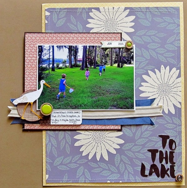
This is my first time working with a designer bundle like this. For me, it is a great value when compared to the cost of buying multiple digital kits. On this page I designed and printed two of my own patterned papers and used one of the fonts to make a die-cut title.
make your own patterned paper
As a toddler, my son enjoyed simple backyard adventures like finding snails. I didn’t have the perfect paper for this story in my supplies, so I used elements from the Hungry Jpeg bundle to make my patterned paper.
I repeated words rendered with the Wendy font and made my own text-print patterned paper. With watercolor branches from the Lovely Floral Collection I created a nature-themed print.
die-cut printed embellishments and title
I used my Silhouette print-to-cut feature to create printed die-cuts of flowers, a doily-like foundation, and the snail from several of the sets in the bundle (Wilderness Mega Pack, Water Color Pack Volume #2, Nature Water Colors, 195 Watercolor Elements).
I also die-cut the title. It’s rendered with the Maudy Script font and then painted with glossy accents for the look of enamel.
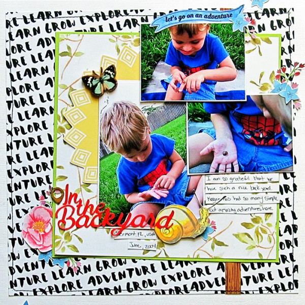
In the Backyard by Christy Strickler |Supplies Cardstock: Bazzill; Chipboard: Studio Calico: Wood Veneer: Prima: Stamp: Kelly Purkey: Ink: Staz-on; Other: Tape, Glossy Accents; The Hungry JPeg Floral Bundle: Maudy Script and Wendy Fonts; Wilderness Mega Pack, Water Color Pack Volume #2, Nature Water Colors, 195 Watercolor Elements, The Lovely Floral Collection
Upon opening the bundle, I did several things:
- I looked through it to identify which fonts resonated most for me.
- I made notes about the stories I thought I could tell with the illustrations and elements.
- I noted the color palettes and considered which of my paper supplies would work with the bundle.
The page is an example of how patterned papers from the designer bundle can be good mixers with a paper stash.
I used one of the patterns in The Spring Collection for the largest block of patterned paper, and then I die-cut embellishments. Many of the images in this bundle are easy to recolor and re-size for make a custom die cut. With my Silhouette I die-cut one of the cranes in white, then used a marker to add details. The title was cut with the Wendy font.
For future bundle purchases, I would consider how well the fonts coordinate with each other. I would also consider the theme of the bundle to ensure I could make good use of a good number of the illustrations. I’d ask myself if the theme was varied enough for me to create multiple pages. It is only a good value if I can make lots of layouts.
As you can see from my third page using the bundle I’ve been able to use it for elegant pages as well as casual outdoor pages.
use the print-to-cut option on your electronic cutter to get custom printed embellishments
I found that many of the elements in this bundle were perfect for giving new life to my older paper supplies.
Here, the patterned paper is an old print from Basic Grey. The floral embellishments complement it well. They came from the Sophisticated Wedding Flowers set in the bundle, and I used my Silhouette Portrait’s print-to-cut option to make them. The printed images included a bit of glitter which doesn’t translate as well to a paper page as it might to a digital one. To jazz them up, I used Stickles glitter glue in Diamond. It added the shine back to each image.
Debbie Hodge on working with designer bundles
This is my third designer bundle. I enjoy using the fonts for my titlework. I also find that the elements have motifs and styling that vary from my scrapbooking stash me and let me get fresh looks–especially when I combine these new elements with the digital product I already own. These bundles never replace my digital scrapbooking supplies, rather, they are great complements.
embellish with watercolor illustrations
This page is a leap for me style-wise, and right now I love it. The combination of funky digital papers in my stash (The Lily Pad’s Mixed Media Monthly) alongside watercolored critters from The Hungry Jpeg and a new scripty font are all a part of this new look.
I typically embellish my pages with dimensional elements–buttons, flair, bows, chipboard–but I so loved the watercolor animals and birds in Watercolor Spring Collection, that I found a way to embellish with them in new ways. I clipped a deer to a cloud shape, and I placed a big bird at bottom left, bleeding off the canvas and jutting into my journaling block. The two have swapped spots in nature! These unexpected touches are an energetic complement to my blocky design.
(The script font in the title is also from the bundle–Melliana–and altered with a watercolor style and sticker treatment).
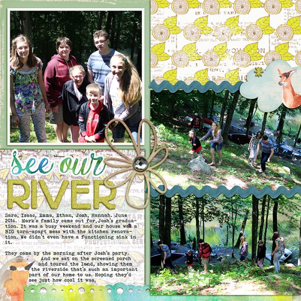
See Our River by Debbie Hodge | Supplies: Mixed Media Monthly March by Little Butterfly Wings, Quirky Heart, Lynne-Marie; Up by Lynn Marie; Springalong Marshmallow Alpha by Allison Pennington; Today by Laurie Ann; Digi Punches by Eye Inspire; Paintshop Styles by Just Jaimee; Watercolor Spring Collection by Digital Press Creation/Hungry Jpeg; Today by Laurie Ann; Feedsack by Spendid Fiins; Melliana, Bohemian Typewriter fonts
While the fonts in a collection are the biggest initial incentive for my purchase, I love the patterns and illustrations, too. I do not download everything in a collection. I figure out what I want to use and get that downloaded and organized in folders. I downloaded most of the fonts in this set from The Hungry Jpeg and many of the illustrations. The illustrations come in multiple formats varying by designer within the collection. I kept the png versions of elements and the jpg versions of patterns. There are layered and vector images for some, and, while they might be nice to have, I prefer to grab what I need now, use them as efficiently as possible, and move forward.
On this page, I used both patterned papers and a new font from the bundle. The title font is Dandelion Soup, a sweet, loopy script. I added a watercolor style (by Just Jaimee) and then a stroke with layered opacity for a sticker effect that makes this font feel at home on a scrapbook page.
The black-and-white floral and dotted prints here came from The Love Pack. I love how their elegant styling juxtaposes with a retro floral print from my digital stash.
The two main reasons I enjoy these designer bundles are: 1) I get lots of new awesome fonts affordably, and 2) the element motifs and styling are a fresh departure from the products I already own. They will not replace my digital stash. Rather, they, are a great complement.
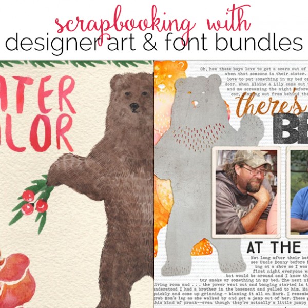
The bear in the digital set is black and invites customization. I used two BIG copies of it. One is altered with a watercolor style (by Just Jaimee) and the other has digital paper (by Lynn Grieveson) clipped to it. The watercolor bear is flat, and the paper bear is digitally cut from paper and thus has a nice shadow and dimension. Notice I also grabbed a bunny from the same set, gave it a watercolor look, and placed it at bottom right.
One more piece here that came from the Hungry Jpeg bundle is the font that “there’s a” is rendered in. That font is Melliana, and it’s my new favorite font. I’ve used it on at least 5 pages in the last week. A glitter style (Just Jaimee) gives it pizzazz.
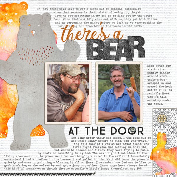
There’s a Bear at the Door by Debbie Hodge | Supplies: The Spring Collection by Julia Dreams from Hungry Jpeg; Walden, Worn Photo Edges 4 by Lynn Grieveson; Straight Stitched Black by Anna Aspnes; Shine by Laurie Ann; Paintshop Styles, NYRG Styles by Just Jaimee; Vintage Woodcut Alpha by Mommyish; Melliana, True North, Bohemian Typewriter fonts
So that’s how Celeste, Christy, and I dug into this bundle. I know we’ll be getting many more pages made with the pieces in it. This bundle, and others in the series, are usually available for a month at a super-steep discount, and then if you want the pieces you need to buy them individually from the designers. Check out The Hungry Jpeg here for a closer look–and to purchase yourself.

