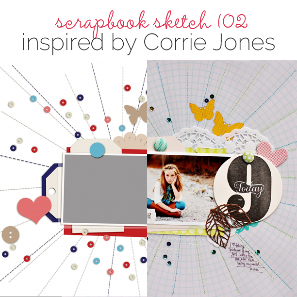
 This free scrapbook page sketch comes from a page made by Corrie Jones for the Oomph and Polish class in the Get It Scrapped Membership, where members have access to a library of over 100 layered templates and page sketches, searchable by # of photos and layout type.
Its lovely layers and beautiful details add instant oomph and polish to any page, just like Corrie Jones achieved in her page, 9 Today.
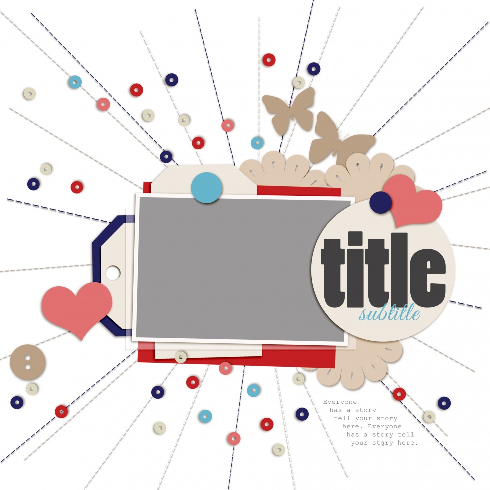
Sketch and Layered Template made by Amy Kingsford based on a layout by Corrie Jones for Masterful Scrapbook Design Oomph and Polish.
Corrie says, “On this page I have used layering to really make my photo stand out. The layers start with plain white cardstock layered with vellum. I stitched the vellum to the cardstock from the center out. Then, I used rub ons, a doily, patterned paper, tags, chipboard, a large coaster and metal leaves layered up to the photo.”

9 Today by Corrie Jones | Supplies: Bazzill: Cardstock; Studio Calico: Vellum, Rub Ons; American Crafts: Tag, Patterned Paper, Chipboard, Pink Paislee: Tag, Rub Ons; Echo Park: Patterned Paper; Freckled Fawn: Doily; Red Bird Ink, Metal Leaves: Coaster; Hambly: Rub Ons; Ki Memories: Stickers; SRM Stickers: Glassine Bag; Crate Paper: Brads, Buttons; Other: Sequins
download template and previews
[hr]
More inspiration…
Looking for more examples of how you might use this sketch/template to inspire your next page? Here are a few inspired pages from our Get It Scrapped Creative Team.
Jennifer Kellogg says, “When I saw this sketch I immediately thought of the photos I took of the High Roller ferris wheel in Las Vegas. I was fascinated with photographing the High Roller. No – I never rode on it! The stitching in the shape of a spindle made me think this was the perfect sketch for the photos I had taken.”
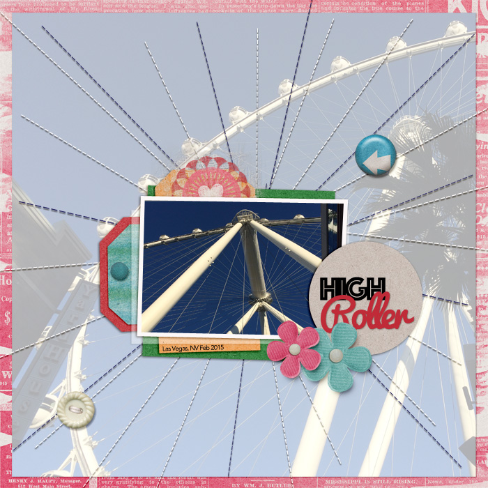
High Roller by Jennifer Kellogg for Get It Scrapped | Supplies: Get It Scrapped & Corey Jones: Omph & Polish Template; Just Jaime: It’s a Good Life Kit; Rachaels Scraps: Button Strings; Mommyish: Buttons 2; Fonts: Avenir, Phosphate, Pacifico.
Sian Fair says, “What was I drawn to? As soon as I saw this sketch I wanted to make a stitched sunburst and scatter it with sequins: it’s such a pretty look! This page is a celebration of a favorite book I read to my son before he was even born. Usually I start with a story and then find a design; but when I saw this sketch I thought about playing round with the lovely design first, and then the idea of adding the moon to the sunrays came to me and I had my story.”
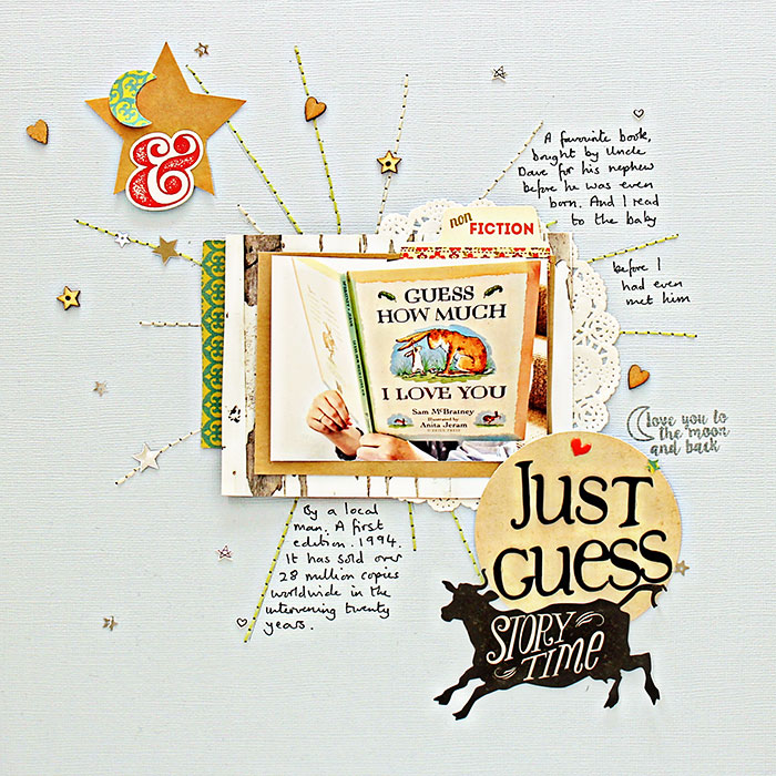
Just Guess by Sian Fair | Supplies Patterned Paper: Basic Grey, October Afternoon; Alpha: cut with Slice machine; Stickers: October Afternoon; Kraft Star and puffy stickers: Studio Calico; Stamp: Gossamer Blue
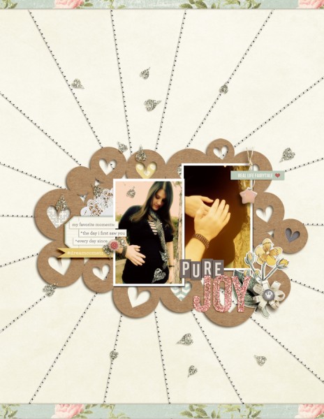
Amy Kingsford says, “When I looked at this sketch I really loved the radiating lines and all of the layers. I used the sketch to scrapbook these photos of my sister-in-law in her 6 month of pregnancy. I made a few changes to the sketch to accommodate my 8.5 x 11 canvas but overall I think this charming design lent itself perfectly to my page’s subject.

