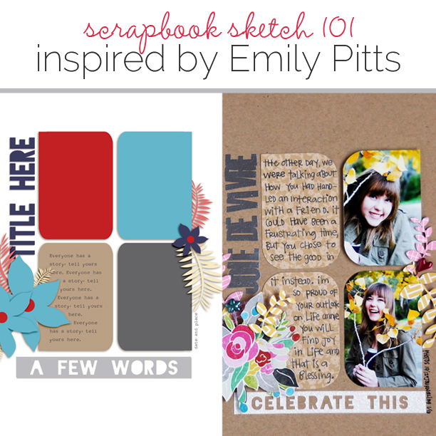
 This free scrapbook page sketch comes from a page made by Emily Pitts for the Make It Mean class in the Get It Scrapped Membership, where members have access to a library of over 100 layered templates and page sketches, searchable by # of photos and layout type.
This page offers an interesting take on your everyday grid with its use of an unexpected shape and its vertical title placement.
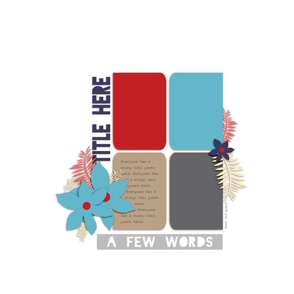
Sketch and Layered Template made by Amy Kingsford based on a layout by Emily Pitts for Masterful Scrapbook Design “Make It Mean.”
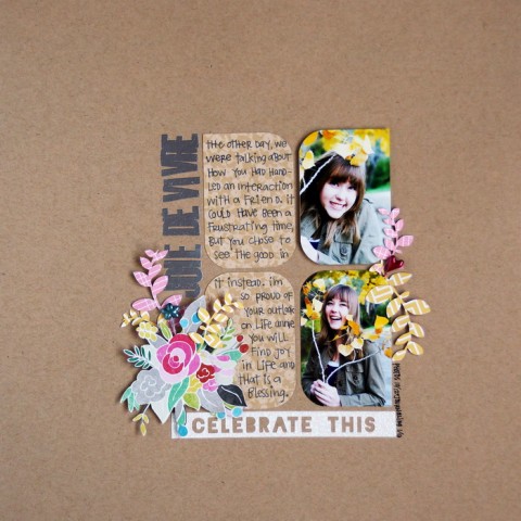
Joie de Vivre by Emily Pitts | Supplies: cardstock by Bazzill Basics; patterned papers by Pebbles, Echo Park, Crate Paper; sticker by KI Memories; stick pins by Fancy Pants; stamps by Cocoa Daisy; embossing powder by American Crafts; ink by Versamark; pen by Uniball; diecut by Silhouette online store; diecut machine by Silhouette; adhesive by Scrapbook Adhesives
Emily says, “Having a teenage daughter shouldn’t be as easy as it’s been. We’ve had a few moments of frustration and angst, but, generally, my daughter doesn’t act like a teenager. I wanted to record what a joyful person she is, how she faces life with a can-do attitude that will continue to serve her well.”
“Instead of doing my title horizontally across the page, I turned it sideways, going up to indicate that she was going in the right direction with this attitude: upwards.
download template and previews
[hr]
More inspiration…
Looking for more examples of how you might use this sketch/template to inspire your next page? Here are a few inspired pages from our Get It Scrapped Creative Team.
Marcia Fortunato says, “I was drawn to the shape of the photos and the grid arrangement in this sketch.”
“For my layout I chose recent photos of my sons, who are now all adults and of whom I am very proud! Because there were four photo/journaling spots, I knew it would be perfect for a layout about my four sons. I made the photos a little larger than in the sketch, but keeping them all the same size maintained the basic layout.”
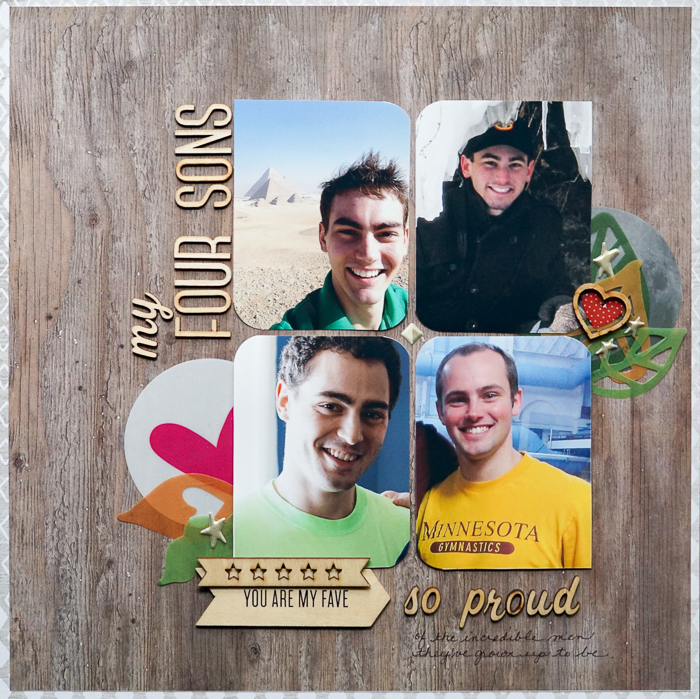
My Four Sons by Marcia Fortunato | Supplies: Patterned Paper: My Mind’s Eye, Life.Love.Paper; Letter stickers: Studio Calico, Pinkfresh Studio; Embellishments: Studio Calico, iHeart Studio, Hello Forever, Freckled Fawn, Crate Paper; Pens: LePen (Marvy).
[hr]
Karen Poirier-Brode says, “I loved this sketch because of the way I could incorporate a lot of patterned paper and elements into a central spot. My page is about my great-grandson who has finally grown into his preemie baby features and looks more like a baby than an old man now.”
“I used the matchbox die as a starting point for my page and included the journaling and another photo inside the matchbox, next making the size of the patterned paper rectangles to match the matchbox.”

Handsome Boy by Karen Poirier-Brode | Supplies: Cardstock Bazill, patterned paper – Jen Allyson lime twist MME; buttons, Baker’s twine – stash; matchbox die and white chipboard – Little B, die cuts – OUR LIL’ MONSTER, Noteworthy, Bo Bunny; chipboard word art – Bundle of Joy, Echo Park, stamp – Dear Lizzy, dimensional sticker – Ready, Set, Go, Amy Tangerine, AC
[hr]
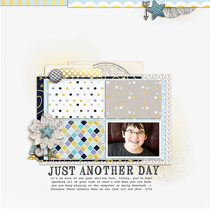
Celeste Smith says, “I was drawn to the grid design and the open white space. My page is about how much I appreciate the time I spend with my son. Here I flipped the design and then used the four blocks of paper on top of my usual layering style.”

