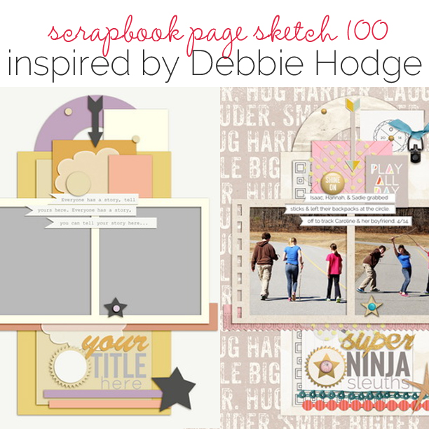
 This free scrapbook page sketch comes from a page made by Debbie Hodge for the Process Play class in the Get It Scrapped Membership, where members have access to a library of over 100 layered templates and page sketches, searchable by # of photos and layout type.
This layered, symmetrical design is perfect for creating a trendy, photocentric page, like Debbie’s Super Ninja Sleuths.”
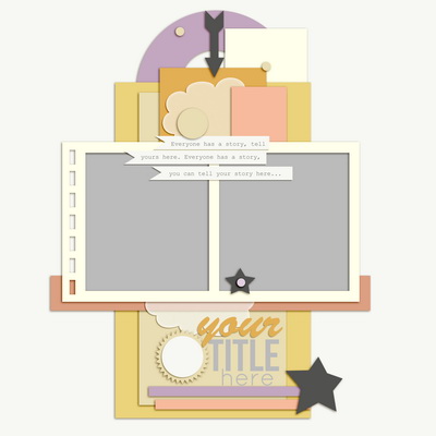
Sketch and Layered Template made by Amy Kingsford based on a layout by Debbie Hodge for Masterful Scrapbook Design Process Play
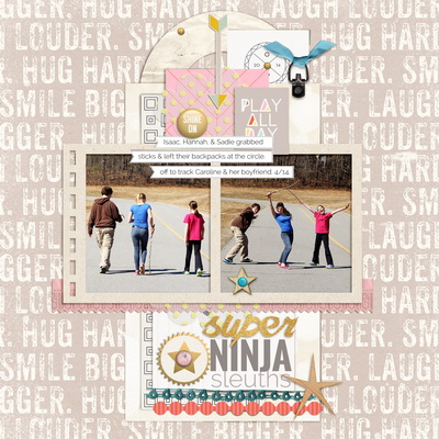
Super Ninja Sleuths by Debbie Hodge | Supplies: Giggle Snort, Coconut (enamel dots) by Sarah Gleason; Hopscotch by One Little Bird; Ribbon Ties, Arttime Elements by Katie Pertiet; Wood Dots by Gennifer Bursett; Word Label Templates, Multimedia Wreaths by Anna Aspnes; Borders by Amy Martin; Shine, Today’s Story by Laurie Ann; Foil actions by Just Jaimee.
Debbie says, ” Sometimes I choose a composition because I know it’s a really good match for everything I want on the page. Other times, like with this page, I choose it because it’s a challenge and because I want an eye-catching design. With this I wanted symmetry and interestingly-shaped white space. After I chose the composition, I selected photos that would work with the design. My first placements are of the photos and the foundational pieces that define the composition.”
download template and previews
[hr]
More inspiration…
Looking for more examples of how you might use this sketch/template to inspire your next page? Here are a few inspired pages from our Get It Scrapped Creative Team.
Heather Awsumb says, “I was drawn to the sketch because I saw options for using 1, 2 or even 3 photos. I originally thought that I would combine the two photos into one big one, but it turns out two photos was just right for documenting this Facebook status update about my excitement for a trip with my sisters in Cape Town, South Africa.”
“The original placement of the journaling strips didn’t work with the photos I selected, so I moved the journaling to the title spot and then placed the title vertically along one of the photos. I also made the photos slightly larger by not using the photo frame included in the template.”
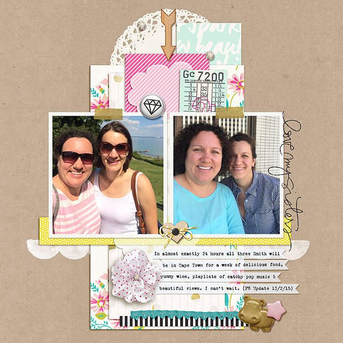
Love my Sisters by Heather Awsumb | Supplies: Shine Bright, Hello (Memory Pocket Monthly), The Everyday Routine Papers, Pure Happiness Elements by Sahlin Studio; Carless & Painted Borders by Allison Pennington; Prix Fixe, Heartbeat, Fete, Day Trippers by One Little Bird; Julep by Gennifer Bursette; Sweet Rosey by Katie Pertiet; What Fun by Sara Gleason; Pocket Stuffers by Valerie Wibbens; Sisters Brushes & Stamps by Ali Edwards; Brad Bonanza by Patti Knox
Sian Fair says, “I find the opportunity to layer pieces and tuck bits behind the photos hard to resist and as such was drawn to this sketch. This page is the story of how we experimented with the Coca Cola making kit my daughter was given for Christmas last year and how I experimented with taking photos of the results.”
“I loved the shape of the original sketch, but that didn’t stop me adding another little embellishment cluster at the top: I used the sketch as a starting point and then personalized it.”
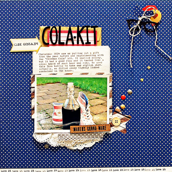
Cola Kit by Sian Fair | Supplies: Patterned paper: Gossamer Blue; Alpha: American Crafts; Diecuts: Crate Paper; Cork and wood veneer: Gossamer Blue; Glasses veneer: Scrap365; Enamel Dots: Teresa Collins and MME; Broderie Anglaise: October Afternoon; stamp: Gossamer Blue
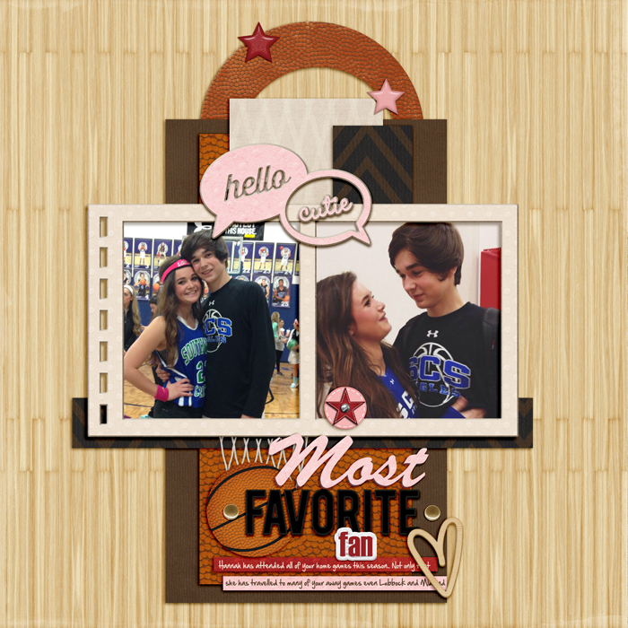
Ronnie Crowley says, ” The strong vertical designs of the sketch initially made me think I could make the layout look a little like a basketball hoop/backboard, making it perfect for a layout about my son’s girlfriend who is his number one fan: she’s been to more of his games than I have this season.”
“Using all the layers in the design I was able to introduce a whole mix of papers into my design which I then topped off with a themed circular element. Finally, by adding the net in the title cluster I felt I had achieved an interpretation of a basketball hoop with even the photo frame somehow giving the feel of the basket.”

