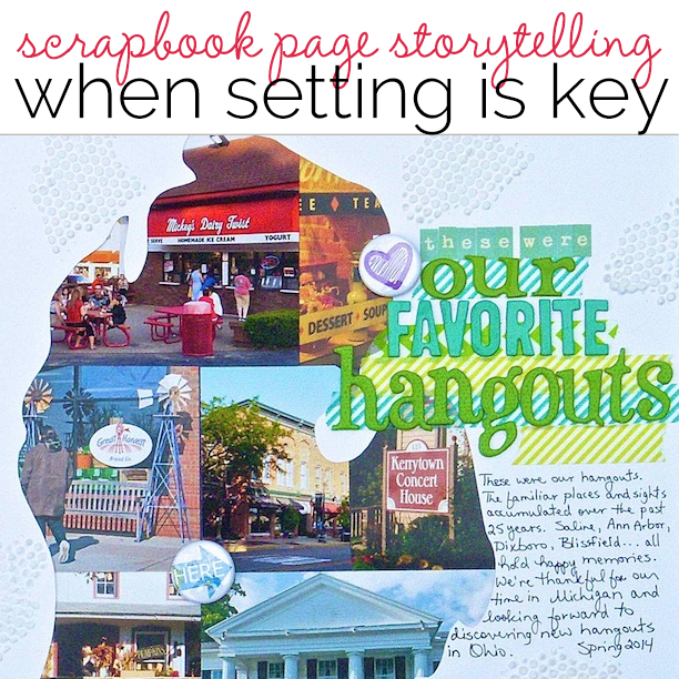
 Some photos and scrapbook page stories are all about place. When setting is key to your story, extend it from the photos out onto the canvas with these scrapbooking ideas.
[hr]
Vicki Hibbins says, “This layout shows my husband and daughter playing on the beach together this summer. I chalked a sky and used strips of torn paper and mulberry paper to create the sea. I also used scraps of card-stock to make pebbles. I wanted to create a generic beach to represent setting rather than an exact copy.”

Beach Fun by Vicki Hibbins| American Crafts card-stock; Close to my Heart patterned paper; white mulberry paper; EK Success chalks; American Crafts Thickers – Kitten; card-stock scraps
[hr]
Kristy T says, “As part of teaching our children about the history of ANZAC Day we visited the Princess Royal Military Fortress up Mount Clarence in Albany and spent time exploring the equipment and the museum buildings.”
“The view from Mount Clarence is beautiful and I photographed it whilst we were up there. I used the photo for guidance and sketched the landscape using watercolour pencils. I then added water, additional colour using gelatos, and white paint to create the scene. Using pencils gives more control over the final look and it is important to remember that your scene doesn’t have to be perfect to help effectively tell your story.”
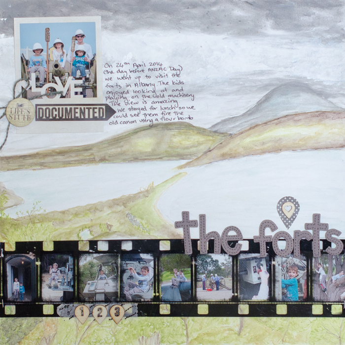
The Forts by Kristy T | Supplies: Paper: Artee; Watercolour pencils: Faber-castell; Getalos: Faber-castell; Paint: Dina Wakely; Alphas: American Crafts; Film Strip: Kaisercraft; Washi Tape: Unknown; Wood Veneers: Studio Calico, Twine: Tim Holtz; Stickers: MME; Flair: Prima; CD Marker: Artline.
[hr]
Andrea says, “This page is about the long road trip we took to Tennessee to see the Smoky Mountains. To include the setting, I added shapes of all the states we traveled through to get there. The arrows show the direction we traveled and the wire letters mimic a road. To complete the layout I added blended and framed photos from our trip.”
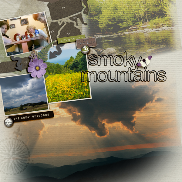
Smoky Mountains by Andrea | Supplies: Anna Aspnes: Great Outdoors Kit; Tangie: Journey 12 arrow; Erica Zwart: Outdoor Adventures kit; SG: compass; Sahlin Studio: Black Wire Alpha
[hr]
Susanne Brauer says, “I have had a ‘hope’ chest since I was 20 years old. Over the years it has been filled with mementos of my life, and it is a reminder of how blessed I have been.”
“I incorporated setting with attic-themed paper that shows a collection of items gathered over the years. I placed the photo of my chest in among the suitcases, ladders, and coatracks, and I added lots of embellishments to add to the feel of things having collected over time. The pull-out tag at the top lists the contents.”
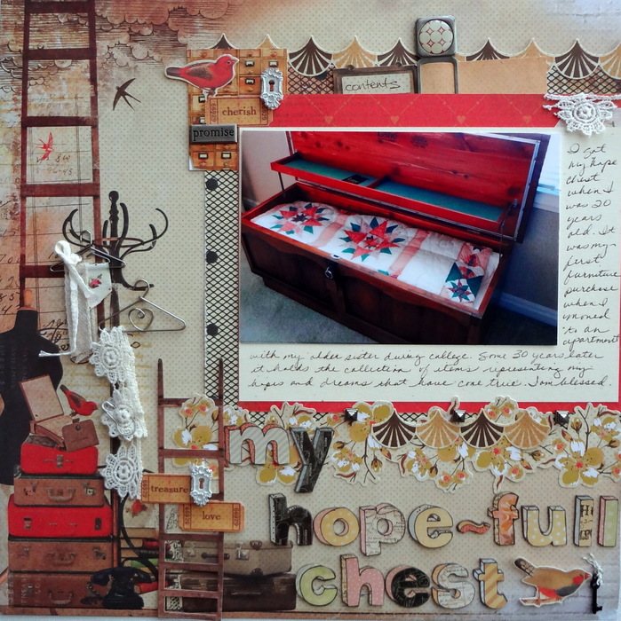
My Hope-full Chest by Susanne Brauer | Supplies: Paper and stickers, Kaisercraft; Alphabet, K & Co.: Metal pieces, 7 Gypsies and Melissa Francis
[hr]
Amy Kingsford says, “This ‘fire leaf’ was a gift from my youngest son who set out to find the biggest of all the leaves that had fallen from the tree at his aunt’s house to give to me.”
“The photo was taken on the car ride home in poor lighting conditions and with a black and white filter applied. My goal was to recapture the backdrop of the beautiful autumn day and the fallen leaves through which he searched long and hard for this gift to me, so I used a fall color scheme, a variety of leaf brushes, and other fall embellishments, along with a few warm splashes of gold.”
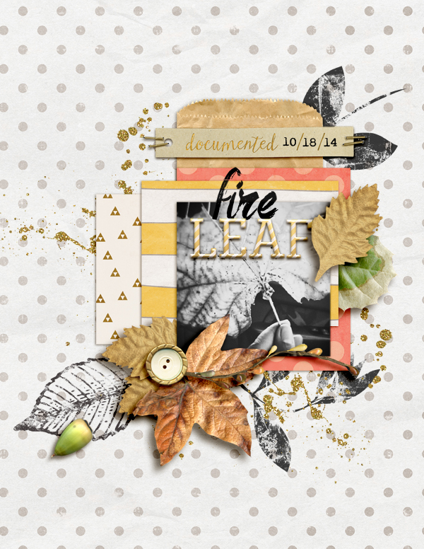
Fire Leaf by Amy Kingsford | Supplies: Jen Allyson, Gennifer Bursett and Amanda Yi: Dialogue Collab; Jen Allyson: Leaf Stamps and Brushes; Creashens: Nuts and Squirrels, Me Time Alpha; Font: Art Brewery.
[hr]
Sian Fair says, “The film sets at Universal Studios gave my daughter some great posing opportunities: here she sits at the bus stop, waiting to strike out on a new life: a perfect photo to illustrate a summer of transition for her”
“I made the most of the whole ‘film set’ idea first of all by editing the photos to get an old-style film look. Then, to create a sense of scripts piled on a desk, I layered old book paper and envelopes.”
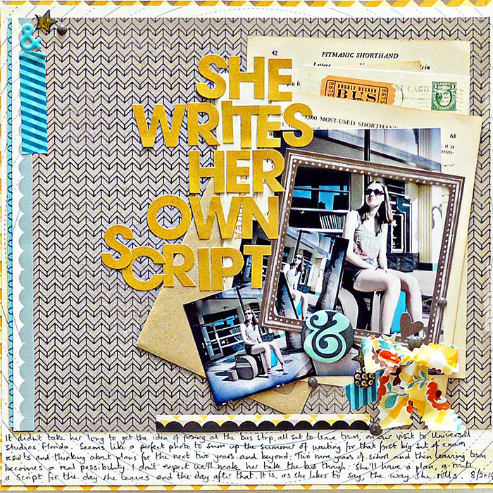
Her Own Script by Sian Fair/ Supplies: Patterned Paper: Fancy Pants, Crate Paper; Alpha: Fancy Pants, Diecuts and Flair: Fancy Pants; Enamel Stars: Freckled fawn, Frame: Crate Paper
[hr]
Sue Althouse says, “This page is about leaving our favorite hangouts in Michigan when we moved back to Ohio. I represented the setting in my design by cutting out the shape of Michigan with my Silhouette and filling it with a collage of photos. This composition captures glimpses of familiar spots and groups them together in an interesting way.”
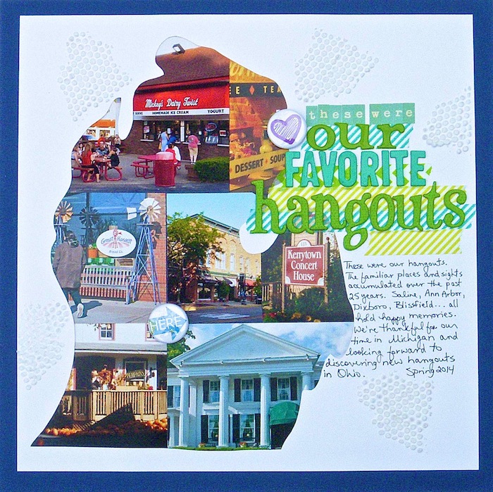
Our Favorite Hangouts by Sue Althouse | Supplies: Cardstock: Bazzill; Alphabets: American Crafts, October Afternoon; Stencil: The Crafters Workshop; Embossing Paste: Studio 490 Wendy Vecchi; Die Cut: Silhouette Cameo; Washi Tape: My Mind’s Eye, Queen & Co.; Flair: A Flair for Buttons; Pen: Micron
[hr]

