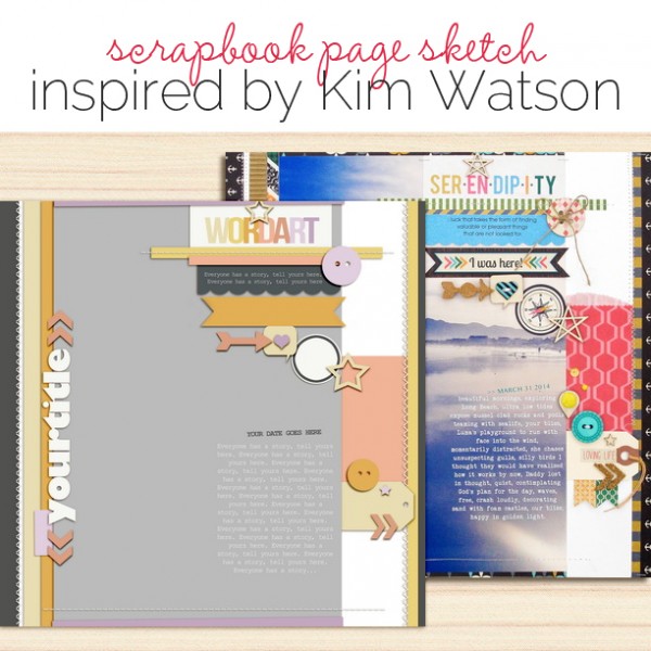
 This free scrapbook page sketch comes from a page made by Kim Watson for the Process Play class in the Get It Scrapped Membership. It’s also a part of the template and sketch library that holds 110+ Photoshop templates and page sketches, searchable by # of photos and layout type.
The full-page photo here is great for lending impact to captured moments and evoking strong emotions, as evidenced by Kim Watson’s Serendipity.
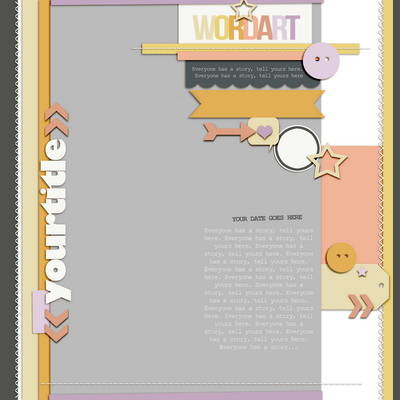
Sketch and Layered Template made by Amy Kingsford based on a layout by Kim Watson for Masterful Scrapbook Design Process Play
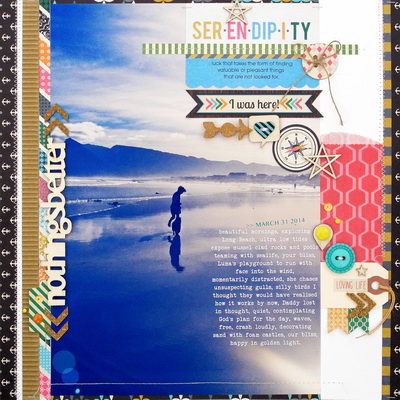
Serendipity by Kim Watson | Supplies: Cardstock by Stampin’Up; Patterned
paper, Corrugated card, Die cuts, Stickers, Buttons, Cork arrow, Chipboard,
Decorative bag by Fancy Pants Designs, Wood veneer, Enamel dots, Sequins,
Cork chevrons by Studio Calico, Adhesive by Tombow, Thermo web
& 3L, Sewing machine, Font: Veteran Typewriter
Kim says, “When a photograph is the catalyst for a page, I recommend that you aim to evoke an a strong emotional connection to the photograph for the viewer–one that snag the reader’s attention immediately.”
download template and previews
[hr]
More inspiration…
Looking for more examples of how you might use this sketch/template to inspire your next page? Here are a few inspired pages from our Get It Scrapped Creative Team.
Jennifer Kellogg says, “I was drawn to this sketch because of the one large photo, and I used it to make a page about how calm and happy I am on cloudy days.”
“I took this photo with my iPhone. I’ve been wanting to use it on a layout, but I had this blurry spot that would really take away from the photo. When I saw this template I was thrilled I could scrap my photo and cover up the blurry (distracting) background.”
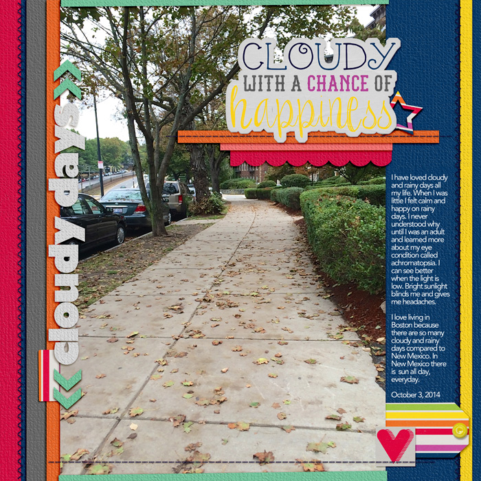
Cloudy Days by Jennifer Kellogg | Supplies: Kim Watson/Amy Kingsford: Get It Scrapped Process Play Template; Amanda Yi & Cornelia Designs: Cloudy with a Chance of Happiness Kit; Font: Avenir.
Jett Hampton says, ” I love this sketch for its use of a large photo with many embellishments, but still maintaining the focus on the photos.”
“This layout is about my niece’s first triathlon and I didn’t have a way to print an 8” x 12” photo so I used a 5.5″ x 8,” a second smaller photo and I enlarged the wordart I used for my title.”
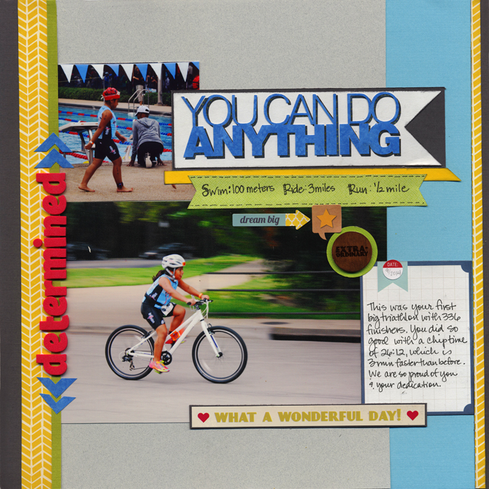
Determined by Jett Hampton | Supplies: Cardstock: American Crafts; Patterned Paper: Fancy Pants Design; Alphas: AC Thickers; Stickers: Fancy Pants, Simple Stories; Journaling Card: Project Life; Wood Veneer: Studio Calico; WordArt: Silhouette cut file
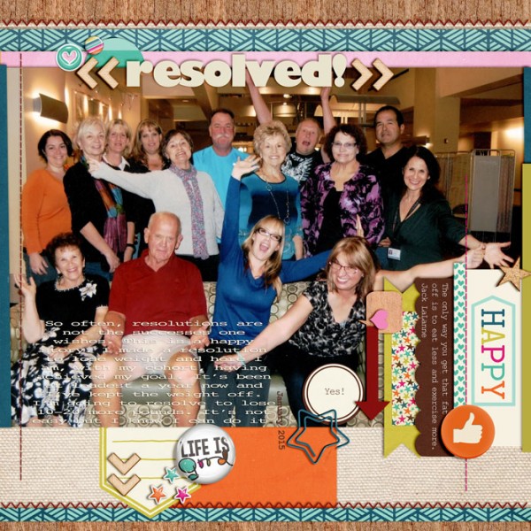
Karen Poirier-Brode says, “I picked this sketch because I am a fan of Kim Watson’s delightful layered bits style. It used one photo and I’ve wanted to do a page with this story and photo of my weight loss for some time.”
“I found the multiple colors in the photo a bit challenging at first but the multiple pieces in the template was a help because I found I could incorporate enough color in the elements to unify the page. I used two kits by the same designer to be sure all the multiple parts worked together and I kept pretty much to the structure of the page though I did rotate it.”

