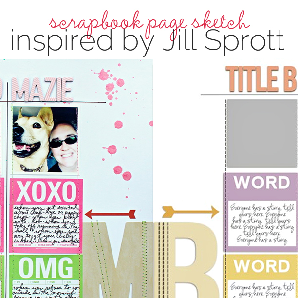
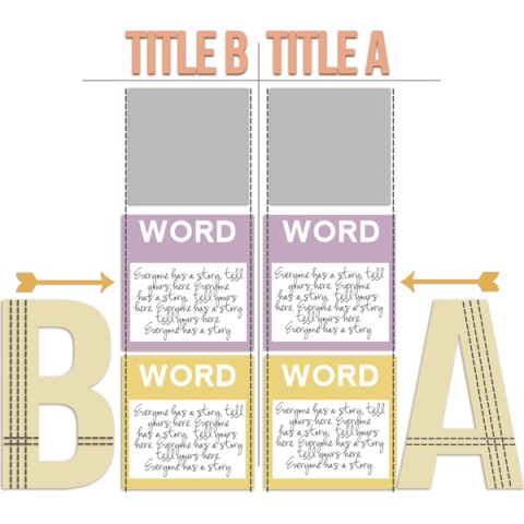
 This free scrapbook page template and sketch comes from a page made by Jill Sprott for the Story Play class in the Get It Scrapped Membership where members have access to a library of over 100 layered templates and page sketches, searchable by # of photos and layout type.
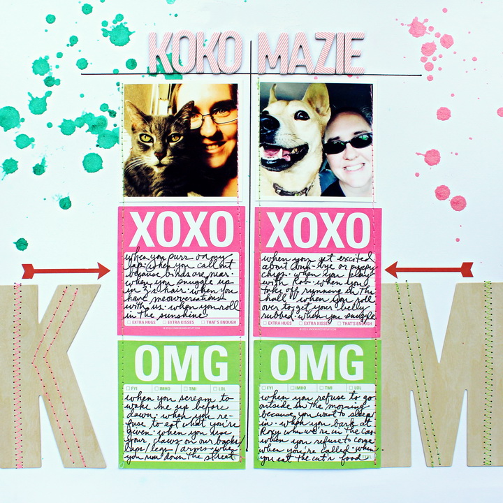
This infographic design is great for creating a comparison style layout between different personalities as Jill has done in her page Koko and Maize.
[hr]

This sketch and template were made by Amy Kingsford based on a layout by Jill Sprott for the Masterful Scrapbook Design Story Play class.

Koko and Mazie by Jill Sprott | cardstock from American Crafts; post-its from Knock Knock; monogram letters from My Mind’s Eye; chipboard letters from October Afternoon; mist from Heidi Swapp; stickers from Studio Calico ; pen from Uniball.
Jill says, “Rather than force myself to use perfectly composed paragraphs to articulate what I love and what drives me crazy about these two furbabies, I used a T-chart, which is a method that I use for generating ideas when I write.”
“Within this t-chart I used themed ‘post-it’ notes to document pros and cons, or, more specifically, what I adore (XOXO) and what irritates me (OMG) about my furry friends. It’s a good-humored approach to capturing their personalities, and it also reveals something about me, I’m sure, as a pet mother.”
download template and previews
[hr]
More inspiration…
Looking for more examples of how you might use this sketch/template to inspire your next page? Here are a few inspired pages from our Get It Scrapped Creative Team.
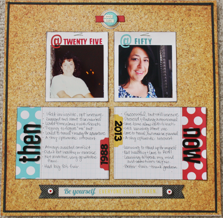
Jett Hampton says, “When I looked at this sketch I loved the clean lines of the design and the use of the T-chart to compare two subjects. I used it to capture similarities and differences about myself at two milestone ages.”
“I’d been wanting to create a LO about me through the decades, but the idea was overwhelming. Jill Sprott’s page immediately gave me a direction to focus on two time frames. Once I had the main elements down, it felt unfinished so I added the thin black strips to mimic the frame of a bulletin board and contain the entire design.”

Then and Now by Jett Hampton | Supplies: Cardstock: Paper Studio; Patterned Paper: Fancy Pants, Simple Stories; Alphas: AC Thickers, Making Memories; Stickers: Fancy Pants, Simple Stories; Staples and Heart Beads: Stash
Celeste Smith says, “I was drawn to the simplicity of this grid design and used the template to make a page about my son, Adam’s, first day of school.”
“I probably would have only scrapped one photo from his first day, but this grid design begged for a multi-photo page.”

First Day of School by Celeste Smith | Supplies: Digital Design Essentials: Show and Tell Bundle; RObyn Meierotto: In Stitches Basics; Font: Trixie Plain.
Kristy T says, “I liked the grid nature of this sketch, the splatters, the double title, the stitching and the frames and used it to make a page about my son’s 7th birthday, what we did on the day and what he is like right now.”
“I was challenged by this sketch to put more journaling on my page but I really wanted to use more photos too, so I adjusted the sketch and used a photo and journaling card instead of the large letters on the sides. I couldn’t make the double title work at the very top of the page so I changed the position of the words, making it asymmetrical. Therefore I made the journaling card and photo frame asymmetrical to keep the page balanced. Faux stitching turned out to be a quick and effective way to add detail.”

7 years, Hello Seven by Kristy T| Supplies: Card: Artee; Frames: Elle’s Studio; Journalling cards: Elle’s Studio; Chipboard: October Afternoon; Wooden word: Teresa Collins; Tidbits: October Afternoon; Alphas: American Crafts, Tim Holtz; Arrow Paperclip: Freckled Fawn; Washi Tape: MME; Pen: Artline; Flair Button: Stamp: Studio Calico; Bloom Spray: Prima; Paint: Distress Paint.

