 Using scrapbook page templates and sketches is a great way to get pages made. The Get It Scrapped membership now includes an always-growing library of 70+ sketches and layered templates. An all-access pass gets you all of them. A sketch/template doesn’t have to lock you into a design, though.
The Get It Scrapped Creative Team made pages with sketches and templates from the membership library and share them here, telling you how they shook things up to make the design their own.
1. make it yours: rotate 90 degrees

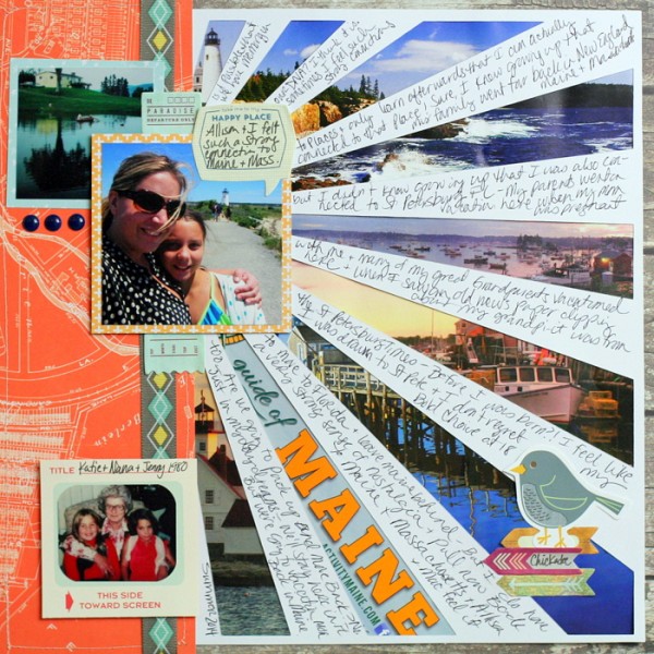
Maine by Katie Scott | Supplies: October Afternoon and Studio Calico patterned papers; Basic Grey and October Afternoon paper embellishments; My Mind’s Eye epoxy stickers; Amanda McGee “Sunburst Mat Stencil” Silhouette Cut File; foam adhesive dots; machine stitching; American Crafts pen and ballpoint pen.
Katie Scott says, “This page is about my strong sense of nostalgia for my home state.”
“I like using sketches because they are a great jumping off point, especially when I’m feeling low on creative energy. For this page I used a sketch from the Oomph and Polish class of Masterful Scrapbook Design, based on a page by Lisa Dickinson.”
“I adjusted this sketch by rotating it 90 degrees to the left. I changed the location and size of the three photos. I also changed the location of the journaling because I had a lot to say, I wrote on the bursts which gave the white burst strips a less stark effect and gave me plenty of room to write – but makes the reader work to read this more personal story.”
2. make it yours: take a standard-sized photo to oversized
Vicki Hibbins says, “Here I scrapbook how my daughter enjoyed looking at the poppies while visiting the Gressenhall Museum Farm.”
“I love using digital scrapbooking templates. A blank page can be daunting, so they make a great starting point. You can easily turn off layers you don’t want in Photoshop and resize, move. or rotate other elements. I used a template from the Scrapbook Coach Clustered Lesson. I resized all the elements at once so that I could include a large photo of my daughter.”
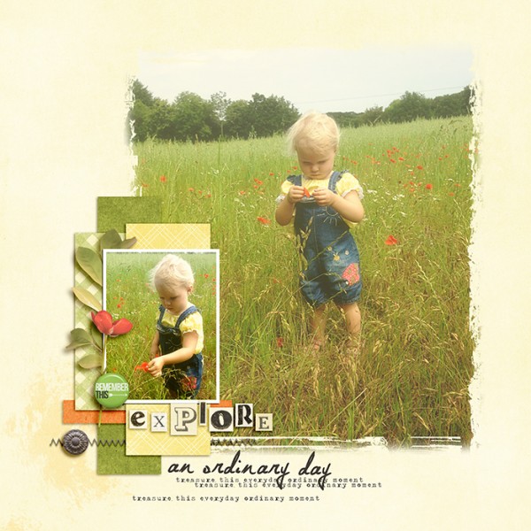
Explore by Vicki Hibbins | Supplies: GIS: Scrapbook Coach 13 Clustered layout 1; K Croninbarrow: Beautiful You; Just Jaimee: Storyteller May 2013; Laura Passage: Summer Wild Flowers; LaurieAnn: Country Wildflowers; Deena Rutter: Odl-Lay-Hee; Mommyish: One Fine Day – Explore; Sahlin Studio: Everyday Love Wordart
3. make it yours: change relative proportions

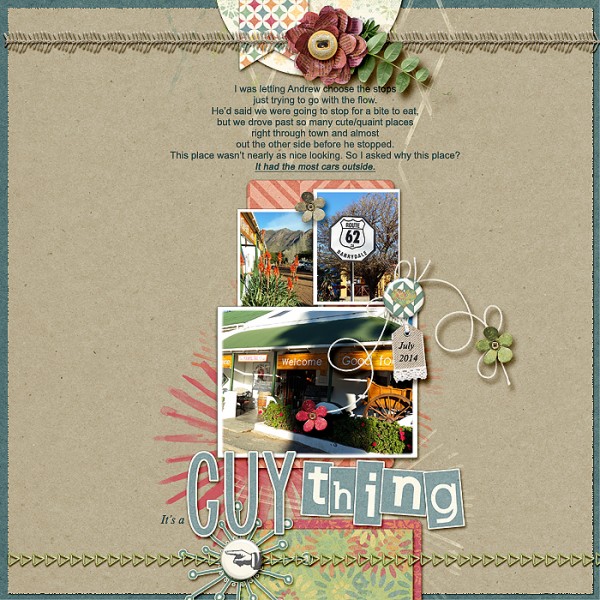
It’s a guy thing by Stefanie Semple | Supplies: Kimeric Kreations: My Favorite thing (kit); Debbie Hodge:Template In a Band 02 from Scrapbook Coach Class.
Stefanie Semple says, “I used less-than-perfect photos to tell the story of how my hubby finds great eating places while road tripping.”
“I love using templates to speed up my scrapping process. I choose a template based on the number of photos I want to include. Templates also allow me to branch out of my comfort zone and do something different than my normal design style, yet still allowing me to add those special touches that make the layouts mine.”
“For this page I used a a template from the Scrapbook Coach class Banded. I shrank the central photo cluster. My main photo had a huge shadow on it, but it was important to the story, so I added a brushwork foundation and made the title the focal point of the layout. I added stitching to indicate the confines of the road trip and some strings to add dimension but also to ramble a little, like our journey through the town.”
4. make it yours: change the foundational pieces

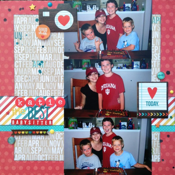
Katie the Best Babysitter by Devra Hunt | Supplies: Sketch: Masterfuls Scrapbook Design RulePlay Inspired by Katie Scott; Patterned paper chipboard, stickers and brads: Simple Stories; Alpha: American Crafts, Simple Stories; Enamel dots: My Minds Eye; Mist: Studio Calico; Ink: Colorbox; Adhesive: EK Success.
Devra Hunt says, “This page is about how my boys planned a going-away party for their babysitter as she left for college.”
“I struggle with page design. Using a sketch takes that struggle out of my hands, and gives me a place to begin, as well as speeds up my process. Once I find a sketch that works for me, choosing supplies and putting the page together comes easily.”
“I used a sketch from the Rule Play issue of Masterful Scrapbook Design based on page by Katie Scott. I extended the larger paper, turning it into a square that covers most of the background. I used a narrower horizontal strip of paper, clustered the embellishments instead of scattering them, and kept the title on one side of the photos.”
5. make it yours: add a row to blocked design

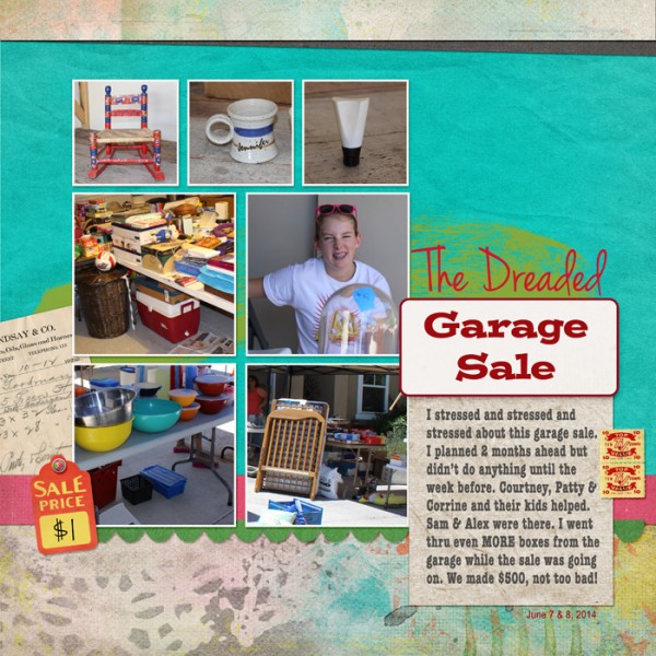
The Dreaded Garage Sale by Jennifer Kellogg | Supplies: GIS Scrapbook Coach on a Shelf: Template 04; Pink Reptile Designs: We Are Moving; Karen Funk: Brown Paper Packages Kraft Paper; Wishing Well Creations: 25 Days Kraft Paper.
Jennifer Kellogg says, “This page tells the story of how we had a huge garage sale while preparing to put our house on the sales market.”
“I would be totally lost without templates! I never use a template as-is. I always change something – add or delete some element, move the elements around, resize the photo spots, etc. Using a template with good design principles makes your pages shine. It isn’t cheating–it’s smart scrapbooking.”
“I started with template #4 in the Scrapbook Coach “On a Shelf” lesson. I added an extra row of photos at the top because I wanted to highlight a couple of items I found when I was gathering things for the garage sale. I deleted the original embellishments and added some from the kit I was using.”
6. make it yours: with a change in orientation

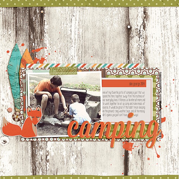
Camping by Celeste Smith | Supplies: Jenn Barrette & Stolen Moments Designs: Campfire Friends; Font: KD Call Me Maybe.
Celeste Smith says, “This page is about how family camping trips bring us together.”
“I like using sketches because they give you a great place to start and they make the process of completing a page quicker. Sometimes I even use the papers as they are shadowed which saves a step at the end. I am a firm believer that if you want to get more pages done, removing choices makes the process go much quicker. Templates remove some of the design choices and let me focus on playing with pattern.”
“I used a template from the PhotoPlay issue of Masterful Scrapbook Design, based on a page by Tami Taylor.I was drawn to this sketch because I liked the journaling card and the horizontal block. I changed the orientation of the photo. I removed the band that went all the way across the page. Then I added a bunch of layers behind my block. I also added edges to the page to frame it a bit.”
7. make it yours: split a large photo into two photos

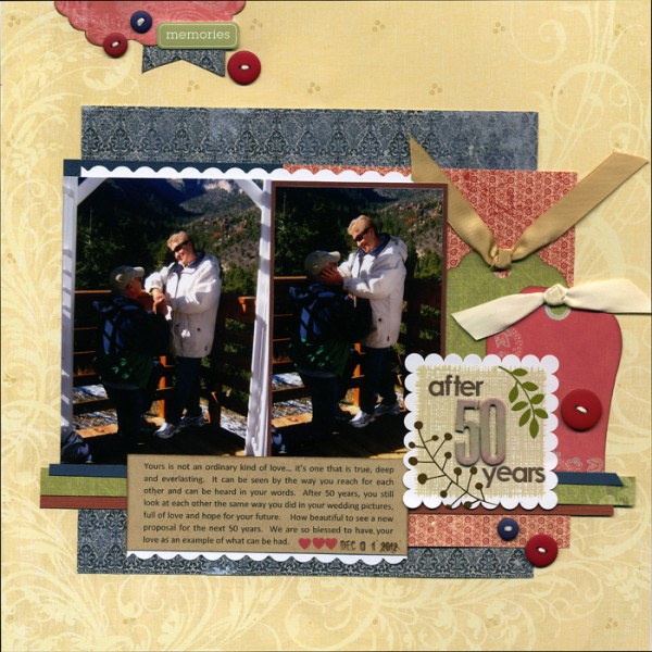
After 50 Years by Jett Hampton | Supplies: Cardstock: American Craft and Papertrey Ink; Patterned Paper: K & Company; Alphas: Heidi Swapp; Sticker: Bella Blvd; Tags: K & Company; Ink: Colorbox; Metal tag: Making Memories; Other: Ribbons and buttons
Jett Hampton says, “My parents celebrated their 50th anniversary, and this layout captures the touching proposal to renew their vows.”
“Sketches allow me to play with product and photos without getting stuck on the composition or design. I started with the Scrapbook Coach Shelf, Layout #1. My photo sizes were larger than the sketch so I grounded them with patterned paper blocks, moved the text below the photos and added tags to help balance the layout.”
8. make it yours: change the balance of visual weight

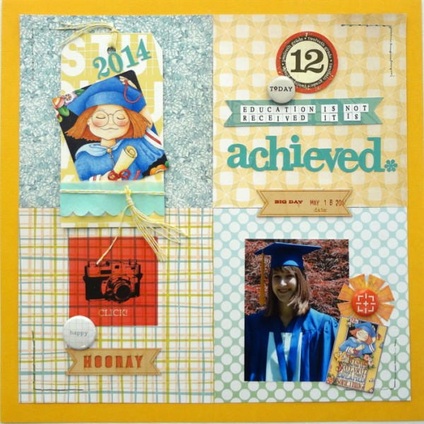
Achieved by Susanne Brauer | Supplies: Sketch: Masterful Scrapbook Design Rule Play, Inspired by Tami Taylor. Cardstock, We R Memory Keepers; Patterned papers, Studio Calico; Alphabets, Websters Pages, Adornit; Transparency, wood veneer and Flair, Studio Calico, Card & Sticker, Mary Engelbreit; Printable Die-cut.
Susanne Brauer says, “My daughter just graduated from high school, and this page celebrates that milestone.”
“I like working with sketches to try new arrangements and analyze why some work better than others. Here, I used Tami Taylor’s sketch from the Masterful Scrapbook Design Rule Play class. While she broke the rules with a grid in which all blocks held equal weight, I wanted there to be no confusion on my page. The focus is on my daughter’s photo, and the other grid blocks playing supporting roles. My daughter’s photo is darker than everything else on the page and makes that area the weightiest and most emphasized.”
9. make it yours: change a photo spot to something else

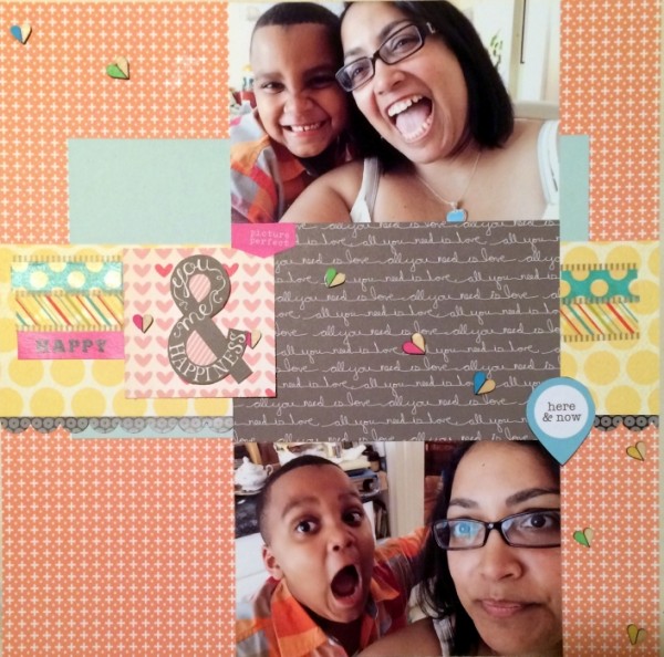
Here and Now by Rosann Santos-Elliott | Supplies: Masterful Scrapbook Design: RulePlay Sketch Inspired by Katie Scott; Echo Park: Capture Life Arrows and Capture Life Mint/Gray; October Afternoon: Girl Talk Dish; American Crafts: Dear Lizzy Day Dreamer; Studio Calico – Life, Love, Paper Stickers.
Rosann Santos-Elliott says, “These photos are from a day in the life with the silliness and quirkiness that goes on with a 6-year-old boy around the house. We both love taking photos and being in them. And we especially love selfies and funny faces.”
“I used sketch from the Rule Play issue of Masterful Scrapbook Design, based on page by Katie Scott. I changed the sketch by substituting patterned journaling card for one of the photos.”
Our membership templates library rocks
 The sketches/templates come in a few flavors. “Designer-inspired” templates are made based upon pages made by top designers for membership class materials. It gives you a chance to “scrapbook like” a variety of scrapbookers. “Scrapbook-Coach” templates accompany the popular Scrapbook Coach series in which you rework a foundation multiple times–but always with a twist. And then there are some “just-because” templates. Search by template type and number of photos then immediately download the sketches and templates when you’re a member at Get It Scrapped.


