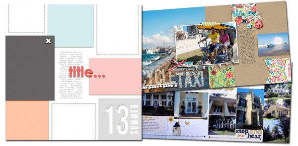
See how scrapbookers Susanne Brauer and Heather Awsumb used a one-page sketch/template from Amy Kingsford’s Scrap Your Summer 2013 Freebie Pack on their two-page layouts.
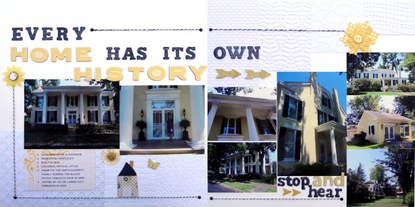
 Susanne Brauer says, “This page is about a tour my husband and I took of an historic home. We both enjoy visiting homes from the past – him for the history tied to their location and me for decor and details of life in those times. This layout will be included in my album of places we’ve visited.”
“The first thing that struck me about the sketch was the various size boxes along the edges. I was worried that my layout would be too busy, so I simplified how I interpreted the sketch. Instead of trying to use patterned papers and photos in many of those spots, I let them inspire my background.”
“In a rare departure from my use of many patterned papers, I used embossing folders to make textured boxes and arranged them along the bottom of the left page and the top of the right page.
I tied my two pages together by running the main title across and dropping down to a subtitle. I used twine and brads to partially frame the photos, helping your eye flow all the way across the 8 photos. In order to make the photos shine I used only yellow, black and white in my color scheme.”

Home by Susanne Brauer | Supplies: Bazzill and Stampin Up cardstock, Sizzix, Cuttlebug, Stampin Up & Tim Holtz embossing folders, American Crafts Thickers, Queen & Co. Twine, Hero Arts stamp, rest from stash
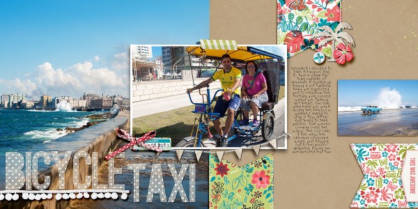
Heather Awsumb says, “This page is about an unexpected adventure on a bicycle taxi during a trip earlier this year.”
“One of my favorite tips for expanding a sketch into a double page layout is to have the second page be a mirror image of the first–and I started that way, but didn’t end up finishing with this approach.”
“I started by expanding my canvas to 24×12, duplicating all the elements and then flipping them to create the mirror image. When I did this I had one big block in the middle that I knew would be a good area for a photo. Duplicating the blocks on both sides of the page felt too busy so I removed them from the left-hand page and used one big background photo with a large title to achieve balance.

Bicycle Taxi by Heather Awsumb | Supplies: Clean Stitched Banners White No 1, Surf Lagoon Kit, Almost There Element Pack, Bunny Slope Element Pack by Katie Pertiet; This and That Kit, These Walls Kit by One Little Bird Designs; Little Miss Sunshine Add-on Alpha by Zoe Pearn; Title Builder by Anna Forest Designs; 10,080 Minutes Date Tools by Traci Reed

