 The newly-popular ‘glamping’ trend offers up a wealth scrapbooking ideas for choosing color, motif, texture, and pattern for scrapbook layouts. Glamping refers to vacationing in nature, but with amenities not typically associated with camping–glamorous camping.
The reason “glamping” style offers great inspiration for your designs is because of the juxtapositions of nature and elegance it presents. Glamping inspiration presents appealing and surprising combos of richly colored comforters inside of canvas tents, twinkle lights wrapped around trees, and campers with bohemian-styled decor.
Designing with juxtapositions like those presented by glamping, are a great way to create visual tension and, thus, grab the eye. See how our team has scrapbooked inspired by glamping and camping styles.
Audrey Tan says, “This page is about our first-time experience with glamping. We stayed in a teepee and it came with a kitchen and bed sets. Literally, everything was provided. All we did was unpack our clothes.”
“To highlight the experience, my page design is dedicated to the glamping site: the exterior as well as the interior. I used the colors of our teepee and surroundings. The background showed off the teepee we stayed in as well as our packed car. I kept embellishments to a minimum and only chose those that were relevant.”
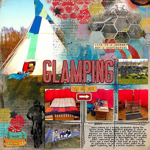
Glamping by Audrey Tan | Supplies: StudioMix47: Be Bold; StudioMix40: Life Is A Journey; Anna Aspnes: Foto Blendz Overlays No5; Traci Reed: Thickabets Vo5; Jenn Maddocks Designs: Let’s Ride; Font: Pea Marcie
Sian Fair says, “My daughter and I couldn’t wait to try out camping with added glamour when we booked a ‘glamping’ week. As soon as we arrived, we rushed round taking photos of all the stylish added extras, while the boys looked on, wondering what they had let themselves in for. Some of the brochures we looked at had tents with an ‘out of Africa’ look, but ours was styled in a more rustic, vintage-Gypsy caravan way. I took inspiration from both, with handcut flowers, like the ones you might see painted on the side of an old caravan or a canal boat, muslin, like an old mosquito net, lots of edges starting to curl in the heat of the stove, and a dash of gold, of course, because we are looking for added glamour!”
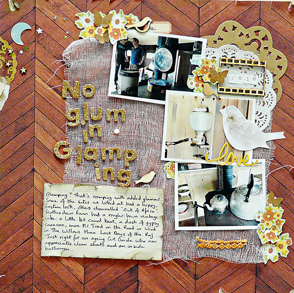
No Glum in Glamping by Sian Fair | Supplies: Patterned paper: Crate paper, Websters Pages; Alphas: American Crafts; Embellishments: Studio Calico wood veneers and kraft stickers, Sodalicious wooden frame, Little Yellow Bicycle canvas sticker,; sequins and glitter from stash
Kiki Kougioumtzi says, “This layout is about how we used to travel with my parents when I was a kid. We carried lots of stuff, including a boat, with our mini cooper. Although we went camping, we carried with us some luxuries so the mix of styles (camping and glamping) seemed appropriate to embellish this memory. I used kraft paper, sequins, lace, wood veneer and a soft earthy color palette.”
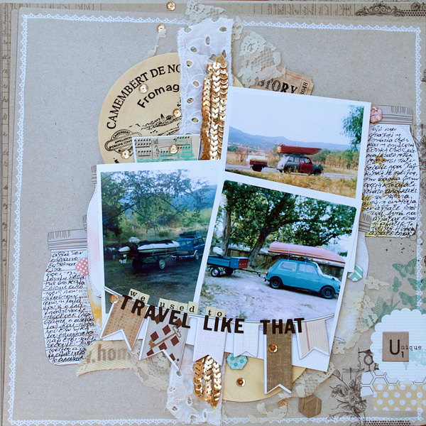
Travel like that by Kiki Kougioumtzi | Supplies:Patterned paper:My Mind’s Eye,American Crafts;Chipboard:My Mind’s Eye,Alphas:Basic Grey,Cosmo Cricket;Other:Wood veneer,lace,sequins.
Heather Awsumb says, “It’s winter right now in Lesotho, which means everything is dead, the landscapes are brown and there is dust everywhere. I was looking through my photos and reminded of how beautiful the country is in spring and summer. I decided to take a random sampling of my favorite photos to remind me of this, and I aimed for a glamping look but without using any overtly “outdoorsy/camping”elements.”
“When I think of “glamping” I think of dining with fine china, silver and crystal under a canvas tent in the dirt. After looking through the Get It Scrapped Glamping Pinterest gallery, I was inspired by an image of a tree wrapped in white twinkle lights. It was a great representation of ‘glamping,’ and it reminded me of the Magic Sparkles Corner brushes by Anna Aspnes. With that as a starting point I looked through my supplies for anything that had either a grungy or elegant look. My first find was the cardboard background paper. I then looked through my patterned paper for elegant patterns. I thought that the “Plum Seed” paper pack by Websters Pages had an “outdoorsy” color palette and an elegant pattern. I looked for anything with sparkles and then tried to counterbalance them with items that roughed it up – like the tape. The final touch was the title where I mixed a script alpha with a rough typewriter font.”
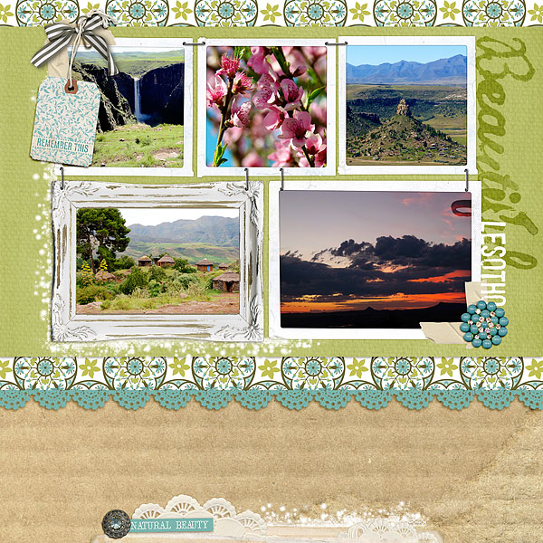
Beautiful Lesotho by Heather Awsumb | Supplies: Plum Seed Paper Pack, Citrus Squeeze Digital Jewels by Adrienne Looman for Websters Pages; Texture Volume 28 by Wishing Well Creations; Magic Sparkles Korners n Edges by Anna Aspnes; Doily Edgers No 1, Cut Ups Great Outdoors, Decorative White Frames No 1, Photo Clusters No 45, Crowning Affair Understated Kit, Messy Stamped Alpha No 6, Crowning Affair Vibrant Kit, Tagging Sentiments No 1 by Katie Pertiet; Sunshine and Lollipops by Zoe Pearn; Life is Good Kit by Fee Jardine; StamPETE font.
Terry Billman says, “My granddaughter was the flower girl in her Uncle Jason’s wedding on the beach in South Texas. Jason and his wife took a laid-back approach and mixed traditional with contemporary—from frills to flip flops. To scrapbook this in a ‘glamping’ style, I mixed a traditional frame, glitter, and lace with outdoor “natural” textures and embellishments. The glitz and lace add a glamorous appeal to the wood grain paper, burlap mat, wood sign, and nautical embellishments.
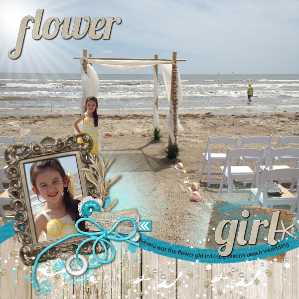
Flower Girl created by Terry Billman| Patti Knox: Text Bytes No. 39; Katie Pertiet: Fading Woods No. 2, Tidewater, From My Bookshelf No. 2, Alandia Noces; Anna Aspnes: FotoGlows No. 4, Cool Glows No. 1, Artsy Paint No. 2, Magic Sprinklez No. 2, Magic Sprinklez No. 1, Art Play Palette Seafoam, Art Play Palette Infatuated; Maplebrook Studios: Just Linens No. 23
Ronnie Crowley says, “The childhood camping I did wasn’t anything like glamping, so I went for a mix of the camping and glamping motif on this page. To give a touch of glamour to my camping photos I added doilies and metal frames with a touch of glamour. Though the pictures being framed are certainly not glamorous, the upscale frames add visual tension and draw the reader in to the story. The burlap fabric mat and pine needles add the rustic feel of ‘real’ camping. Pine needles evoke many memories for me about camping in the south of France along the coast. Wood styled paper for the background draws it all together.”
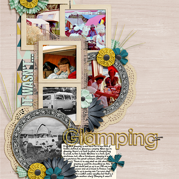
Glamping It Wasn’t by Ronnie Crowley | Supplies: Little Green Frog Designs – Lemon Meringue Pie | Audrey Neal – Campcurrie | Bella Gypsy – These Small Moments | Melita Bloomer – Build Your Wings | Mye De Leon – Better With You | Paula Kesselring – Music | Studio 68 – Sol Alpha
Traditional camping motifs offer inspiration, too
Brenda Becknell says, “My granddaughter is going through a camera shy stage right now, but I managed to snap this photo while she was playing. When I think of camping, I think of casual, natural, and a bit grungy, so that’s the effect I went for on this page. I used Kraft cardstock, red gingham paper, denim ruffle trim, burlap strip and flowers, twine bow, and wood veneer hearts. To add grunge, I distressed and inked the edges and stamped ink blotches.”
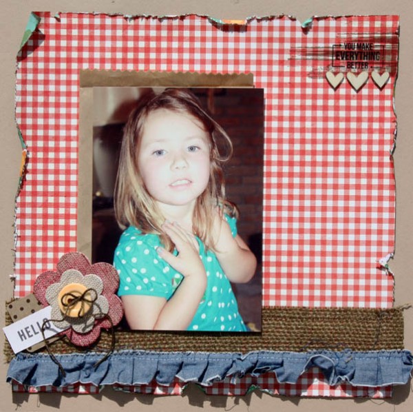
Hello by Brenda Becknell | Supplies: Cardstock: Hobby Lobby; Paper: Pebbles; Denim trim: Maya Road; Burlap flowers; Little Yellow Bicycle; Wood veneer hearts: Studio Calico; Stamps and Ink: Hero Arts
Stefanie Semple says, “These photos are from a church camping trip we took the weekend that my second son turned 13. When I think of this trip, I remember the heat, the bugs, the sand that crept in everywhere, as well as the fact that we all pretty much hated it, even though I tried to make it a home away from home, taking presents and a birthday cake and candles along.”
“I went for a rough-and-ready camping look, using a map piece as my background and adding a visual triangle of scruffy brushwork behind the photo strip. We slept in tents and there were lovely pine trees around so I included realistic pine elements – the branch and pine cone. I added a treasure map to the top left cluster as a reminder that we had to seek the good in this trip and make the best of it. I kept the layout fairly plain with just the bare basics as really that is what I feel camping is all about – making do and making the best of an uncomfortable set up. The main photo was a blurry shot of the chairs outside the tent. I changed its blending mode to soft light and typed my journaling over the image in white.”
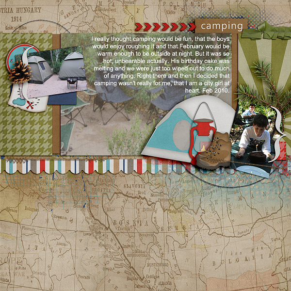
Camping by Stefanie Semple | Supplies: Memory Clips by Ramona: Happy Campers (kit); Stolen Moments Designs; Scraps by Moments – Just call me Alli (template)
Ashley Horton used camp-styled elements on this page about a day trip to the beach. She says, “I included wood-grain and map-print papers, a compass flair, arrows, a geo icon, and stickers. I brushed acrylic paint over the background for a messy, white-washed look.”
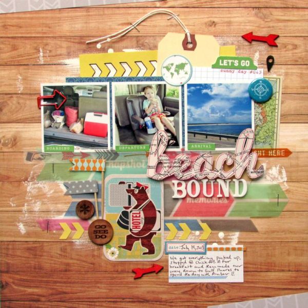
Beach Bound by Ashley Horton | Supplies: Patterned Paper, Vellum & Tags: Elle’s Studo; Patterned Paper, Stickers, Washi Tape & Tid Bits: October Afternoon; Spray Mist & Wood Veneers: Studio Calico; Flair Button: The Paper Bakery: Paper Clip Arrow: Two Peas in a Bucket; Acrylic Paint: Apple Barrel; Font: Pacifico
Amy Kingsford says, “This page is about recognizing and appreciating my husband’s tent-building skills, something I’ve always been thankful for on our outings. I’ve used a variety of camp-themed products and combined them with bright colors, lots of texture and plenty of distressing for a rugged look, that is still upbeat and cheerful.”
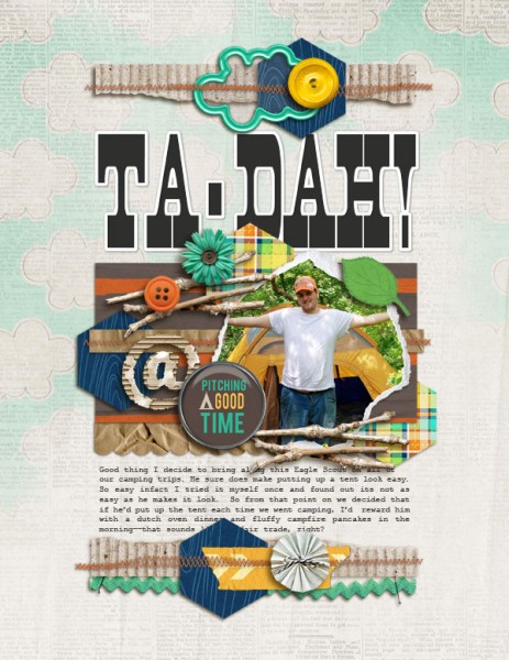
Ta-Dah by Amy Kingsford | Supplies: Creashens: S’mores Please Papers and Elements and Corrugated Alpha; Scotty Girl Designs: Camp S’more Elements; Audrey Neal: Woodpile Papers and Camper’s Flair; Crystal Livesay: Lots to Say Templates; Fonts: Aldine and Courier New
[current]

