Part 3 | Identify and recreate basic shapes and lines.
Studying the basic shapes and lines that are present in a creative display is perhaps the easiest and most straight-forward approach to capturing the display’s essence on your scrapbook pages. Look specifically for shapes that you are personally accustomed to using on your pages. You might be surprised at how easily boxes become photos and shelves transform into borders or trim.
What distinct shapes are present that contribute to the display’s design power?
The shapes that are found in a creative display are easier for our eyes to identify and translate—as well as being largely responsible for the visual interest that exists within the display. Using similar shapes in your own design is sure to help you capture the same fun sense of variety that is found in so many creative displays.

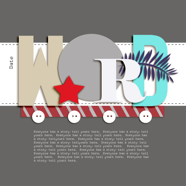
Scrapbook Page Sketch by Amy Kingsford inspired by wooden letters spelling NOEL and arranged on a mantel. See inspiration.
What role do lines play in establishing a sense of flow within the display?
For some displays, lines play a huge role in how the objects within a display are arranged. Translating those same lines to your scrapbook page can be a great design starting point.

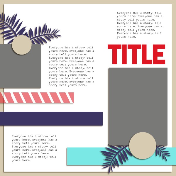
Scrapbook Page Sketch by Amy Kingsford inspired by an arrangement of furniture and greens. See inspiration.
Download sketches and templates here.
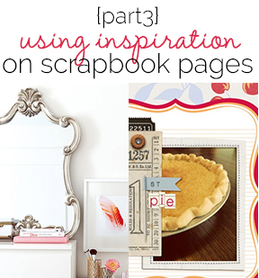
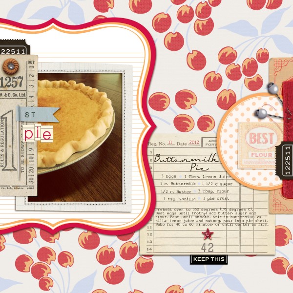
I find studying shapes and lines to be the simplest and most obvious approach to breaking down creative displays to use as inspiration on my own pages. “First Pie” is an example of how I’ve used the basic shapes within a creative display to piece together my scrapbook page design. I started by incorporating the bracketed shape of the mirror in this vignette by using a die cut paper and then introduced the rectangular shape of the picture frame and also the rounded shape of the lamp. I used similar placement of these shapes as well. See inspiration piece: Source

First Pie by Amy Kingsford | Supplies: Jenni Bowlin Studio Digitals: Farmer’s Wife Collection, Vintage Bling, Classic Label Papers, Chalkboard Alphas; Robyn Meierotto: Cut It Out Frames; Sahlin Studio: Ephemera, Fabric.
I hope you’ll try the approaches in this series on your own pages. Get started right now with these inspiration pieces.
[akingsford]

