
 by
by Part 2 | Study how the objects in the display relate to one another.
Looking at the individual elements in a display and considering how they work together with regard to placement, alignment and proportion is another great approach to translating creative displays into striking scrapbook page designs. Take time to consider the following:
Where have the key elements in the design been placed?
Take a look at this wall display of pictures: two squares topped by small antlers and a small mirror to the side. Its eye-catching quality stems mostly from the arrangement of the items in the display and the resulting white space. Try using like placement for the elements in your scrapbook page design to create a similar impact.
How are things spaced and aligned within the display?
The spacing and alignment of objects with in a creative display like this one–in which differently sized thermoses are arranged on a shelf suspended from the ceiling in front of a window–can also be crucial to its design power. Pay close attention to these smaller details, as they can help you to establish both rhythm and flow in your scrapbook page designs.

Scrapbook Page Sketch by Amy Kingsford
What role does the size of the objects play within the display?
The proportion of the objects to one another within a creative display can contribute to the display’s visual interest and also help to establish emphasis in a grouping of elements. Translating similar proportions to your scrapbook pages can be a great way to establish focal points and create interesting layers.

Scrapbook Page Sketch by Amy Kingsford inspired by arrangement of stacked books, glass jars, and a wall-mounted picture. See: Source
Download sketches and templates here.
You can aim to replicate several of the design principles practiced in creative displays on your pages or you can focus in on the one that really jumps out at you. In either case, studying how the pieces of a creative display relate to one another can be helpful in understanding how its design might be put to work in your own pages.
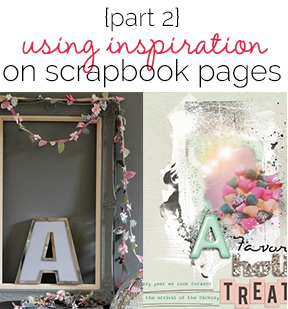
On “Holiday Treat” I’ve used similar placement and shapes to recreate the overall feel of a simple display(of an open frame strung with garlands and an oversize A sitting within the frame) including the circular element that runs off the right bottom edge of the page, the oversized centered photo and probably the most recognizable—the letter A that sits inside the frame of my photo. See inspiration: Source

A Favorite Holiday Treat by Amy Kingsford | Supplies: Anna Aspnes: ArtPlay Palette Mint Blizzard, Mint Plastic Alpha, Warm Glows No. 3, Scriptease FotoBlendz No. 3, ArtPlay Palette Retro Holiday; Sahlin Studio: Typset Alpha No. 2; Vinne Pearce: Dash & Dot Collection; Valorie Wibbens & Paislee Press: Head in the Clouds.
[akingsford]
[current]
