I truly LOVE using inspiration to spark ideas for my scrapbook pages and guide my design choices throughout my creative process. In Translate Creative Displays and Vignettes to Your Scrapbook Layout Design I talked about one of my favorite types of inspiration to turn to–creative displays. I suppose what I love so much about using this type of inspiration is that creative displays use many of the same design elements and principles that we aim to achieve in our scrapbook pages but on a smaller scale, which makes them easier to spot and in turn implement in like ways in our own designs.
In Translate Creative Displays and Vignettes to Your Scrapbook Layout Design I mentioned the three different ways I go about translating the inspiration from creative displays to my personal scrapbook pages as:
- Look for the underlying foundation of the display.
- Study the relationship shared between the objects in the display
- Identify and re-create basic lines and shapes present within the display.
And in a series of articles I’d like to focus more on each of these approaches, in an effort to help you develop a few tricks for breaking down and using this type of inspiration in your own scrapbook pages.
Part 1 | Look for the underlying foundation.
The first thing I do when attempting to break down and use this type of inspiration in my scrapbook page designs is to simply take a few minutes and study a single creative display or vignette that captures my eye. I try to identify its foundation—those core constructs of the design that give it a solid base and ultimately shape the display as a whole.
Below I’ve shared a few examples of inspiration, I’ve talked a bit about their foundations and then I’ve provided you with sketches and finished pages that can result from these examples.
Is the display arranged inside of compartments like that of a grid?
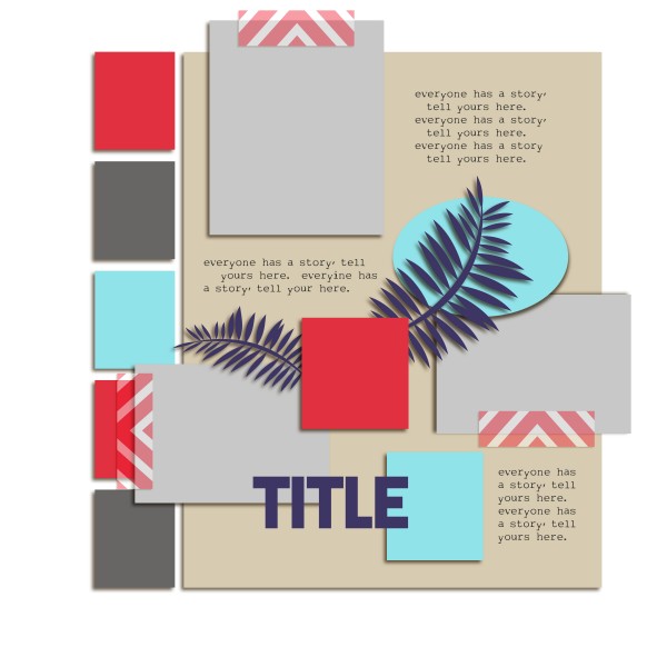
This creative wall vignette is displayed inside of a collection of boxes that are arranged in a clean but non-linear pattern (see inspiration piece). This looks a lot like a design foundation that I often use in my scrapbook pages that I like to call a “free style grid.” Its still got that “modular” feel to it but its lack of balance and its use of different shapes within that modular gives it a much more informal feel.
Does the display sit on a mantel or shelf that showcases its contents?
The base of another colorful arrangement is the dresser upon which it sits. (See inspiration). When used in a scrapbook page design a strong visual line or barrier that is used to ground your elements can help you to command focus and give you the perfect spot to highlight the key elements of your page. We call this foundation “the shelf.”
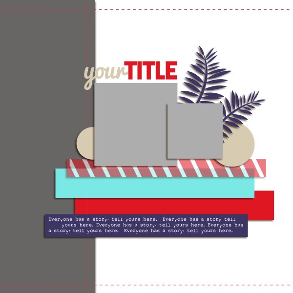
Scrapbook Page Sketch by Amy Kingsford inspired by arrangement on a dresser — with a doorway to the left (the strong vertical line).
Is the display grouped together in a single cluster or made up of multiple groupings?
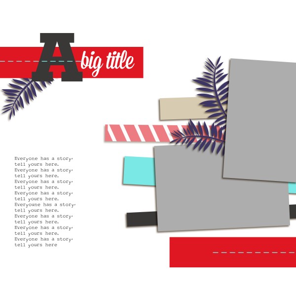
The simple yet impactful foundation of this creative display is made up of three distinct groupings of objects (1) a wooden stool with pillows backed by a ladder, 2) an E on the wall, and 3) a lamp on a stool and other ornaments). See inspiration piece. It can easily be translated into a scrapbook page design whose multiple clusters create a powerful visual triangle. A multi-clustered foundation is a great choice when you want there to be emphasis on more than one part of your page and it can easily be used to direct the flow of your designs.
Download sketches and templates here
There are many other familiar foundations that you might see within the creative displays you study that you can turn around and use as inspiration for building your scrapbook pages. They may be difficult to see at first, but they’re there! Remember, identifying the core of any creative display is a big step towards unlocking its design power in your own page.
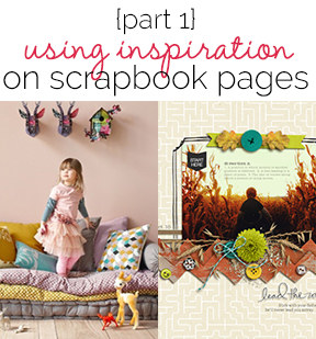
I’d like to leave you with one final example of how I’ve used this approach in one of my own pages. The inspiration piece is of a girl standing on a casual sofa, with a few toys surrounding and playful animal busts hanging above. See inspiration piece. The horizontal layers of the couch jumped out at me. They created a strong visual barrier for the image’s focal point to rest on. This immediately reminded me of one of my favorite compositions—the shelf. And from there it became much more simple for me to see this creative display’s parts in a way that could be communicated in the composition of my scrapbook page.
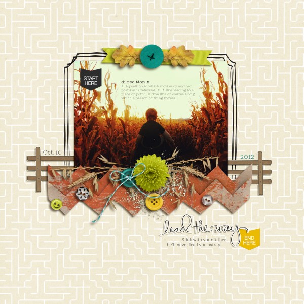
Lead the Way by Amy Kingsford | Supplies: CornMaze Collab by One Little Bird, Emilly Merritt and Paislee Press; Petals No. 3 by Sara Gleason.
[akingsford]

 by
by 