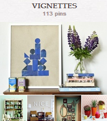
Creative merchandisers and home stagers often use the art of creative display to attract attention and create visual impact in an effort to drive sales.
Home decorators use creative displays to draw focus and create the appearance of a well-put-together home.
Scrapbookers can take cues from these kinds of displays to inspire page design–and I frequently do.
In fact, I’m such a fan of translating creative displays to scrapbook page layout that I’ve included a detailed lesson with sketches and layered templates on how to do this in the Layout issue of Masterful Scrapbook Design just out.
My process entails:
- understanding the underlying foundation of the display,
- studying how objects relate to each other within the display, and
- recreating lines and shapes from the display.
Here’s one of my recent vignette-inspired pages. Every year we can’t wait for the Hickory Farms kiosk to pop up in our mall so we can start stocking up on our favorite holiday treat. To capture this memory I used a vignette from the decor8 blog as a starting spot for my design.
I replicated many of the same shapes and their placement in my own design. See the inspiration piece here. My two favorite details that I’ve lifted are the letter A that I’ve layered over my photo like the one in the image and the stitched journaling lines that are meant to be a loose translation of the shorter stack of magazines.

A Favorite Holiday Treat by Amy Kingsford | Supplies: Anna Aspnes: ArtPlay Palette Mint Blizzard, Mint Plastic Alpha, Warm Glows No. 3, Scriptease FotoBlendz No. 3, ArtPlay Palette Retro Holiday; Sahlin Studio: Typset Alpha No. 2; Vinne Pearce: Dash & Dot Collection; Valorie Wibbens & Paislee Press: Head in the Clouds.
Find a collection of vignettes on the Get It Scrapped Vignette Pinterest Board and see how our creative team has used vignettes to inspire their own pages.
Jennifer Matott says, “This page was entirely inspired by my photo and the vignette arrangement in this inspiration piece. The photo is of me with my girlfriends during a sunset in which the light was on the side of a barn where it created vibrant shadows.”
“I liked the grouping of 3 rectangles in the vignette. I also loved the feathers but wanted them to hang down instead of being tucked in. The little photo booth photos were perfect as snippets of imagery, so I printed my photo small and added a few little shapes of papers to create an interesting arrangement.”
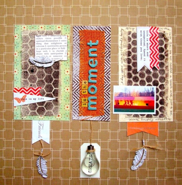
In the Moment by Jennifer Matott | Supplies: All papers, embellishments, and letters are from the November Scrapbooking From The Inside Out kit; Twine: Pink Paislee; white tag,Canvas; Stencils: Crafter’s Workshop
Inspired by a “plate wall” from mmmcrafts, Michelle Houghton made this page about a fun outdoor game that my sister in-law taught her family. In the inspiration image, an assortment of plates are arranged in a curve that goes around the lamp on a side table just in front of the wall. Michelle says, “We spent a lot of time playing it on a family vacation. I turned the vignette horizontally and cut my photos to become the circular plates.”

Kube Champions Unite by Michelle Houghton | Supplies: cardstock – Bazzill Basics and Bazzill Basics Two Scoops, droplets – Kaiser, letters – October Afternoon, ink – Sharpie
Audrey Tan replicated the “plate wall” look with buttons and misting “negative-space” circles. Audrey says, “I misted with a circular mask and to make a backdrop for my buttons.”

Live Love Laugh by Audrey Tan | Supplies: Anna Aspnes: ArtPlay Palette Bask, Children Quote No3, Antiquated Frames No2, ArtPlay Palette Crazy Life, ArtPlay Palette Metro Graffiti, ArtPlay Palette Concerto, ArtPlay Palette Family, ArtPlay Palette Mist, ArtPlay Palette Heraldry, ArtPlay Palette Find My Way No2 ArtPlay Palette Authentic, ArtPlay Palette Blossom, ArtPlay Palette Christmas No1, ArtPlay Palette Blooming Marvelous, ArtPlay Palette Bicycle Splendid Fiins: Knockout Circle Explosion Katie Pertiet: Cut Ups Everyday No2; Julianna Kniepp Designs: Craft Time (For Boys), Project 365 2012; Font: Pea Candice
Meghann Andrew says, “This layout records an exciting time right now for our little family, as we’re expecting our first child. I was drawn to a vignette of two fancy oval mirrors and black-framed photos because of the teal background wall and the mix of simple and ornate frames. I recreated it loosely on my layout by using two ornate frames and three very simple ones against a teal background.”
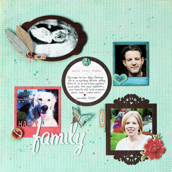
Happy Family by Meghann Andrew | Supplies- Patterned paper- Basic Grey (teal), My Mind’s Eye (red), October Afternoon (woodgrain), Crate Paper (butterfly); chipboard die-cuts- Crate Paper; wood veneer frame- Crate Paper; punch- Stampin’ Up!; fabric feathers & button- American Crafts; pearls- Doodlebug Designs; die-cut shapes- Lori Whitlock (ornate frame), Meghann Andrew (‘happy polaroid’ & circle); wood veneer letter- Studio Calico; journaling tag- Elle’s Studio; other- Stickles; die-cutting machine- Silhouette Cameo; chipboard letters- American Crafts; spray mist- Studio Calico
Marie-Pierre Capistran says “This is the story of one of our favorite places to visit when we go on holiday in Orlando: a petting farm. The design was inspired by this mantle arrangement from BHG.com that featured a white framed photo and several small pitchers and vases. Everything is white and yellow. I framed a photo and arranged the embellishments on a straight line on either sides of the framed picture. I also tried to stick to the scheme colour (I adapted it to my photo) and to the shapes of the objects in the vignette.”
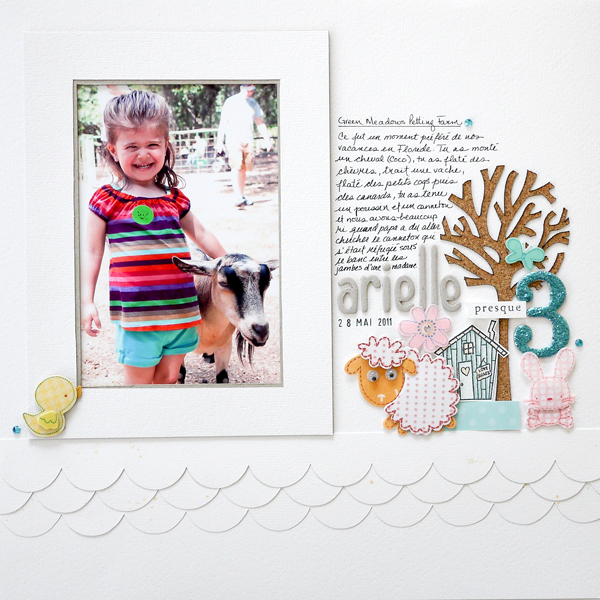
Green Meadows Petting Farm by Marie-Pierre Capistran | Supplies: Cardstock: Bazzill; Patterned paper: 3 bugs in a rug; Stickers: Sandylion, Magenta; Chipboard pieces: SU!, Maya Road; Stamps: A Muse, Martha Stewart; Ink: SU!; Rhinestones: Queen&Co.; Stickles: Ranger.
Deborah Wagner says, “This is a photo from several years ago of my son climbing a tree in our backyard. I was inspired by a dramatic arrangement of feathers in tall vases, a globe, and a framed image. I especially liked the tall vases filled with feathers. During my scrapping process, I lost the globe shape, and added another tree. The idea of adding the banners came while trying to draw the eye from the trees to the photo. Although I strayed from my original inspiration, it was a great start, and it certainly got my creative juices flowing.” (Special technique: I duplicated the background paper 2 times and blended all three layers together to get 3 trees instead of just one.)

Life is Grand by Deborah Wagner. Supplies – Designer Digitals: Katie Pertiet – Branched Paperpack, Far Away Fairyland Kit, Vintage Paperie No.3, Banner Twine Templates No.1, Watery Pencil Fairies No.1, Dictionary Blendables Everyday No. 1, All Done Up Frames No.4, Star Glows No.1; Ali Edwards – Life Is Crayon Brushes
Sue Althouse says, “This page records photos of my husband and me dressed up for several special occasions. A wall arrangement provided the inspiration for the layout. I kept the basic design of simple frames grouped tightly together, filling each frame with some combination of photo, paper, title, journaling or embellishment. Just like the inspiration piece, my background is stark white and nothing escapes the confines of each frame. This more formal presentation lends itself well to the theme of dressing up for a special event.”
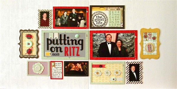
Puttin On the Ritz by Sue Althouse | Supplies: Cardstock: Bazzill; Patterned Paper, Brads, Buttons, Chipboard Frames & Shapes, Small Letters: Fancy Pants; Alphabet: American Crafts; Floss: We Are Memory Keepers
Barb Brookbank says, “This layout is about my close relationship with my granddaughter and one way I express my love – by braiding her hair, which I’ve done since she was a toddler. Using the image of a home entryway that included a large mirror over a long table with boots beneath as a starting point, I began with a circular photo, placed on a doily to repeat the shape of the mirror. The ribbons and journaling echo the shape of the table. I clustered leaves and a flower on the left. The papers, ribbons, pumpkins and elements represent the mat and the objects on the floor. I tried to place an element where the hanging ‘burst’ was but found it made the page too cluttered and was too distracting.”

Harvesting Memories by Barb Brookbank | Supplies: Kit: Autumn Day by Kristin Cronin-Barrow; Font: Scrap Casual
[akingsford]
[getinspired]

