Space is the ground or field of a composition. It’s inactive until it’s broken into by form. Once form breaks into space, the proportions of negative and positive space are altered.
When you’re scrapbooking several photos and substantial journaling, those proportions will probably be heavy on positive space. You’ll be using much of the “real estate” on the page for your photos and writing and have less white space–and that white space may be primarily in the form of margins and gutters. This is the kind of white space designers think of as passive, as less “jazzy” than generous and interestingly shaped white space.
When you’re working with fewer photos, though, you have the leeway to include that “generous white space” and it can be a great match for the mood and focus you want to create.
We write about white space frequently here at Get It Scrapped, and Creating White Space with 5 Page Foundations is a good introduction to the topic.
1. Use generous white space to create focus.
Leah Farquharson says, “I love, love white space. In fact, I would say that I use it in pretty much every layout that I make. I feel that by strategically grouping elements of your page together, you can best draw attention to the most important things on the page.” She’s placed all of her elements at top left and radiating out onto the page. The white space, itself, balances her elements. The branch bleeding off page edge and suggesting a supporting tree also helps “hold everything up.”

Autumn Envy by Leah Farquharson | Supplies: patterned paper, wood veneers, canvas leaves: Studio Calico. Cardstock: Bazzill. Journal spot, buttons, ink: October Afternoon. Twine: The Twinery. Foam letters: American Crafts.
Amanda Jones says, “I include generous white space on the majority of my pages–In fact, I’m not sure I know how to create a layout without it!”
“White space is a great tool for drawing attention to the focal point of your page and guiding the viewer’s eye through it.” Amanda clustered her photos and title in a cluster near page center, then added small clusters at top left and bottom right to create a downward diagonal flow that guides the viewer’s eye through all of the important pieces of the page. ”
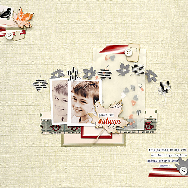
Ready For Autumn by Amanda Jones | Supplies: Patterned paper, Silhouette cutting files, buttons – Jenni Bowlin Studio; Other – washi tape, vintage tags, glassine envelope, vintage typewriter.
2. Use generous white space to give the eye a resting place.
Meghann Andrew says, “I frequently incorporate generous white space into my pages, as my style is quite clean. I like how it gives the eye a place to rest so that the things you want your layout to focus on can really stand out. Here, I clustered all of my elements at the bottom left corner of the layout and only used one 4″ x 4″ photo to give myself as much white space as possible. Splatters of mist maintain the white space while adding interest.”
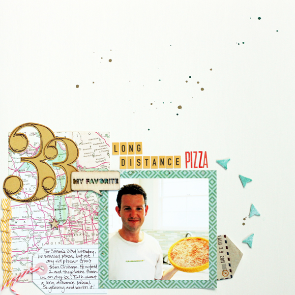
Long Distance Pizza by Meghann Andrew | Supplies (from Studio Calico’s Central High kit): Cardstock- American Crafts; patterned paper- Basic Grey (green diamond), Tim & Beck (map), Studio Calico (numbers); tag- Crate Paper; baker’s twine- My Mind’s Eye; wood veneer- Studio Calico; stickers- October Afternoon (yellow letters), American Crafts (red letters); ribbon- Studio Calico + American Crafts; envelope- Basic Grey; mistable arrows- Studio Calico; spray mists- Studio Calico
Vicki Walters gave a favorite photo with a fitting quote lots of white space,keeping things simple and clean.
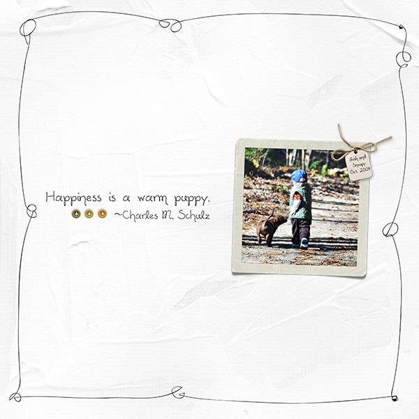
Happiness by Vicki Walters | Supplies: Font: Alisa; Anna Aspnes: 12×12 Artist Edges Overlays No 5 and PotPourri Paperie No 5; Digital Design Essentials: Autumn Kiss.
3. Use generous white space because it fits your subject
Chris Asbury liked the idea of incorporating lots of white space on a snow page. She says, “A few years ago, my husband and I celebrated our anniversary with a weekend in Yosemite, where we were treated to the first beautiful snowfall of the season. I wanted to enhance the magical quality, so I added digital glows in overlay light mode.”
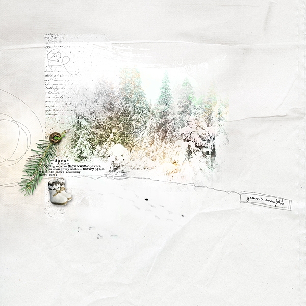
Footprints by Chris Asbury | Supplies: Digital: Anna Aspnes Designs: ArtPlay Palette SnowFun (paper, boots, word transfer, button, scribble overlay), ArtPlay Palette Viaggio (clipping mask), ArtPlay Palette SweetPea (transfer), 12×12 ScriptTease Winter (overlay), WarmGlows No. 2, Boxed ArtStrokes No. 1, MiniPaletteMintWinter (transfer).
Kiki Kougioumtzi designed “In Your Dreams” with a lot of white space to “echo the silence in our house when my daughter sleeps and to focus on the photo.” A smaller cluster with a cloud and hot air balloon at top left balances the larger grouping below and supports the dreamy theme of the page.
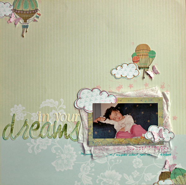
In Your Dreams by Kiki Kougioumtzi | Supplies:Pattern paper:K & Company,American Crafts,Basic Grey;Alphas:Basic Grey; Stamps:Fiskars, American Crafts,My Mind’s Eye,Magnolia,Tattered Angels; Other:Jenni Bowlin Printable butterflies and Paper punch, Memento ink,tissue paper.
Adryane Driscoll used lots of white space on “Miss Molly” to emphasize the innocence and simplicity of childhood. She says, “Most of my pages have generous white space. I like the idea of focusing my work on just part of the page. It’s my way of telling a story in as few words as possible. While there are times when journaling should take center stage, there are also times when there aren’t words that go with a photo, or the words I have don’t adequately express the emotion I want to convey.”

Miss Molly by Adryane Driscoll | Supplies: Anna Aspnes I Artsy Layered Template No.68, ArtPlay Gather Solids Paperie, Stitched Loops White No.1, Bunches of Daisies No.1, Antiquated Frames No.2, and Acrylic Alpha & Number Set No.1, and MagicSparklez No.6
4. Use generous white space to add interest and tension to your design.
Barb Brookbank scrapbooked a “sad little scene” of her grandson who’d had enough of a photo shoot –he was hot, and tired–with dark grey colors and clouds. She says, “There were other shots of him (umm crying) but this one was a real heartbreaker! I purposely put him facing out of the page since it would seem he didn’t want to face anyone!”
The placement of this outward facing photo to the far left is unexpected and adds tension to the page, with the smaller cluster and diagonal stripes at the far right pull the viewer back in.

Reality Check by Barb Brookbank | Supplies: Kit: Head in the Clouds – Paislee Press and Valorie Wibbens; Font: Pea Celestial Creations; Photo: Tere
[current]

