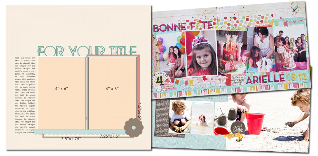
See how scrapbookers Marie-Pierre Capistran and Tara McKernin used a one-page sketch/template from our Bundle #56 on their two-page layouts. Both Marie and Tara continued the “series” of photos in the original sketch over onto the second page, but each achieved quite different results.
Continue the “pattern”
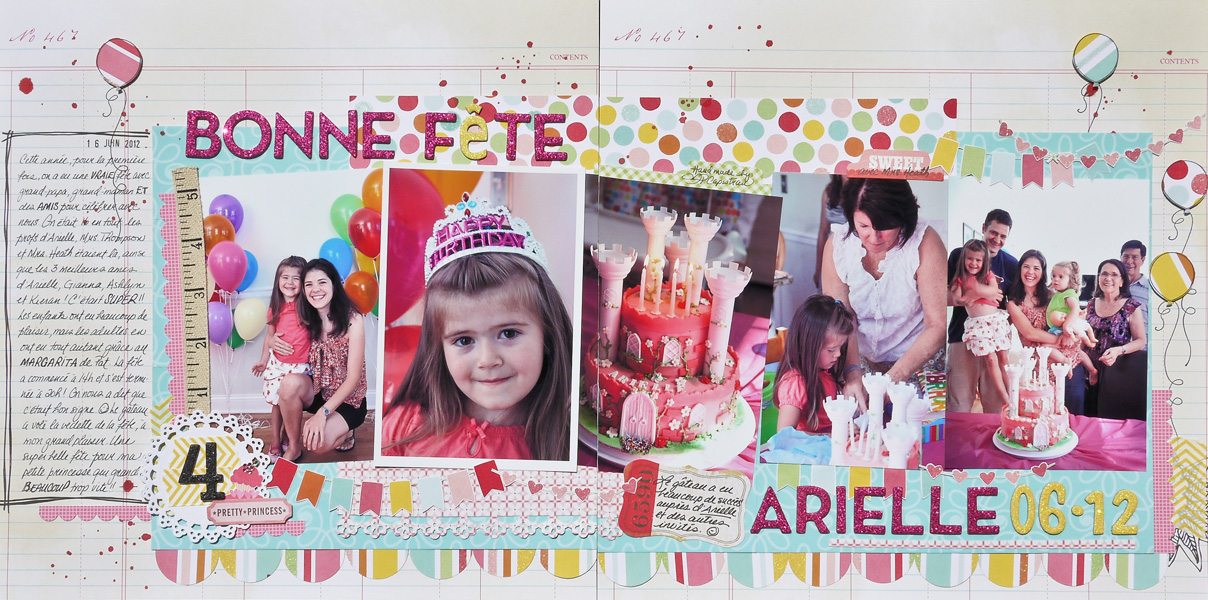
Marie-Pierre Capistran took the two portrait-oriented photos on the sketch as her cue to continue a pattern or series of similarly-sized and shaped photos across the two pages.
Marie says, “When I saw the sketch, it was obvious to me that the second page would be a row of vertical photos. The orange frame around the photo on the right would go around the last photo of the right page. I chose a long title, and divided it in two–with it beginning on the left and continuing over to the right, connecting teh two pages. I repeated many elements across the two pages, including banners, scallops, borders and balloons.”

Bonne Fete Arielle (Happy Birthday Arielle) by Marie-Pierre Capistran | Supplies:
paper: Amy Tangerine, Pebbles, We are Memory Keepers; Thickers: AC Macaw and Niki Riki; Washi tape: Bella blvd.; Stamps: SU! and date stamp from office supplies store; Punches: SU! scalloped border punch, SU! circle punch and Martha Stewart; Stickers: Crate Paper; Doilie: Martha Stewart; Mist Spray: Tim Holz Adirondack red pepper; ribbon and rhinestones from unknown sources.
Fill one side with a photo enlargement.
Tara McKernin filled the second page of her spread with one photo enlargement. She modified the original sketch so that it would extend across to the 2nd page just a bit. She did this by adding a third photo — continuing the series that was already started in the sketch.
[lovesketches]


