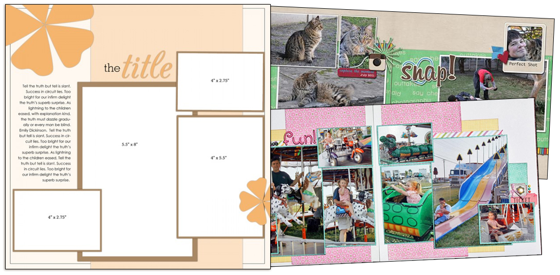
See how Brenda Becknell and Stefanie Semple used a one-page sketch/template from our Bundle #48 on their two-page layouts.
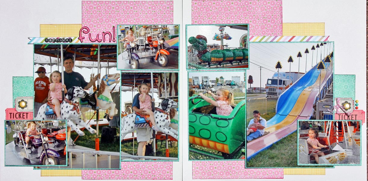
Use a mirror image of the sketch on the second page. Brenda Becknell says, “I used the sketch ‘as is’ for the left side of my two-page spread. For the right side, I used a mirror image of the sketch. I flipped one of the photos (the one of my granddaughter in the green coaster car) before printing so she would be facing into the center of the page.) I used a very fine-tipped Copic marker to outline portions of the patterned papers.”

Carnival Fun by Brenda Becknell | Supplies: PP: Jillibean Soup, Bella Blvd; Cardstock: Bazzill and Hobby Lobby; Memento ink; Tickets: Jenni Bowlin and from stash; Alpha stickers: Doodlebug; Alpha diecuts: Cricut “All Mixed Up” cartridge; Doodlebug twine; Brads: Making Memories and Recollections
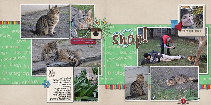
Stefanie Semple says, “For the left side, I rotated the template 90 degrees counter-clockwise to accommodate a landscape-oriented photo as the focal point. Fro the right side of the spread, I took the rotated version and flipped it vertically. The result is a composition as a whole with asymmetrical balance.” “I aligned the bands of paper running behind the groupings straight across both sides. I incorated three bits of red to create a visual triangle that spans the two sides: a heart, a wordart strip and a button. The titlework bridges the gap between the two photo clusters.”
[lovesketches]


