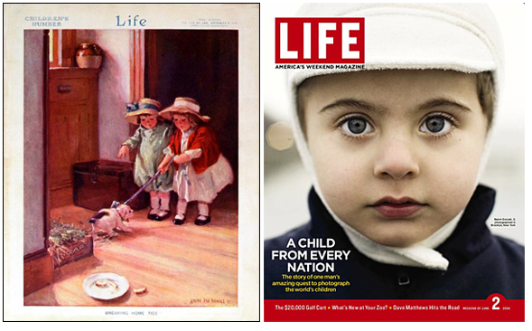
A 1911 cover from Life Magazine uses conventional margins to frame the cover art. In the 1930s Life Magazine moved to using photographs bleeding off three edges of the page.
by Debbie Hodge
A scrapbook page combines photos, text, and embellishments within the space of the page canvas.
Margins and mats can be used to “frame” your composition and add emphasis. Frames are familiar. We’re accustomed to frames on artwork, windows, and even computer screens. You can use framing and matting to orient the viewer’s perspective of your scrapbook page.
Or you can do the unexpected and break out of the frame.
When you run an image off the page edge, the viewer perceives that there is more to it, and the image seems bigger. The image becomes a more active part of your design.
Take enlarged photos to the edge
This photo of the Lauterbrünnen Valley in the Swiss Alps is one of Emily Pitts‘ favorites from a family vacation and she gave it full impact by filling the right side of her two-page spread with it.
Emily worked also with the content of her photo to guide the eye. Notice how the sweep of the mountains from top right is continued over onto the left side where it meets journaling and titlework and then sweeps back up with the fussy-cut flowers.

Magical by Emily Pitts | Supplies: Cardstock: Bazzill; Patterned Papers: My Mind’s Eye; Flowers: Sassafras; Alphabet: American Crafts; Embroidery Floss: DMC; Pen: Zig by Kuratake; Adhesive: Scotch Quick Dry Liquid Adhesive
Katrina Kennedy often bleeds enlarged photos off thee sides of the canvas when she scrapbooks. This already engaging photo of her son is made even more so by its size and the absence of constraining margins on three sides.
When your photos are such dominating pieces of a page, look to the content to guide the placement of other elements. Just as Emily used the sweep of the mountains to guide her embellishment placement in the layout above, Katrina’s journaling placement is guided by her photo: her journaling is left-aligned with the bright window in the photo above it.
While we’re talking about bleeding elements off edges: take a look at Katrina’s title. “Memories” bleeds off the photo edge. Part of it is missing, but the viewer’s mind fills in the missing parts.
Take blended photos to the edge
Anna Aspnes often makes her page base by blending and layering papers, digital elements and photos. Oversized photos that bleed off page edges add context as well as interest. The photos of her daughter at top left and bottom right of “Spring Crafts” show her engaged in sewing and are the perfect complement to the full photo of the completed project. Notice also how the cropping and placement of these photos guides the eye down into the and through the page.

Supplies: ArtPlay Palette Easter Bunny, SprayPaint No. 2, AnnaBlendz Artsy No. 2, FotoGlow Flowers No. 1, ThinStrips Masks No. 2
If you want to learn about blending photos, Jana Morton is the go-to teacher for this topic. On this layout she has scrapbooked the contradictions in how she lives her life with a blended photo of herself. The crop of the photo is especially dramatic showing only a little more than half of her face. Our mind fills in the rest, and her theme is well supported.
Take embellishments to the edge
Any time a known shape bleeds off the edge, the viewer’s mind fills in the rest of the shape. The result of requiring this of the viewer is that they are more actively engaged. The page also is perceived to take up space off the canvas. Your page gains energy from the technique. Lisa Dickinson ran a band of circles across her page. They begin somewhere to the left of the page and end somewhere to the right.

Spring Break | supplies: cardstock (Bazzil Basics) + patterned paper (Webster’s Pages, American Crafts, Jenni Bowlin Studio) + stamps, ink (Jenni Bowin Studio) + stickers (Sassafras Lass) + label (Studio Calcio) + die cuts (Pink Paislee) + tag (American Crafts) + circle cutter (Creative Memories) + buttons (Maya Road) + ribbon (May Arts) + border punch (Fiskars) + twine (Coats & Clark) + font (Ieicester)
While Katrina Kennedy bled her photo off three edges of the page above, you can still bleed off three edges even if you don’t have a big and powerful photo. Lynnette Penacho bleeds circle embellishments off top and bottom of June Faves, and she runs the journaling strips off the left edge — or is it that the journaling strips start somewhere to the left of the canvas? That’s the beauty of this technique. The page starts and ends somewhere off the canvas.

Supplies: Full Throttle by Fee Jardine, Blissful Stitches: Curves by Traci Reed, Alpha from Birthday Girl by Zoe Pearn, Teeny Type Alpha by Zoe Pearn (retired), Choose Happiness by Kristin Cronin-Barrow and Shawna Clingerman, Everyday Moments by Lauren Grier and Jenn Barrette, Pumpkin Parade by Heather Roselli, Font is DJB Lynnette by Darcy Baldwin
Take standard-sized photos to the edge
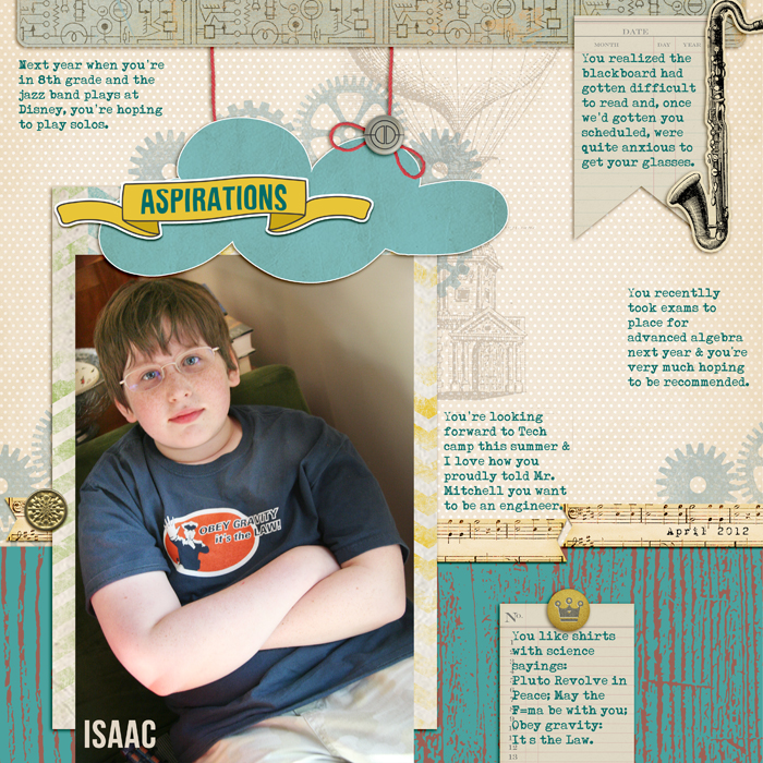
The photo size and crop on “Aspirations” is standard. I’ve placed it flush with page bottom to add a little punch to the design. I like the idea of my son’s photo rising up from beneath the canvas along with the cloud and hot air balloon embellishments. I’ve taken a similar approach to that of Lynnette: I’ve got bleeds on three sides of the canvas. Notice the saxophone at top right and the band of patterned paper at top.

Aspirations by Debbie Hodge | Supplies: Wesley by Ardent Sparrow; Sweet Storytellying by Sahlin Studio; IQ by Lynn-Marie and Studio 68; Vintage Ledger Journa Cards by Robyn Meierotto; Narrative by One Little Bird; Vintage Findings by Jen Allyson; Artplay Concerto by Anna Aspnes; Far Away From Here by Juliana Kneipp
Doris Sander uses traditional crops and vintage elements on “Happy Bird.” Her composition is based on a familiar two-column foundation. There is nothing traditional and boring about this page, though, and the bleeding off page edge of the photo at top left as well as the layered journaler at bottom left are unexpected and a part of what give this page its charm.

Happy Little Birdie by Doris Sander | Supplies: patterned paper, stickers, chipboard – Jenni Bowlin Studio, punch – Jenni Bowlin for Fiskars
What’s your approach to framing, margins, and bleeds?
[current]


