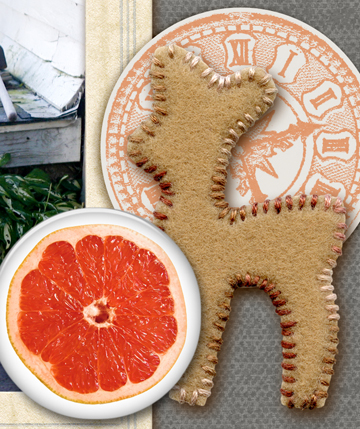
The pieces in this embellishment cluster support page theme, set tone, and have appeal. The cluster as a whole is a part of the page flow. Check out the page below for details. Supplies: felt dear from Darling Dear Kit by Creashens; grapefruit pin from File Box 3 by Paula Kesselring; clock from The Daily Details by Digi Chick Collaborative
by Debbie Hodge
A successful scrapbook page captures the viewer’s attention, controls the eye’s movement, conveys information, and evokes emotion. Embellishments are one of the tools you have for achieving these ends.
Just as every sentence in a story should either deepen character or advance the action, every item on your scrapbook page should be pulling its weight. Every element you add to a scrapbook page should either deepen meaning or advance visual design.
Are you using embellishments this way? Because embellishing scrapbook pages is about the joy of the detail, you need to balance the fun and appealing with the purposeful.
How to do that? Aim to have your embellishments do at least one of these four things.
1. Embellish to add charm and design interest
What charms you in decoration? What do you find appealing and delightful? Do you like bold colors or vintage embellishments or, perhaps, both? Is it bright juicy epoxies, handmade decorations, or something else that you like? When you include images, styles, and colors that you like you’re revealing and recording another aspect of YOU on the page.
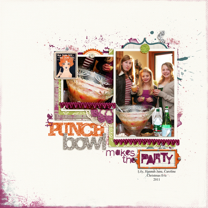
I used a white textured cardstock as the base for “Punch Bowl” because I wanted to use bright fun colors that grab the eye and set a party-like tone. Purple and blue splatters mimic the splash of punch and the pompom trim adds visual texture and appeal.
The Punch Bowl Makes the Party by Debbie Hodge | Supplies: Silver Glitter Alpha No 1, Distressed Toolset No 5, Dripped Stains No 5, Distressed Edge Overlays No 1 by Anna Aspnes; Just Linens 1 by Maplebrook Studios; Speech by Paula Kesselring; Between the Lines Alpha 5, Old Time Christmas No 2, Holiday Trim by Katie Pertiet; Fastenits 2 by Pattie Knox; 11:30am, 11am by Amy Wolff; Also A Very Small Alpha, An Additional Very Small Alpha by Allison Pennington; Restoration by Gina Cabrera; Vinnie Pearce Journey Back
2. Embellish to deepen meaning
Surely you’ve got embellishments in your stash that are images. Some of these are fun decorations and cues to your subject while others come packing “baggage.” They trigger associations that can be used to deepen the meaning of your page. (Check out Images and Meaning on Your Scrapbook Page.)
Use embellishments with straightforward and themed meanings. Go ahead and push the “easy” button. Embellishing with images that have a direct connection to your subject eases your viewer right on into the page . They’re understanding what the topic is even before they’ve taken time to examine the details.
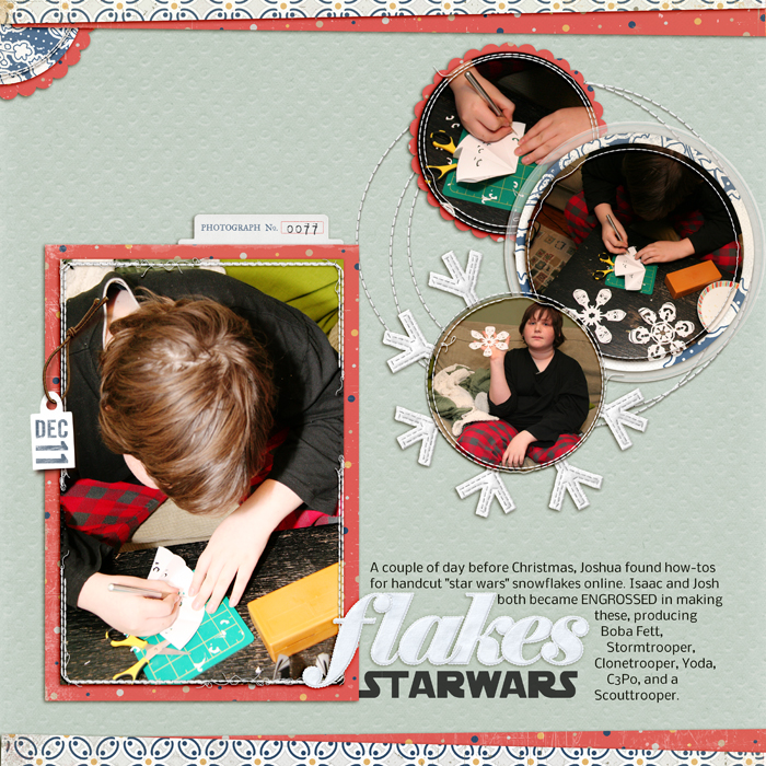
On this page of my son handcutting snowflakes (in the shape of Star Wars characters) I matted one of the photos on a felt snowflake shape that reminds me of ornaments I’ve made in the past and that cues the viewer to page subject.
StarWars Flakes by Debbie Hodge | Supplies: Darling Dear by Creashens; Felty Flakes, Yuletide Felt Alpha by Pattie Knox; Retrouvailles by One Little Bird and Vinnie Pearce; Stitched Circles No 2, Stitched Frames No 1 by Anna Aspnes; Digital Date Stamps No 15 by Katie Pertiet; Nobile and StarVader fonts
Several years ago, our neighbors introduced the kids in the neighborhood to their Dad’s old Tintin books. The gang would spend summer afternoons reading Tintin over the garage, and when winter came, we invested in our own copies of these books by Herge. They are still favorite bathtime reading for both of my sons.
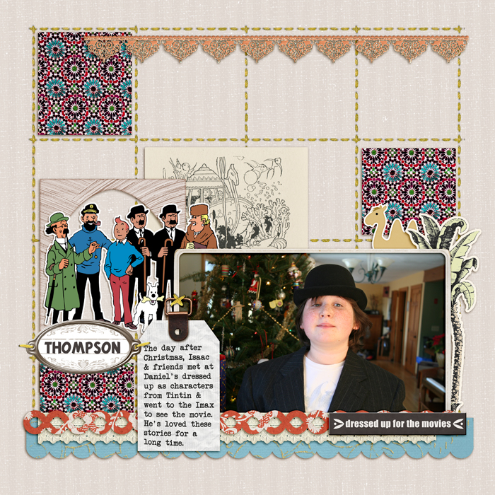
For this page of my son dressed up to attend the new Tintin movie, I turned to the stories for embellishment inspiration. “Red Rackham’s Treasure” includes Professor Calculus’ underwater machine and the vintage illustration from Katie Pertiet’s Collageables reminded me of it. The camel and Moroccan motifs (from Taste of Morocco Kit by Krista Sahlin and Britt-ish Designs) go along with the stories like “Land of Black Gold” that take place in the Middle East. I also grabbed an image from the Tintin website because it included Mr Thompson, and Isaac was dressed as him. My son ADORES this page.
Dressed Up for the Movies by Debbie Hodge | Supplies: Taste of Morocco by Sahlin Studio and Britt-ish Designs; She's a Doll by Vinnie Pearce; Glitter Thread Stitches by Lynn Grieveson; Oiselet Rouge Elements, Collageables No 1, Flossy Stitches Yellow, Vintage Frames No 26 by Katie Pertiet; Libris by ViVa Designs; Tintin illustration from tintin.com; Tintin and Another Typewriter fonts
Use embellishments that trigger abstract associations. Hearts, butterflies, clocks, wings, birds, and even wise owls are examples of images that we associate with abstract feelings (as opposed to concrete objects).
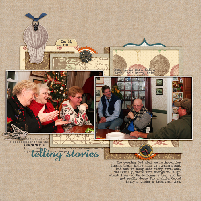
These photos were taken the night my dad died, as we gathered to remember him, and my uncle told stories that made us smile. I embellished with a hot-air balloon, ascending, as toward the heavens. The bird embellishment is an obvious nod to my dad’s love of birdwatching and a symbolic representation of a connection between the skies and the ground, or heaven and earth.
Telling Stories by Debbie Hodge | Supplies: Well Traveled, Restoration by Gina Cabrera; Retrouvailles by One Little Bird and Vinnie Pearce; Journey Back by Vinnie Pearce; Rimmed Framers 1, Tied Fasteners, Krafty Canvas 1 by Katie Pertiet; Interlude by One Little Bird; Flair Box 3 by Paula Kesselring; Odstemplik, Another Typewriter fonts.
3. Embellish to set tone
As you gather your embellishments, think about your attitude toward the subject you’re scrapbooking and the mood or tone you’d like to set. Is it a serious topic for you? Perhaps it’s joyful or humorous. You might be feeling sarcastic, formal, or even solemn. Select embellishments that support this tone. An acrylic star sets a different mood than a star cut from gingham cloth. Fabrics like corduroy set a comfy tone, while velvet is elegance. Acrylic embellishments can be clean, cool, and modern. Epoxies are often juicy, young, and fun. You can also treat your embellishments with techniques like distressing, inking, sanding, misting, and glazing.
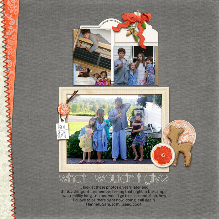
These are older photos that I’d scrapped once already but that I couldn’t resist scrapbooking again — with different journaling that talks about what it is to have children growing up. The photos make me immensely happy and I used citrusy oranges that also make me happy, tying rickrack around the symbolic acorns, and adding a bright pin with morning grapefruit to this “rise and shine” page along with a charming baby dear of felt. I hope the tone is joyful and tender at the same time.
What I Wouldn't Give by Debbie Hodge | Supplies: Darling Dear Kit by Creashens; File Box 3 by Paula Kesselring; Pull-out Journaling by Lynn Grieveson; The Daily Details by Digi Chick Collaborative; The Maple Origins, Nobile fonts.
4. Embellish to support design
Embellishments are important for achieving basic design principles on your pages. They can create and contribute to flow on the page, add repetitions, and be the source of eye-catching contrast.
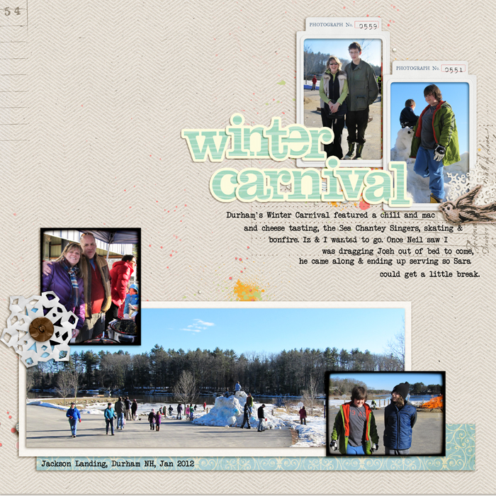
The focal point on “Winter Carnival” is the bright and large title, along with the smaller photos and journaling it connects the eye to. The hand-cut snowflake embellishment at bottom left stands out, catching the eye, and drawing it backwards and down to take in another cluster of photos. The eye will move back and forth between the two clusters, staying engaged in the page and taking in the story.
Winter Carnival by Debbie Hodge | Supplies: Retrouvailles by One Little Bird and Vinnie Pearce, Antoinette by Shannon Hegarty; Vintage Pointsettia by Krista Sahlin, Touch of Magic Sweet Awaits by Kitty Designs; Restoration by Gina Cabrera; Handcut Snowflakes by Valerie Wibbins; Woodcut Alpha by Crystal Wilkerson
What are the embellishments that appeal to you? When you scrapbook your stories choose them to go with page subject and tone, and use them to deepen page meaning and achieved a design that guides the eye around the page and tells your story well.

