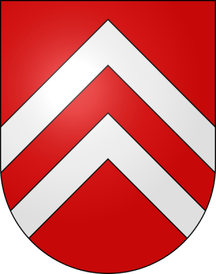
Chevrons appear frequently throughout the history of Heraldry, especially throughout France and Switzerland.
Once a thing of the past, “chevron prints” have made a raging comeback.
Everywhere you turn in today’s fashion, home decorating and scrapbooking industry you will find this lively motif! Read on for ideas on putting this hot trend to work on your scrapbook pages.
Interesting facts about the chevron
- The chevron design dates back to 1800 BC and was used on pottery and architecture by the ancient Greeks.
- Charles Schulz’s beloved comic character Charlie Brown sported a Chevron design on his sweater for nearly 50 years.
- Chevron gas, whose logo is a nested chevron design, is one of America’s five largest corporations.
- The chevron is used on modern-day military and police uniforms to signify rank, but was seen earlier on Spartan battle shields.
- Chevrons appear frequently throughout the history of Heraldry, especially throughout France and Switzerland.
- The origin of the word chevron comes from the old French word for rafters.
- The chevron was revived in the late 1960s as a part of the Art Deco movement.
- In the late 1960s, fashion designer Pierre Cardin popularized the chevron print in his clothing.
Using chevron prints on your scrapbook pages
Use chevrons to give your layout a fresh, fashion-forward look
Because chevrons are such a hot style right now they can immediately impart a fresh and fashion-forward feeling.
On “Grow,” Kelly Purkey used a bold chevron pattern to drive the tone of her page, creating an energized and trendy feel that is complimented by her bright and cheery colors and fun embellishment style.
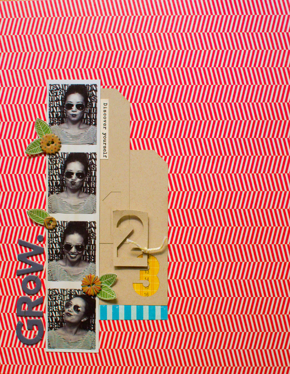
Grow by Kelly Purkey | Supplies: Patterned Paper – My Mind’s Eye, Studio Calico, Crate Paper; Stickers – American Crafts; Buttons – My Mind’s Eye; Tags – Ormolu; Twine
Take a chance, and use chevron patterned paper as your “white space”
A larger chevron pattern can be perfect for your background when working with a design that incorporates generous white space.
Because all of the elements are in a tight cluster on my “All We Wanted for X-mas,” using this large-scale chevron becomes a bit less scary–because there is less danger of overcrowding and distraction.
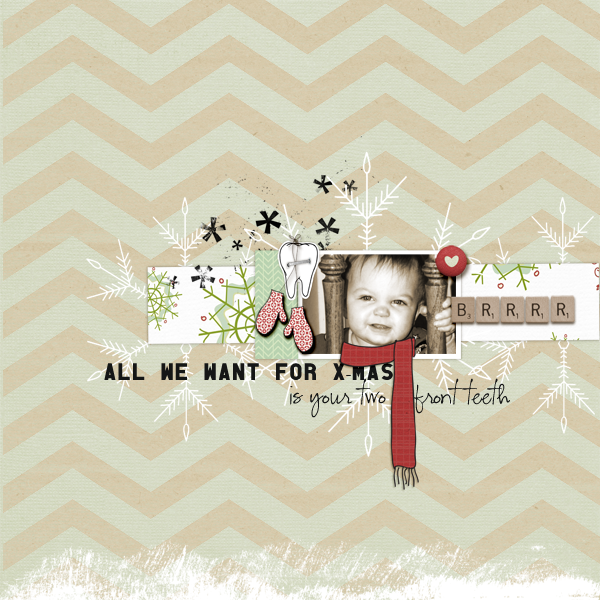
All We Want by Amy Kingsford | Supplies: Baby It’s Cold Outside Kit + Templates by Leora Sanford, Natural Line Papers by Kitty Designs and Retro Holiday Add-On Brush Set by Anna Aspnes Font: CK Ali and Old Block
Create a dynamic chevron border
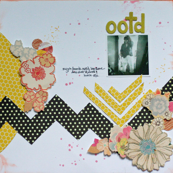
Vee Jennings created a strong border with paper hand-cut in a chevron shape on “OOTD.” The border sets the stage for her whole layout. It creates a shelf for Vee’s photo, connects her two embellishment clusters, and establishes an energized flow.
Use ric-rac to mimic the chevron pattern
Using ric-rac to mimic the chevron pattern is a fun way to bring texture and dimension to this trend.
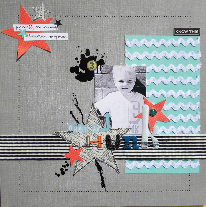
On “What a Hunk,” I made a fun chevron-inspired mat by laying down several strips of white ric-rac across a piece of aqua cardstock. The trick is to make sure that each strip is lined up so that the peaks are nested inside of the next strip’s valleys. This mat strengthens the modern feel of my page.
Use zig-zag stitching to repeat the chevron shape
On “Cowtown Birthday,” Emily Pitts‘ has combined chevron papers, ric-rac, and zig-zag stitching to repeat the pattern throughout her page. This not ties all of the other fun patterned papers together on this beautifully pieced two-pager, but it also establishes a nice rhythm within the design.
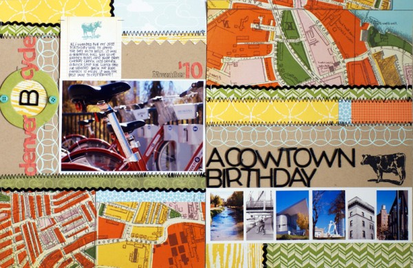
Cowtown by Emily Pitts (Masterful Scrapbook Design Smorgasbord Issue) | Supplies: Mind the Gap, Flat, and Pint kits by Studio Calico; Zing embossing powder by American Crafts; Ink by Versamark
Create a visual triangle of chevron accents
On “Foodies,” Vee Jennings used three separate pops of the same metallic-embossed chevron stamp to create a triangle of eye-catching spots to guide the viewer’s eye through all of her yummy photos and journaling.
Use chevrons as arrows
On “Where the Heart Is,” I used individual chevrons flipped sideways as arrows that direct the eye outside of my inner canvas to my title and journaling –giving viewers a chance to take in my title and the story behind my page.
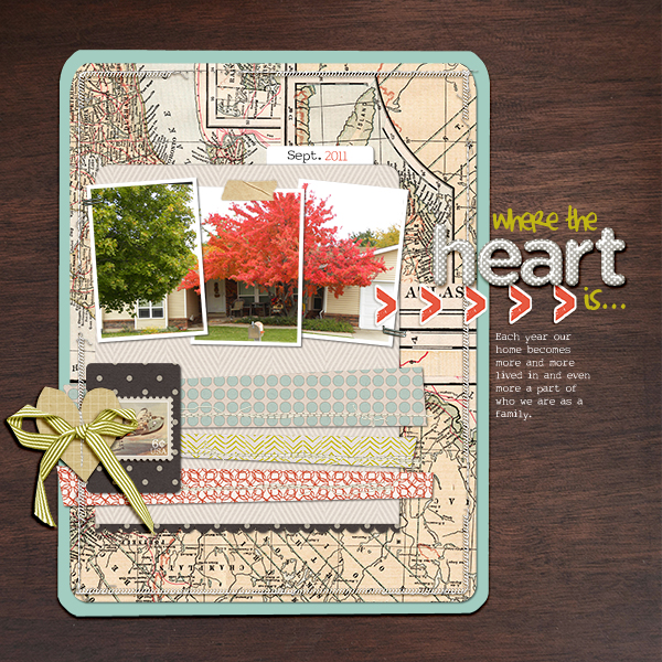
Where the Heart Is by Amy Kingsford | Supplies: Simple Scrapper Premium Collection April 2011 Template No. 1, Photobooth and Oh Joy by Paislee Press, Neutral Lines by Kitty Designs, Scissor-Cut Hearts, Stitched Fall Mix No. 2 and Stitched White. Borders by Anna Aspnes, Airtime and Billet Doux by One Little Bird Designs Fonts: Complete in Him and My Type of Font
Use a chevron design to draw attention and ground
On “I Love You Too Buddy,” Emily Pitts used an embossed chevron stamp to draw focus to her title. The stamp’s placement grounds her over-sized title while, at the same time, emphasizing it.
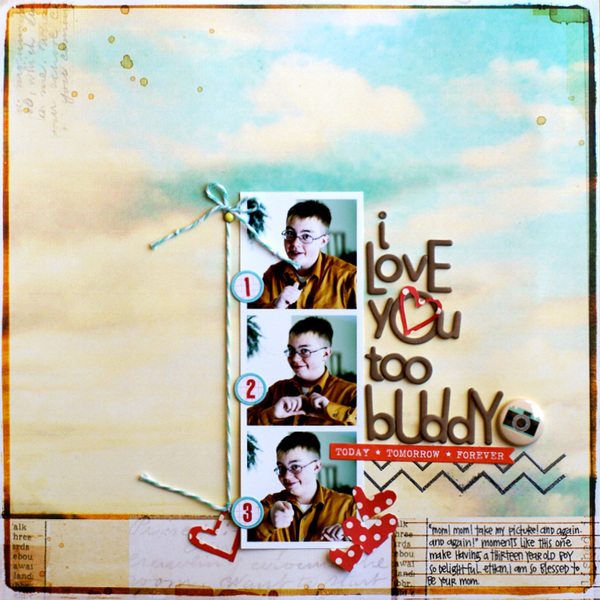
I Love You Too Buddy by Emily Pitts | Supplies: Boardwalk, Boogie Board by Studio Calico, circle foam tabs and pewter metallic zing by American Crafts
Fill a wide chevron shape with patterned papers
Celeste Smith cleverly used the chevron band across “Today,” as an opportunity for mixing several charming patterns. The scalloped edges on her photo and the zig-zag border add repetitons of the pattern throughout the page for a cohesive look.
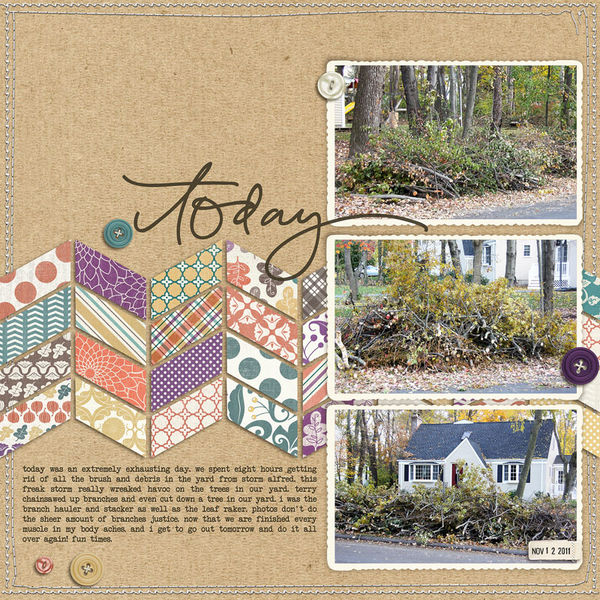
Today by Celeste Smith | Supplies: Kit: Autumnal Collection by Erica Coombs at Design House Digital, Word Art: Word aRt Today Element by Robyn Meierotto at Design House Digital; Font: Another Typewriter
Fill blocked compartments with chevron print paper
While a bold chevron print can overpower in larger doses, a small block of it makes a great accent.
On “Making Spirits Bright” Debbie Hodge filled one of the compartments in her blocked design with vivid chevron print. The chevron shape is repeated in the zigzag-edged medallion and even in the intersections of the diagonals on the plaid print paper.
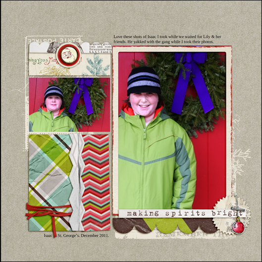
Making Spirits Bright by Debbie Hodge | Supplies: Dashing Papers, Dashing Trimmin’s by Allyson Pennington; Pine Letter Box Collage, Christmas Village, Words and Pictures Christmas Paper Pack, Krafty Canvas No 1 by Katie Pertiet; Christmas Cheer by Lynn Grieveson; Kitschy Christmas by Sahlin Studio and Jen Barrette; Ornamental by CD Muckosky
These are just a few of the fun ways that you can start using chevrons in your layouts!
[akingsford]
[ontrend]

