by Debbie Hodge
Wondering how to add a little something different to the next scrapbook page you make? Try building a page based upon one of these five ideas.
1. Incorporate a curved line into your composition
Dina Wakley says, “Continuance is a Gestalt principle that means that our brains like to follow lines. When we look at a piece of art, or a magazine advertisement, or even a nature scene, our brain will follow the lines it sees.”
See here how Dina has created a strong curved line on “Lately” with torn paper, a series of pennants, and stitching. Challenge your self to get a curved line or path onto your next scrapbook page.
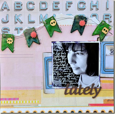
“Lately” by Dina Wakley. Dina explains continuance, as well as white space and closure in Art Journaling 103: Color and Composition.
2. Put macro white space between your elements instead of around them
When you run substantial and interestingly-shaped white space through the middle of your page, you will create a subtle ambiguity between figure and ground that’s interesting. On “Bright Spot,” two vertical blocks bleed off the page sides and are staggered in their vertical placement. The result is white space through the vertical middle that has an unexpected (and thus eye-catching) shape.
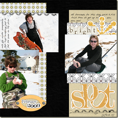
“Bright Spot” by Debbie Hodge. Debbie details several approaches to using “divides” in your page compositions in Lesson 9 of Building Pages.
3. Create a rectangular canvas within a square canvas
Ancient Greek and Egyptian artists and architects understood that a composition based upon the “golden ratio” (and the rectangle it creates) is pleasing to the eye. Are you a “square-canvas” scrapbooker most of the time? Try working on a non-square canvas and then incorporating that onto a larger square.
On “Excitement on a Swing,” Cindy Liebel’s use of a white rectangular mat to hold her journaling, title, and photos gives her page an interesting composition and lets her incorporate several different patterned papers.
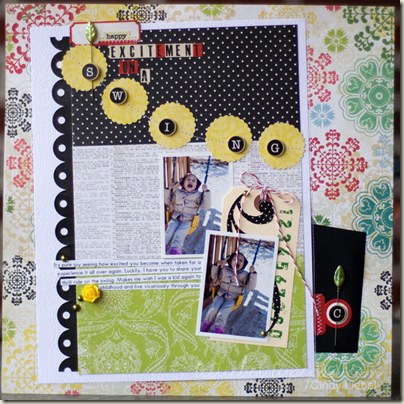
“Excitement on a Swing” by Cindy Liebel. Cindy annotated this layout in the Masterful Scrapbook Design Apr ‘11 Patterned Paper issue. Lesson 2 of Building Pages presents the principles of the golden ratio and its connection to the scrapbook canvas as well as several variations for beginning this kind of composition.
4. Balance your page elements around a vertical axis.
Successful pages have a good visual balance among the elements on the page. While you can’t weigh these visual elements with a scale, there are guidelines (i.e., darker colors have more weight than lighter colors, and familiar shapes are weighter than irregular shapes) you can use. Read about visual balance and find a more extensive list of weight guidelines in my article Learn Scrapbooking Design Principles: Lesson 6 Balance
On “More Please” I arranged photos, title, journaling and embellishments on either side of a vertical axis. It was actually a challenge I set for myself before I started making the page – something to keep me on my toes and trying new things.
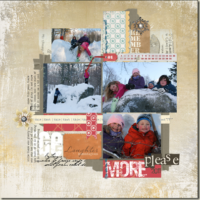
“More Please” by Debbie Hodge. Debbie writes about scrapbook page balance in her free e-course Learn Scrapbooking Design Principles: Lesson 6 Balance.
5. Put it on a shelf
Challenge yourself to make page that has a “shelf” upon which you sit at least one (maybe more) of your important page elements (i.e., photos, title, journaling, embellishments). This kind of composition is a fun exercise akin to that of decorating the mantle.
Lisa Dickinson’s shelf on “Home” is a scalloped delight that was inspired by the details around the neck of a jacket.
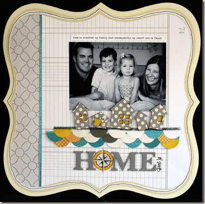
“Home” by Lisa Dickinson. Lisa annotated this layout in the Masterful Scrapbook Design Mar ‘11 Inspiration issue. Ideas and design tips for using “shelves” on your pages are covered in lesson #7 of Building Pages.
[getinspired]

