The half-and-half design is one of several layout configurations of combined elements that scrapbookers use again and again when making scrapbook pages (blocked, clustered, shelf, cross, band and more).
These foundations are used again and again because they work well for housing the most frequently encountered combinations of elements (1 to 5 photos with title and journaling) and they consistently yield well-designed pages.
A big part of the Get It Scrapped membership are the 22 Scrapbook Coach classes (with 88 video lessons) on scrapbook page foundations. In the class on the half-and-half design, there are four different takes on it, and our creative team shows you how they use them here.
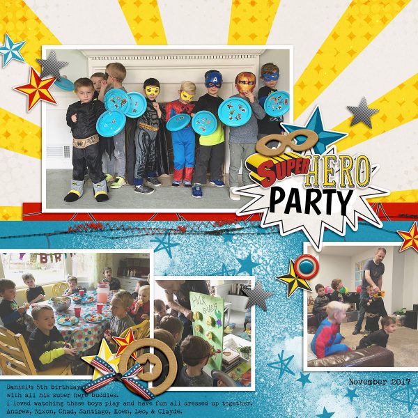
Lynnette Wilkins says, “This page is about my son’s 5th birthday party, which was Super Hero themed.
This foundation was a great starting point because I had one photo of all the kids and a few other pictures of the kids doing activities. This design places one larger photo at the top, making it the focal point, with the others supporting the story. I also like how splitting the canvas in half adds to that.”
“I really liked using this foundation as a guide for the design of my page. It’s not a design I use often, but it really works well for these photos and my story.”
Devra Hunt says, “Ever since he was a little boy, my son and husband have called their time out and about together ‘Special Outings.’ As he’s gotten older, the outings have changed, such as this visit to Seattle Center.”
“This half-and-half design is one I have used before, and l know how to make it work for me. I have figured out how to use bold or subtle patterns and colors. I like the ability to substitute a journal spot for a photo, or change the size and orientation of a photo which makes the page look different each time. Today I had three photos to work with, all featuring murals in the background, all also featuring my son, creating their own visual triangle.”
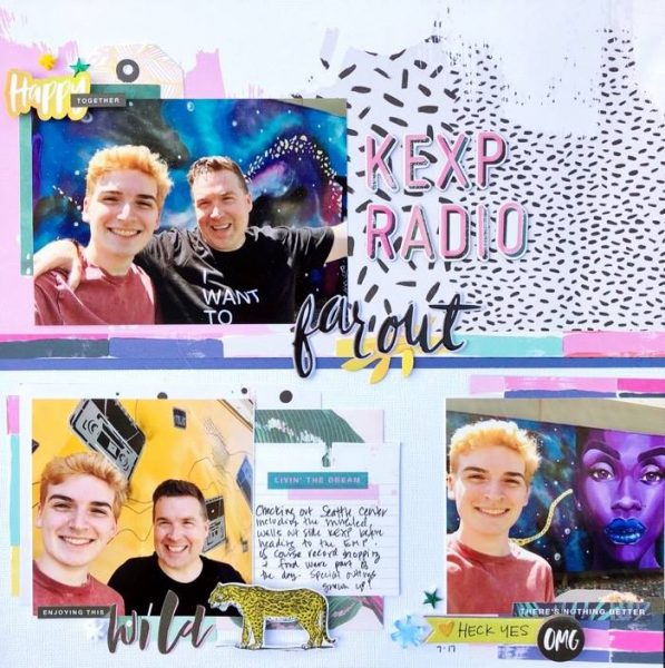
KEXP Radio by Devra Hunt | Supplies: Patterned paper, die cuts, stickers, -Crate Paper, Alphas & cardstock-American Crafts, gems-Queen & Co, acrylic shapes-Color Cast Designs
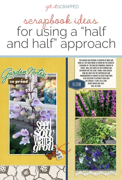
Ronnie Crowley says, “I’m just in love with the flowers in my garden at the moment so I had to create a page with a few of the pictures I’ve taken.”
“The half and half foundation provides a strong linear design which is a contrast to the organic shapes in the pictures and gives a strong balance to the page. This was an easy page for me to make as half and half is a go-to favorite for me. I find it compliments my style as it provides a strong focus on the pictures.”
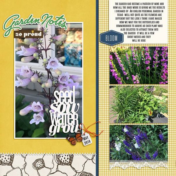
Garden Notes by Ronnie Crowley | Supplies: One Little Bird – Take Root; Amy Wolf and Pink Reptile Collab – Homegrown; Get It Scrapped – Coach 7 Template
Iris Fox says, “My little family of four had a day out at The Museum of Ice-Cream in San Francisco. The day had a rough start, and based on mixed reviews online we didn’t have high expectations, but it ended up being a ton of fun.”
“The half-and-half foundation was a great starting point for my page because I had a bunch of photos, and wanted to highlight one in particular. The collage of many smaller photos on the upper half play a supporting role, while the larger photo on the bottom, placed on the darker paper with the journaling spot and playful title, has more weight. Your eye is drawn to it first, then drifts through the rest of the design with the help of the embellishments in 5 places, which in my page are the pops of orange acrylics.”
“One thing I really enjoyed about this design was playing with the layers beneath each photo. In particular, because the page halves are comprised of different background papers, it was fun to incorporate the edge of the top paper as one of the layers, slipping some of the layers beneath it.”
“I will definitely be exploring this foundation in future pages. It’s different than most half-and-half designs in how you integrate the two halves together. I like that it allows a clear distinction between the photos, but they still flow well together.”
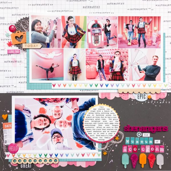
Shenanigans @ the Museum of Ice-Cream by Iris Fox | Sipplies: Cardstock: Bazzill; Patterned Paper: Elle’s Studio; Acrylic Pieces: Color Cast Designs, Freckled Fawn; Die-Cuts: Elle’s Studio; Epoxy Stickers: Elle’s Studio; Wood Veneer: Elle’s Studio, Freckled Fawn; Chipboard: Project Life; Tile Alphas: Pretty Little Studio, October Afternoon, Tim Holtz, Paint: Ali Ewards (Astoria)
Marcia Fortunato says, “This layout is about my search for blooming trilliums and the wildflowers I saw along the way on a recent hike in the woods.”
“Because my story had two parts – the first part of my hike where I found flowers but no trilliums and then the discovery of a patch of trilliums – the half-and-half approach worked perfectly. I had a lot of photos of smaller wildflowers that I wanted to group together in a collage, but I wanted to highlight the trillium photo since it was the “star” of my story. This foundation gave me two canvases to work with. I chose a patterned paper where one side was a black and white pattern and the other side was colorful, then cut it roughly in half and flipped one side to use both patterns, and I mounted them on a piece of cardstock. To keep the chronology of the story in order, I chose to put my focal photo on the right-hand side.”
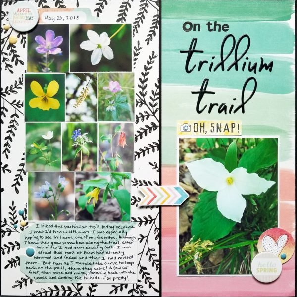
On the Trillium Trail by Marcia Fortunato | Supplies: Patterned Paper: Maggie Holmes/Crate Paper; Cardstock: Neenah; Title: Pinkfresh Studio, Making Memories; Embellishments: Cocoa Daisy; Pen: LePen (Marvy Uchida).
Debbie Hodge says, “I was recently scrapbooking a trip from three years ago. I had a lot of pages to make and I wanted to be efficient, yet keep things appealing and as fresh as possible. I, thus, used the half-and-half design over and over againg–but I tweaked it a bit each time by playing with backgrounds and element placements. Here are three of those trip pages using the half-and-half design.
“This first page is from our last day at sea on the cruise. The top half of the design has photos from on-deck and the bottom half has photos from around the ship. While I often define the two halves of the canvas clearly by filling each with a single different background paper, here, I pieced several papers in the top half.”
“The photos on the top half abut each other and run edge to edge. They are not lined up at top or bottom though, and I backed up each with a different print peeking out above and below the photos. It’s a twist that makes this half-and-half design look a little bit different from the many others I made.”
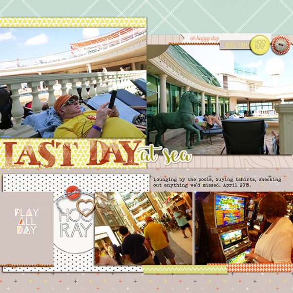
Last Day at Sea by Debbie Hodge | Supplies: Take Root by Lauren Grier; Hopscotch by One Little Bird; Just Jamie Storyteller November Watercolor Alpha; Dandelion Days by Forever Joy; StraightLine Stitched Orange by Anna Aspnes; Safina Script, Bohemian Typewriter fonts
Debbie Hodge continues, “The second half-and-half design I’m sharing here is of our last cruise dinner. Again, I arranged my elements in two horizontal sections. At the top are four square photos, edges abutting, the tops and bottoms staggered.”
“The bottom holds two larger photos plus title and journaling. The unexpected tweak to the design here is that the band of paper backing up the bottom half doesn’t go all the way to the left edge of the canvas. Vellum and a doily are layered at this corner. It’s a way to keep the design fresh.”
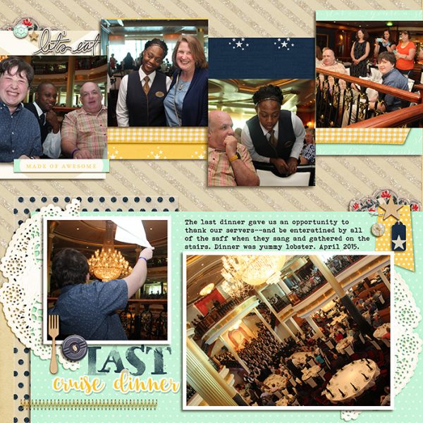
Last Cruise Dinner by Debbie Hodge | Supplies: StarGazer, Nosh, Prix Fixe by One Little Bird; Soft Landing by Lynn Grieveson; Storyteller November Watercolor Alpha by Just Jamie; Stitched by Anna Bitz by Anna Aspnes; Dawn’s Light by Amy Wolff; Bohemian Typewriter, Safina Fonts
Here’s one more half-and-half design from Debbie’s cruise series. Debbie says, “The design is quite simple. This time the focal photo, title and journaling are in the top half, and a series of supporting photos are in the bottom half. Those supporting photos at the bottom are in a series with abutting edges that runs from edge to edge to edge of the canvas. Strips of patterned paper run along the top and bottom of this supporting series.”
“The top half has a solid background. Notice the title and journaling treatment: the left edges of an orange patterned paper, the title, and the journaling block all align with each other AND with one of the supporting photos below. The effect of this is to define a column in addition to those half-and-half rows.”

Leaving Galveston by Debbie Hodge | Supplies: Sundrifter by Laurie Ann; Stitched by Anna White by Anna Aspnes; Stringbits by Kim Jensen; Safina Script, Trend Rough Slab, Bohemian Typewriter fonts
abc

