Finding and using inspiration from outside of other scrapbook pages is a wonderful way to shake things up in fresh ways.
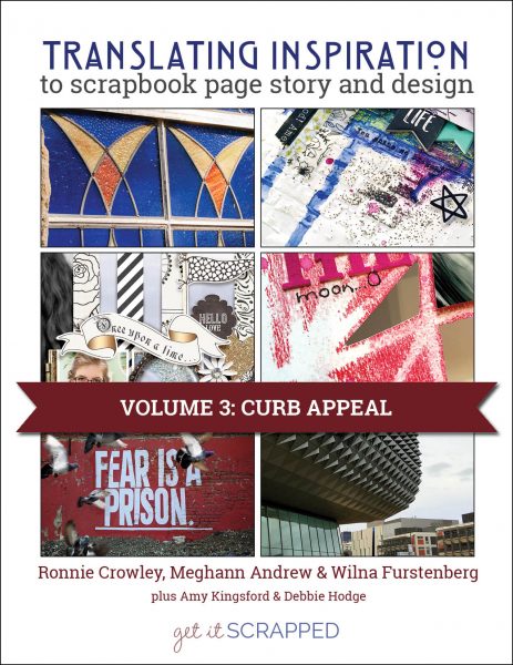
This year in the Get It Scrapped membership we’re exploring a variety of those outside sources. The newest class in the Translating Inspiration series, has three guest teachers showing you how to find and use curb appeal to inspire your next scrapbook page.
Learn how to find inspiration as well as how to design with it.
You can find inspiring buildings and curb appeal in a variety of places. Look first in your own neighborhood or perhaps an area you love to visit from time to time. Keep an eye out as you travel to and from work or perhaps look back on photos of the places you’ve traveled to.

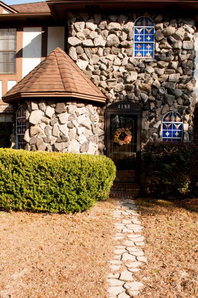
Guest designer Cheryl Ashcraft was inspired by this fairytale-like home that she passes every day in her neighborhood to scrapbook the photos from her daughter’s senior prom.

Guest designer Kim Watson was inspired by a piece of street art and allowed the overall grittiness of the location to influence the texture on her page’s background.
You can translate inspiration to several aspects of the scrapbook page.
In the upcoming class, our guest teachers look to curb appeal for ideas in rendering and placement of photos, titlework, journaling and embellishments.

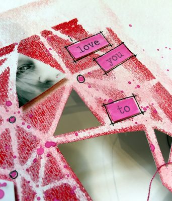
Guest Designer Louise Nelson used the triangular design of the building that inspired her to create a stenciled pattern and to influence the shape and rendering of her photo.
These are the guest teachers for the newest membership class.
Join us for rich storytelling and advanced design lessons in the Get It Scrapped membership.
 About Cheryl Ashcraft: Hey y’all! My name is Cheryl. I’m a native Floridian living in Northwest Florida on the Gulf Coast. My husband Jay and I have been married for 24 years. We have two children, Olivia and Daniel. I started paper scrapbooking in 1996 when I was pregnant with my daughter Olivia. It wasn’t until August 2007 that I started making digital layouts in. I started converting my layouts to templates and opened my first store in February 2010 at The Digichick. Since that time, I’ve was at Scrap Orchard until it closed in 2015 and now I am at The Lilypad and I absolutely love it! When I’m not taking pictures, scrapbooking, or designing templates, you’ll find me tending to my home. I love to decorate and keep a quiet and tranquil space for us to have as a retreat.
 Up until 12 years ago, Louise considered herself not at all crafty or artsy for that matter. She enjoyed furniture restoration and home decor DIY. In 2005, Louise began to scrapbook and in the last 12 years has developed a distinctive style that is an elegant mix of ‘negative space’ and art mediums. During this time Louise has been very fortunate to have designed for many wonderful Companies and Store/Challenge Design Teams; and also to have publications, feature articles, and 2 covers for Somerset Memories. In recent years, Louise has developed a love of mono printing, stamp carving, painting, art journaling, ceramics, and assemblage; and has pursued these with her usual creative passion.
Kim Watson lives on a mountainside with her lovely family, in a quaint
seaside suburb just outside of Cape Town, South Africa.
Life next to the ocean, surrounded by nature gives her an endless source of content for her pages, which she describes as being full of texture, layers, color and, of course, her trademark stitching.
Get an all-access pass to this Translating Inspiration class and more than 80 others with a Get It Scrapped membership. Click here.


