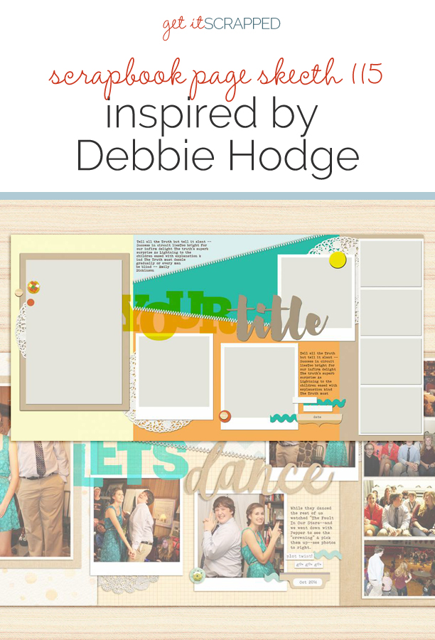
 This free scrapbook page sketch comes from a page made by Debbie Hodge for the Scrapbook Coach Class Double Wide and offers plenty of space for multiple photos as well as opportunities for pattern play and a standout title.
In the Get It Scrapped Membership, members have access to a library of over 100 layered templates and page sketches just like this one, searchable by # of photos and layout type.
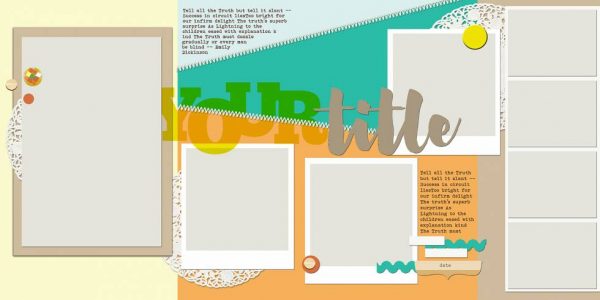
Template and layout by Debbie Hodge. Layout inspired by layouts made by Kim Watson for the Masterful Scrapbook Design eBook “Loving the Double Wide.
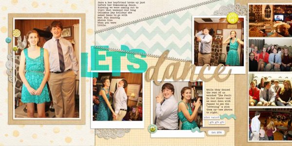
Let’s Dance by Debbie Hodge inspired by Shelly Jaquet | Supplies: It’s All About the Grid by Kaye Winiecki; Pillow Talk by Creashens; Vintage Woodgrain Alpha by Mommyish; A Daring Adventure by Sara Gleason and Amber LaBau; Instagram Frame by Katie Pertiet; Sprinkles 14 by Valerie Wibbens; Triumph by Laurie Ann; Amaze Yourself by Little Butterfly Wings; Melliana, Bohemian Typewriter fonts
download sketch & template.
Get over 150 more sketches and templates with a GIS membership
[hr]
More inspiration…
Looking for more examples of how you might use this sketch/template to inspire your next page? Here are a few inspired pages from our Get It Scrapped Creative Team.
Ronnie Cowley says, “I love double page layouts and ones with lots of spots for pictures and so this was perfect as far as I’m concerned especially as my page is about a trip to Universal Studio which I had lots of pictures from. When I work with a template I remove the embellishments and titles so I have the bare bones to work from. I find if I leave them on I feel constrained in my choices.”
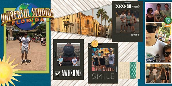
Universal Studios, Florida by Ronnie Crowley | Supplies – Get It Scrapped – Scrapbook Coach Template; Chelle Creations – Rainbow Greens; Creashens – Penny Stitch; Flergs – A Summer Story; Gennifer Bursett – Washi Tags; Traci Stroud – Its a Date
Nicole Mackin says, “I loved the amount of photos in this sketch as I always have groupings of photos I want to keep together but don’t want a ton of individual pages. This page is about cousins playing together during a mini family reunion. I definitely added my own touches to the sketch by adding a few more layers and embellishments. As far as photo and paper placement is concerned, I stayed pretty true to the sketch.”
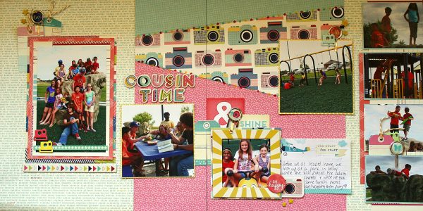
Cousin Time by Nicole Mackin | Patterned Paper: American Crafts (Shimelle); Ephemera & Tags: American Crafts (Shimelle); Chipboard Embellishments & Alphas: American Crafts (Shimelle); Chipboard Cameras: Studio Calico; Clips: American Crafts (Shimelle); Twine: My Minds Eye.
Lynn Grieveson says, “I was attracted to the sketch because I love the sunburst type effect of the diagonal stitching and I had the idea of using it to frame a background photo to add more detail about the place and ‘set the scene.’ The layout is about a night we spent at the Keogh hot springs in California on one of our US road trips. We got up in the morning and our daughter ‘prospected for gold’ in her PJs before a swim in the very retro hot pools.”
“The design of the sketch led me to split the layout into two distinct areas – the farm type section on the left and the retro pool section on the right. I think it makes for a fun and interesting visual juxtaposition.”
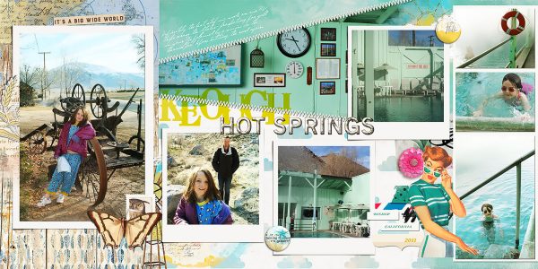
Keogh Hot Springs by Lynn Grieveson | Supplies: Lynn Grieveson: Blue Skies Ahead Kit, Blue Skies Ahead Transfers, Big Sky Kit; Mommyish: Mercury Glass PS Styles; Paula Kesselring: Summer Days Mixed Media; Fonts: Jellyka Gare du Chambord and Oklahoma; Get It Scrapped: Template for Scrapbook Coach 19. Made by Debbie Hodge. Inspired by layout by Shelly Jaquet.
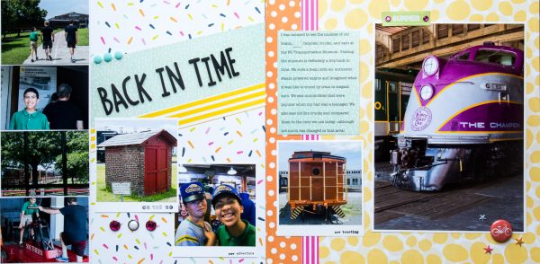
Kelly Sroka says, “When I first started scrapbooking, I always did double-page spreads. The pages invariably had matching papers and each side mirrored the other. So this sketch intrigued me for two reasons–1) that it is a double-page spread which I do not create very often anymore, and 2) the design is not at all symmetrical. I was challenged to use a mix of papers and photo sizes all on one layout. Through the eight photographs on the page, I was able to tell the story of my family’s recent trip to the NC Transportation Museum. At first I thought I would use a picture of my family as the large photograph, but then I decided to use a shot of one of the trains instead. This picture of a train that was used in the 1930’s seemed to represent the theme of our trip that day–going back in time.”

