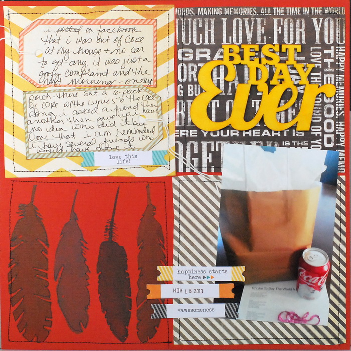
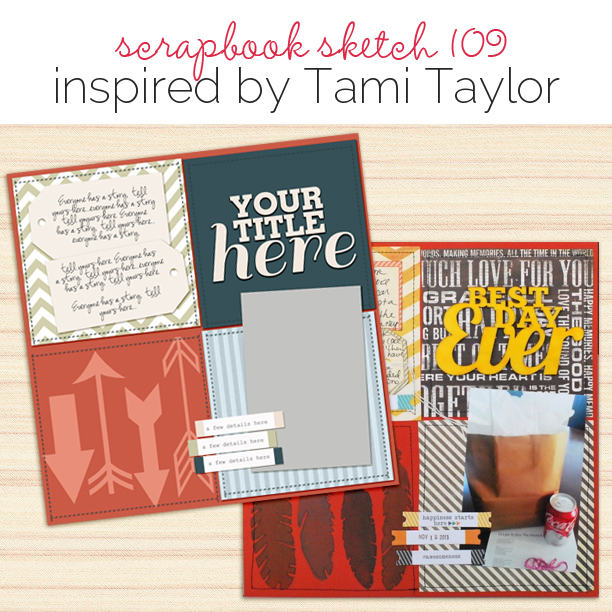
 This free scrapbook page sketch comes from a page made by Tami Taylor for the Rule Play class in the Get It Scrapped Membership, where members have access to a library of over 100 layered templates and page sketches, searchable by # of photos and layout type.
This four-block grid design has got all of your bases covered, with a spot for your title, photo, journaling and even an eye-catching technique or accent cluster!
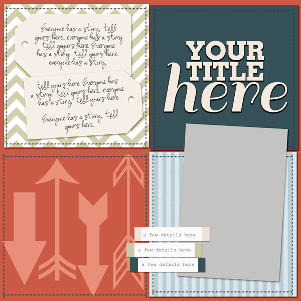
Sketch and Layered Template made by Amy Kingsford based on a layout by Tami Taylor for Masterful Scrapbook Design Rule Play
Tami said, “When scrapbooking this event, I wanted to share the sense of confusion I had in trying to figure out who left this gift for me as well as the happiness I felt in knowing I had so many kind and dear friends. It honestly could have been any number of people (no one ever fessed up to doing it). I wanted the viewer to start by looking at the layout as a whole, unsure of what the most important thing was. Is it the Coca-cola? The journaling? Feathers? That it was the best day ever? In order to create a little confusion, I used a design without an obvious focal point. Each of the blocks in this grid have roughly equal visual weight.”
download template and previews
Get over 150 more sketches and templates with a GIS membership
[hr]
More inspiration…
Looking for more examples of how you might use this sketch/template to inspire your next page? Here are a few inspired pages from our Get It Scrapped Creative Team.
Katie Scott said, “When I looked at this sketch, the layout looked easy to execute with 6″ x 6″ patterned papers so I used it with those paperes to document the dates, places and faces of my McElroy family tree. They arrived in the US in 1875. I flipped the sketch because it worked better for my photo.”
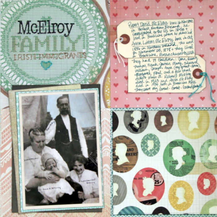
McElroy Family by Katie Scott | Supplies: Patterned Paper: Crate Paper, Letter Stickers: Basic Grey; Distress Ink: Tim Holtz; embroidery floss, shipping tags.
Audrey Tan says, “I was attracted to the sketch’s four-block grid. I’ve never done a page like that before so I used it for my layout about a meet-up with my best friends in Singapore. I always try to see them when I’m in the country.”
“In creating the four blocks, I used digital transfer overlays. Different overlays provide foundations for each block, and the effect is an artsy style that varies from the inspiration piece.”
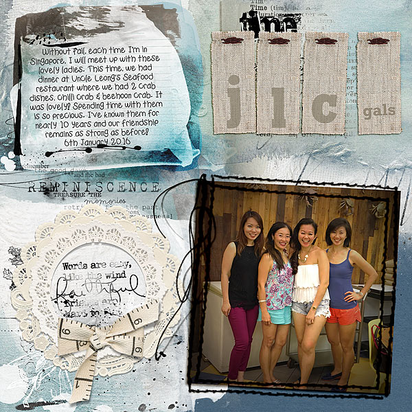
JLC Gals by Audrey Tan | Supplies: Anna Aspnes: ArtPlay Palette Reflections, Tme Word Transfers, Journal Transfers No2, Friends WordArt No3, Reflections WordMix No1, MultiMedia Wreaths No1, Urban Stichez Frames No1; Jen Allyson: Notions – Blue & Co Linen Alphabet; Fonts: Tangie Frog Footman Medium, Rockwell Bold
Devra Hunt says, “I used this sketch to tell the story about a time my son took our pillows and foot rests to create a creative nook in his room.”
“I reduced the size of the squares to create a mat for my photo. I purposely crossed over the grid borders with photo and embellishments to create interest and add whimsy.”
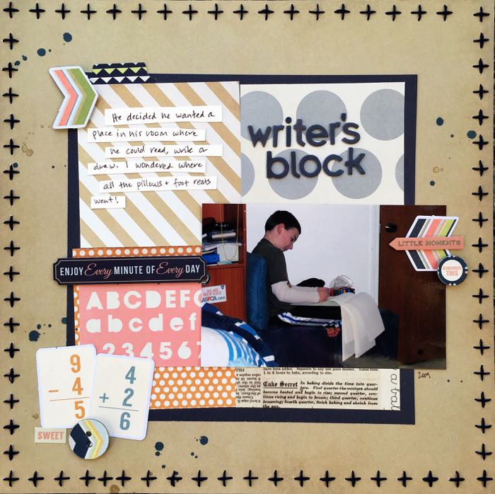
Writer’s Block by Devra Hunt | Supplies: PP, die cuts, embellishments-Fancy Pants, stitch template-American Crafts, thread-DMC, alphas-Basic Grey, Mist-Studio Calico, pen,Sakura, adhesive-EK Success, Recollections
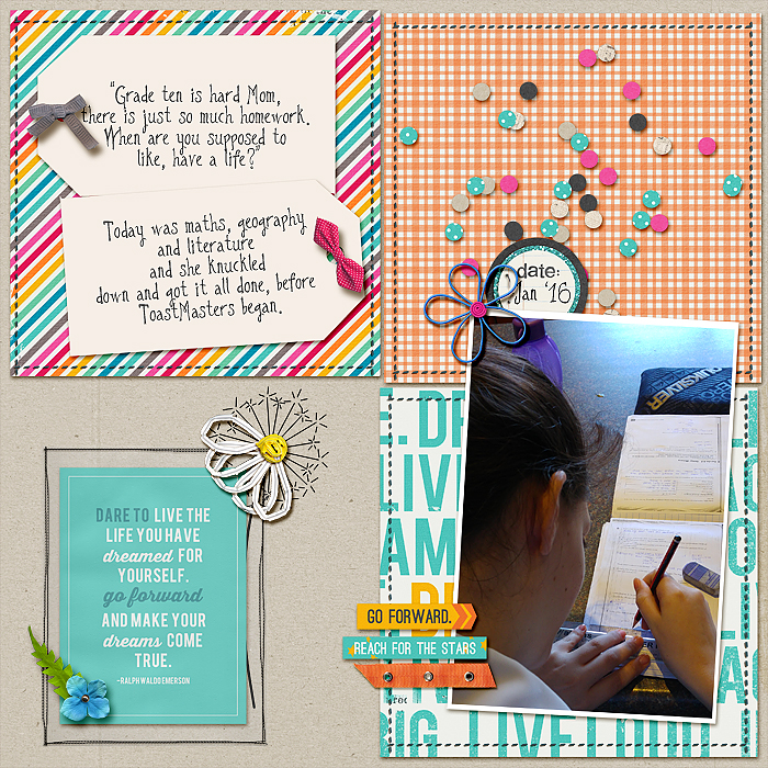
Stefanie Semple says, “I loved the four compartments in the sketch with their broken boundaries. For this story of my daughter and the pressure of grade 10, I only had one photo: of her, taken from behind. Since the story is told from her viewpoint, I wanted to document it as it really was for her, without my usual sugar coating.”
“I added a pocket with a journal card to encourage her and pretty dandelion flowers to represent the temporary nature of these school pressures and struggles. Her school days are divided into home, school, homework and recreation. So the 4 blocks were perfect for that too.”

