 Your scrapbook style needs to please you AND be workable. When you figure out what work you like to do and what work you do well (they might be different, and that’s OK) make sure to get it onto your pages. In the Style class that’s part of the Get It Scrapped membership we have a whole section on this and refer to this as your “masteries.”
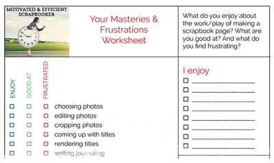
Here’s a worksheet for you to use to take a look at your own masteries and frustrations.
[hr]
when your mastery is layering patterns
Celeste Smith says, “My sister and I tried a Shake Shack on our way to a play in New Haven.”
“I took the Masteries and Frustrations Quiz and decided to create a page using the technique of layering patterns. On this page, I layered four pieces of patterned paper. The best tip I can give with patterned paper layering is to play with the scale of the paper and allow bits of the paper to stick out of your stack. I have a small scale polka dot here, a medium scale floral, and a larger scale utensil print. As well, it is always helpful to have one pattern that pulls the colors from the other patterns. I achieve that here with the stripe and the utensil pattern. Mixing the scale makes the layout more dynamic.”
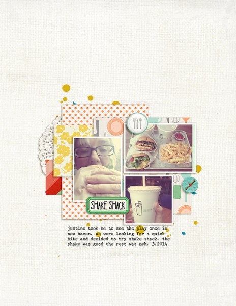
Shake Shack by Celeste Smith | Supplies: Pixels & Co. Curated: Foodie Kit; Font: AMD High Jump, Underwood Champion.
[hr]
when your mastery is mixing busy patterns
Christy Strickler says, “This Page is about how I finally felt at home once my cats were comfortable in our new apartment.”
“One of the things I love to do is to mix a lot of busy patterned papers together. I choose one bold pattern for the canvas and then allowed it’s colors to guide my choices for other prints and for the embellishments. Often the paper choice is influenced by the story I want to tell. In this case, I chose a print with a lot of houses as the main background. I pushed the photos around on the paper to get a general feel for their placement, then added two other prints in smaller portions. Once I know which prints I’m using and how to place them with the photos, I can build my embellishment clusters based on design principles.The embellishments are chosen based on motif, color and texture to support the full story. I stop adding to the page when everything feels balanced.”
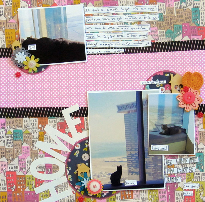
Home is Where My Cats Are by Christy Strickler |Supplies Patterned Paper: Studio Calico, My Mind’s Eye; Letters: American Crafts, Basic Grey; Flowers: Sassafrass, Freckled Fawn; Wood Veneer: FreckledFawn; Jewels: Making Memories; Tape: My Mind’s Eye; Doily: My Little Shoebox
[hr]
when your mastery is making your own product
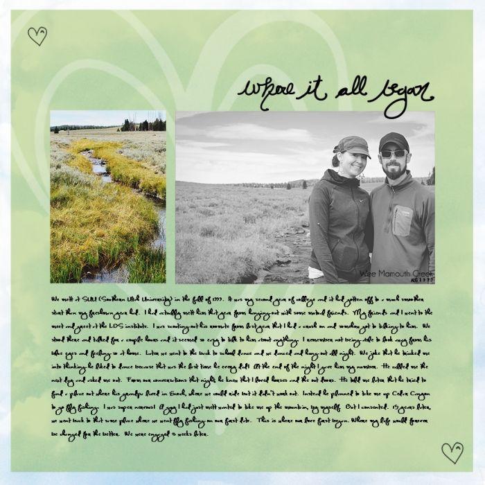
Summer Christiansen says, “This page is about when my husband and I went back to our first date spot and the story of how we met..”
“My scrapbook masteries, or things I enjoy about scrapbooking, incllude: making my own product, finding the right photos and editing them, and journaling. I used product I’d previously designed that evoke the feeling I want on this page. That helped me speed up my process. My favorite pieces here are the background paper that I designed from a cloud I extracted from a photo and the handwritten word art.”
[hr]
when your mastery is titlework
Devra Hunt says, “While visiting Pike Place Market for the first time, we stopped at Beecher’s Cheese, and watched cheese being made.”
“Page titles come easy to me, and often they are humorous, sometimes they are puns. I use the humor in the titles to draw the viewer into my page. I also use the humor to help me choose product that leverages that humor even more across the page. The title here is something a 10-year-old boy would say. The embellishments also use words that mimic that idea.”
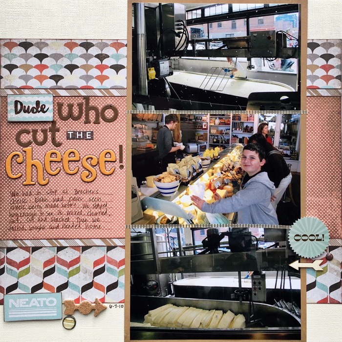
Dude Who Cut the Chesse? by Devra Hunt | Supplies: Cardstock-American Crafts, Patterned paper, stickers, brads-Basic Grey, Stamps-Snarky Stamps by Heather Joyce, Hero Arts, ink-Colorbox, arrows-Studio Calico, Fancy Pants, alphas-Doodlebug Design, American Crafts, October Afternoon, pen and adhesive-EK Success
[hr]
when your mastery is titlework
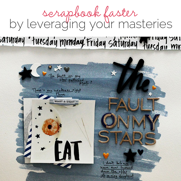
Sian Fair says, “This is a page about my weakness, my dietary downfall, my favorite snack: I’ve never met a doughnut I didn’t like.”
“I love coming up with neat titles! Lately I’ve been making use of some of the lovely big words appearing in collections in veneer and chipboard, and they do make for quick titles–but a longer phrase with a little thought behind it can add real impact for a page to remember. So here I took a movie title and tweaked it for a bit of fun which let me leave the rest of the page relatively simple.”
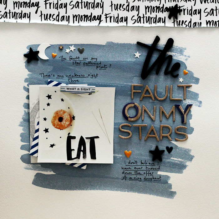
The Fault On My Stars by Sian Fair | Supplies: Patterned Paper: American Crafts Dear Lizzy ; Life Pages cards: Gossamer Blue; Alphas: American Crafts; Puffy Phrase: Evalicious
[hr]
when your mastery is including several photos
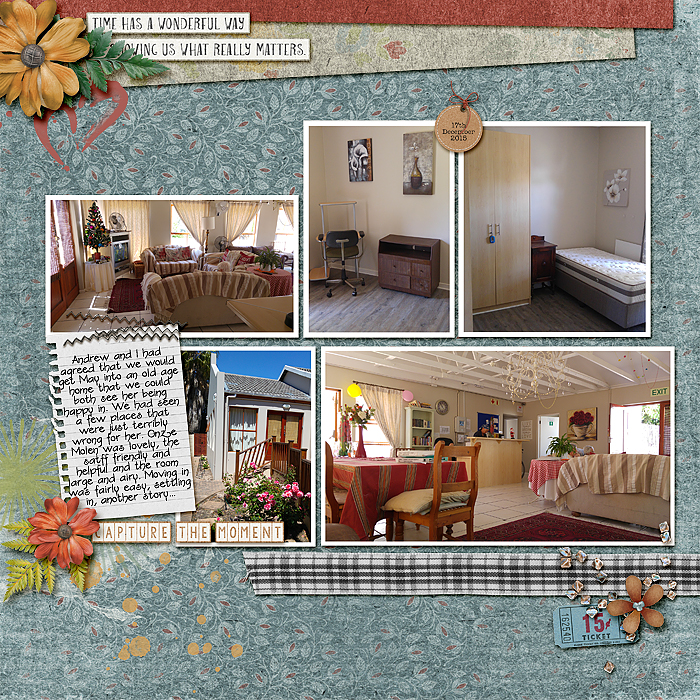
Stefanie Semple says, “After my Mother’s mini strokes, we had her living with us for a while, until we found a place that we could imagine her being happy in. Onze Molen was that place for us, but not yet really for her.”
“I find it easy to choose a variety of photos to tell my story. Here, a great mini print serves as a background. When choosing colors from the photos for a unified feel, I stick with one kit to decrease my choices and speed up my process. Here word art serves for title since the turmoil in my heart made coming up with a catchy title not easy or fun work.”
when your mastery is including several photos
Debbie Hodge says, “This page records an afternoon of mac-and-cheese cooking for my son and his friends.”
“I love including several photos on single page layouts, and I’ve mastered strategies for cropping and arrangement of the photos to lay out the story and still include room for title and journaling and embellishments. This page uses one of my favorite configurations: a row of smaller photos in the top half of the canvas and a larger photo clustered with journaling and title below. I usually divide the canvas background with two bands of paper: here a print and a solid.”
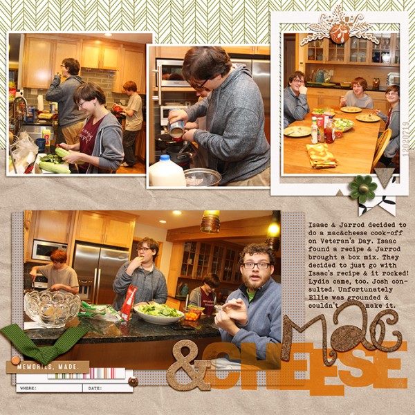
Mac & Cheese by Debbie Hodge | Artifact by Sara Gleason; Brad Bonanza by Patty Knox; Fall in Love Alpha by Amber LaBau; Stamped Alpha by Just Jaimee; Bohemian Typewriter font

