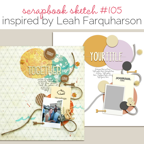
 This free scrapbook page sketch comes from a page made by Leah Farquharson for the Process Play class in the Get It Scrapped Membership, where members have access to a library of over 150 layered templates and page sketches, searchable by # of photos and layout type.
This sketch’s playful yet striking design is perfect for putting the spotlight on that one special photo, just like Leah did in her page Together (pictured below).
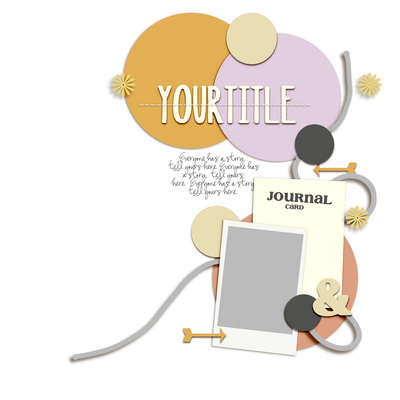
Sketch and Layered Template made by Amy Kingsford based on a layout by Leah Farquharson for Masterful Scrapbook Design Process Play.
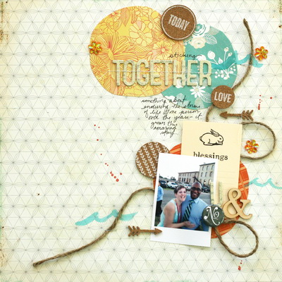
Leah says, “I began this page with one of my current favorite photos. It’s a quick snap of my husband and me taken by my brother at a wedding we all attended together (like most people, we don’t have nearly enough photos of the two of us!). The process here is really the one I use on a majority of my pages. The photo and its story drive how I determine the composition, materials, and embellishments. A lot of the work on a layout is determined by how I feel when I’m going over the story in my mind.”
download template and previews
Get over 150 more sketches and templates with a GIS membership
[hr]
More inspiration…
Looking for more examples of how you might use this sketch/template to inspire your next page? Here are a few inspired pages from our Get It Scrapped Creative Team.
Summer Christiansen says, “I liked that this sketch was tight but also had smaller clusters within its design. The page is about a brother’s love for his little sister. This sketch challenged me to use more product on my page then I typically would, thus creating a look that was my style but with more more color and product than usual.”
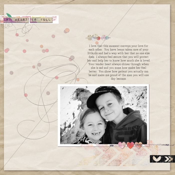
My Heart is Full by Summer Christiansen | SUPPLIES: Captivated Visions My Heart Is Full kit, and Process Play Sketch (Members Gallery templates).
[hr]
Margareta Carlsson says, “This sketch is so fun with all the different shapes and the flowing design. My page is about the advantages of having a best friend who is also a foodie. I added washi tape and stamping on the edges to balance and emphasize. Instead of the twine shown in the sketch, I used enamel dots and gems to make a kind of trail.”
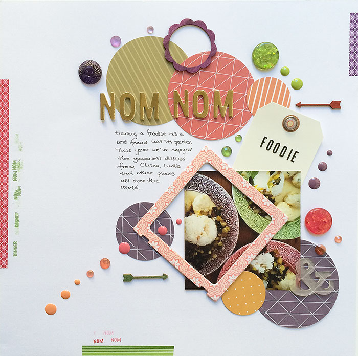
Nom Nom by Margareta Carlsson | Supplies: Title letters: Pink Paislee Citrus Bliss Gold Foil Bliss American Crafts Thickers; Alpha: Studio Calico kit exclusives; Tag: Studio Calico; Brad: Basic Grey; Chipboard frame: Crate Paper Maggie Holmes Open Book; Enamel dots and gems: Studio Calico; Acrylic ampersand shape: WRMK; Resin accents: Webster’s Pages; Wood veneer: Studio Calico; Inks: Color Theory from Studio Calico; Washi tapes: No specific brand; Roller word stamp: Studio Calico Brimfield PL kit. Patterned paper punched circles: Studio Calico 6×6 Dots & Stripes paper pad.
[hr]
Jennifer Kellogg says, “This page is about my nephew’s first birthday. The first thing I thought of when I saw the sketch was birthday because the large circles reminded me of balloons. I also knew exactly which kit I was going to use. The paper flowers in this kit were perfect for the circles in the design. I tried to work in the string from the original design, but I couldn’t find an element in the kit that would work. It doesn’t matter what inspires you with a sketch – if you are inspired go with it!”
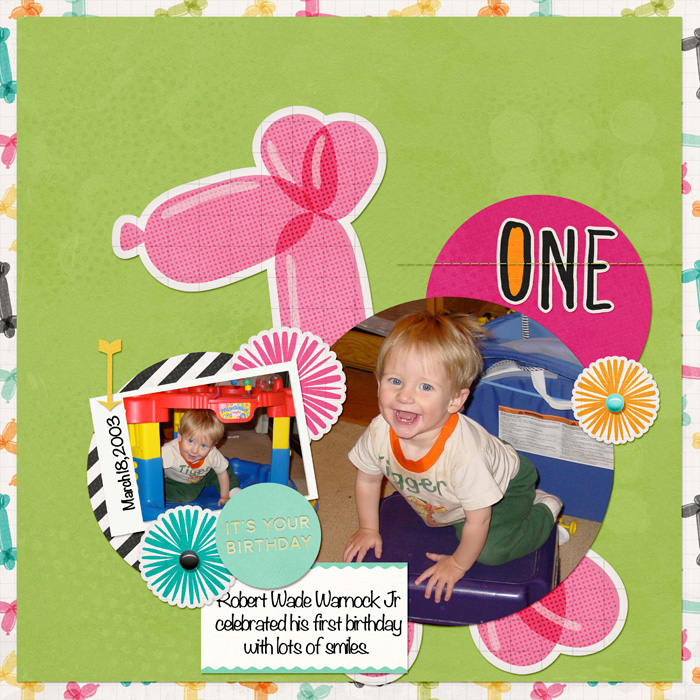
Robbie at One by Jennifer Kellogg | Supplies: MSD Template by Leah Farquharson: Process Play; Scotty Girl Designs: Party Animals Kit; Font: Noteworthy.
[hr]
Sue Althouse says, “This page is about my life-long love of cats. I was drawn to this sketch because of the white space, circle shapes, and the way the journaling was tucked into the layout. The sketch got me working outside my comfort zone. I used one very small photo and no patterned paper, which are not my usual choices. I dove into my embellishment stash for items that would give my page color and texture; selecting doilies, stitching, flair, wood veneer and buttons.”
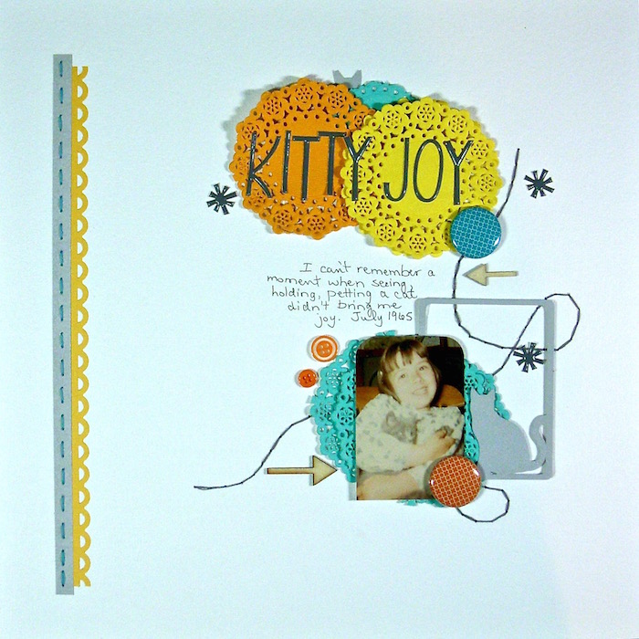
Kitty Joy by Sue Althouse | Supplies: Cardstock: Bazzill; Border Punch: Fiskars; Silhouette Die Cuts: Cat Silhouette Journaling Card; Alphabets, Stickers: American Crafts; Floss: We R Memory Keepers; Buttons: Queen & Co.; Flair: A Flair for Buttons; Wood Veneer: Studio Calico; Paper Doilies: Doodlebug

