 Tension is an important element in making something beautiful, including scrapbook layout designs. Including an unexpected juxtaposition is one way to create tension. Creative Team member Karen Poirier-Brode reported on trends last year after attending a Pantone Trend webinar and one of the upcoming trends had to do with juxtapositions, things like “spiky hair with formal wear” or “concrete worked into embroidery.”
We challenged the Get It Scrapped creative team to make page with unexpected technique and product juxtapositions, and they share these layouts here.
[hr]
Marcia Fortunato says, “This layout is about the somewhat craziness in my life over the past several months as I juggle time between our two homes, which are over 750 miles apart.”
“I wanted to symbolize the craziness and chaos amidst a very positive change. I used a formal band design with black-and-white photos and papers and juxtaposed those with a chaotic, colorful background. The use of black-and-white photos opens up the range of colors that will work, and makes it easier to combine a wildly colorful background with photos and journaling.”
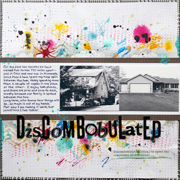
Discombobulated by Marcia Fortunato | Supplies: Patterned Paper: Studio Calico, Simple Stories, Echo Park; Letter stickers: Thickers (American Crafts); Inks: Speedball Acrylic Inks, FW Acrylic Ink (Daler-Rowney), FW Pearlescent (Daler-Rowney), Glimmer Mist (Tattered Angels), Color Theory mist (Studio Calico), Hero Arts; Stamps: Scrappy Cat, Glitz; Pen: Zig Photo Signature (EK Success).
[hr]
Audrey Tan says, “This page is about a onesie that I bought for my son on his birthday. I chose the particular onesie as I liked the design but later found out that it belonged to a cartoon character, Jake the Dog in Adventure Time. My son loves it and wears it all the time.”
“In creating this page, I likened the clothing’s character to that of superhero garb, and so included superhero images on this page. I applied artsy techniques to juxtapose against the superheroes. Hence, the background is an artsy paper with digital transfers applied. A fun little addition is the mask layered over my son’s eyes–it amps up the superhero theme.”
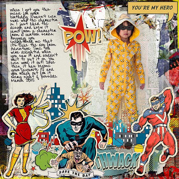
You’re My Hero by Audrey Tan |Supplies: Anna Aspnes: ArtPlay Palette Metro Graffiti; Stolen Moment Designs: Sidekick Optional; Traci Reed: Heroic; Font: Pea Alicia Script
[hr]
Devra Hunt says, “Our dog seemed to think that something was wrong because my son fell asleep on the couch. He slept facing my son the whole time.”
“The subjects in the photo are sleeping. It is a low energy photo with only neutrals as color. I decided on a high energy design as juxtaposition, a complete opposite of what the photo is saying. First I hand stitched a burst. I used bright, warm colors of ink over boldly shaped stencils to fill in the burst. I also used a superpower speech bubble stamp inside some of the rays of the burst. I repeated the speech bubble elsewhere, using wood embellishments. Lastly, I used a funny, energetic quote from the movie Ferris Bueller’s Day Off.”
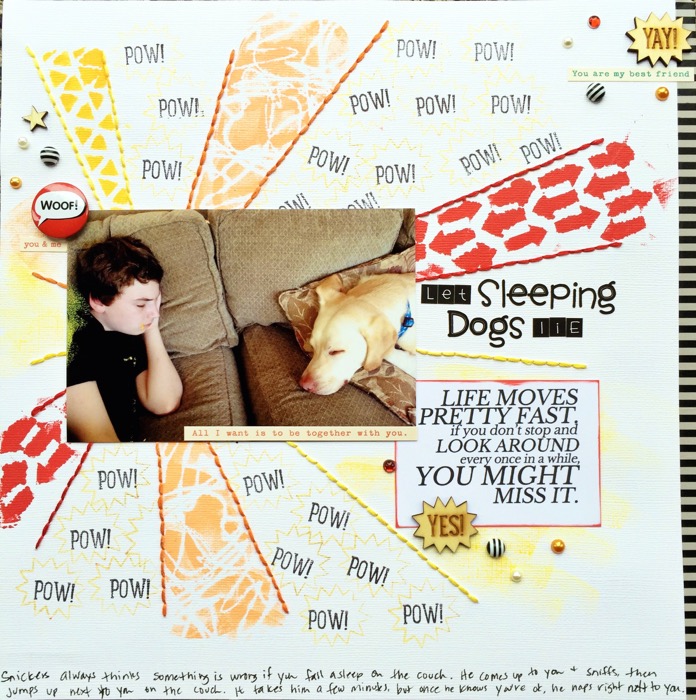
Let Sleeping Dogs Lie by Devra Hunt | Supplies: Cardstock-American Crafts, stitch template-Bazzill, thread-DMC, ink-VersaMark, stencils-The Crafter’s Workshop, stamps & wood pieces-Freckled Fawn, sentiment stickers-Cosmo Cricket, flair & bling-Queen & Co, washy-bella Blvd, Alpha-DoodlebugDesigns, , printable quote-Paper Issues, adhesive & pen-EK Success
[hr]
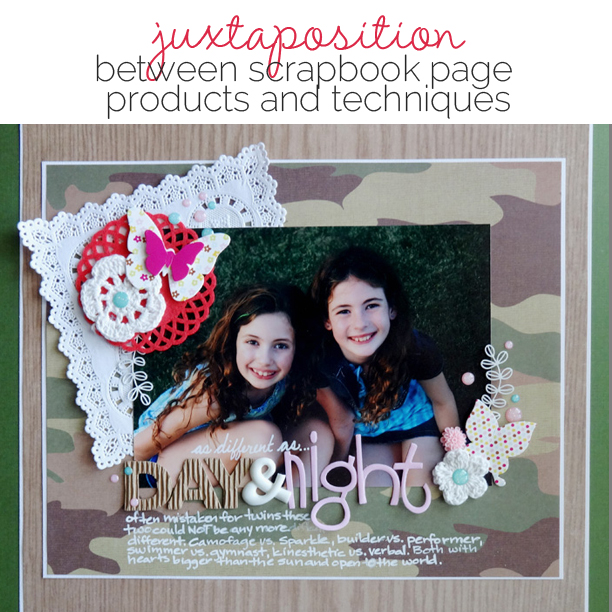
Michelle Houghton says, “This layout features a photo of my two beautiful daughters, and it shows how similar they are physically these days. I created a juxtaposition with the supplies by using wood grain and camouflage paper under lacy doilies and sparkles to represent how different my girls are in personality.”
“Try keeping one of your products more neutral in color. That allows for a lot of play with varying theme and color in other areas of your page. My wood and camouflage papers, although carrying a strong theme, are neutral enough in color that they make a great base for all sorts of other colors and possible themes.”
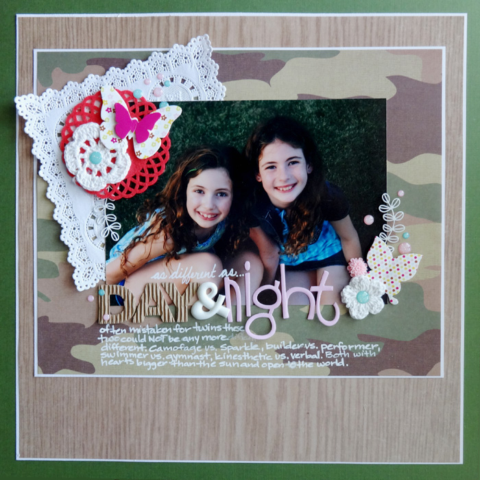
Day and Night by Michelle Houghton | supplies: cad stock; Colorbok, patterned paper; Recollections, crochet flowers; SEI, acrylic flower; Studio Calico, butterflies; American Crafts, felt and paper doily, ampersand, vine, glitter dots; Freckled Fawn, pink letters; Bella Blvd., corrugated letters; Pebbles, ink; Sharpie
[hr]
Amy Kingsford says, “This page features a few fun closeups from a friend’s wedding and tells the story of a bride and groom who chose to let a little bit of their style shine through on their special day.”
“I mixed soft watercolors and florals in muted spring tones with bold tribal motifs rendered mostly in black and white ink. The photos are mostly black-and-white, with small bits selectively left in color. This and a richly layered design tie everything together. This juxtaposition in motif was a great fit for this story.”
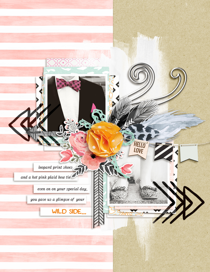
Wild Side by Amy Kingsford | Supplies: Sahin Designs: Fearless Papers and Elements, Love Letter, Journaling Templates; Hungry Jpg: The Floral Bundle; Cocoa Mint: The Wildreness Mega Pack; Digital Press Creations: Create Your Own Arrows; Web Villa: Floral Compositions; So Nice: Hand Drawn Tribal Pack; Font: Convoy, Dubiel

