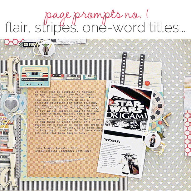
 This is the first in a series here at Get It Scrapped in which our team makes scrapbook pages from prompts that require certain products or approaches.
Research suggests that limits can boost your creativity because they push you out of your comfort zone. Dr. Seuss wrote Green Eggs and Ham on a bet that he couldn’t write a book with only 50 words.
Let’s see what you create when part of your process is prescribed.
the prompts
Your page must include:
- 2 (two) square photos
- At least 3 (three) pieces of flair
- Striped patterned paper
- A one-word title
inspiration (aka, it’s been done before)
These Get It Scrapped articles show you how others have used individual ingredients from the prompts on scrapbook pages. Of course, you’ll be going farther with all 4 ingredients.
- Designing Scrapbook Pages with Square Photos: Stable But Not Boring
- 7 Ideas for Adding Attitude to your Scrapbook Pages with Trendy Flair
- Scrapbooking Ideas for Using Striped Patterned Paper to Evoke a Mood
- Ideas for Using Short Titles on Scrapbook Pages
the GIS Creative Team takes the challenge
Sian Fair says, “I bought my brother a Star Wars Origami book for Christmas, but it was too heavy for him to take back home in his suitcase, so now I’m wondering if I could do some paper folding.”
“Working with the prompted ingredients reminded me that a prompt is simply that: it’s a way of getting started, not a complete list of rules. So, yes, I used the list, but looking for the striped paper led me to another collection of papers which gave me the retro look I was after and I was able to add those in. It’s a jumping off point.”
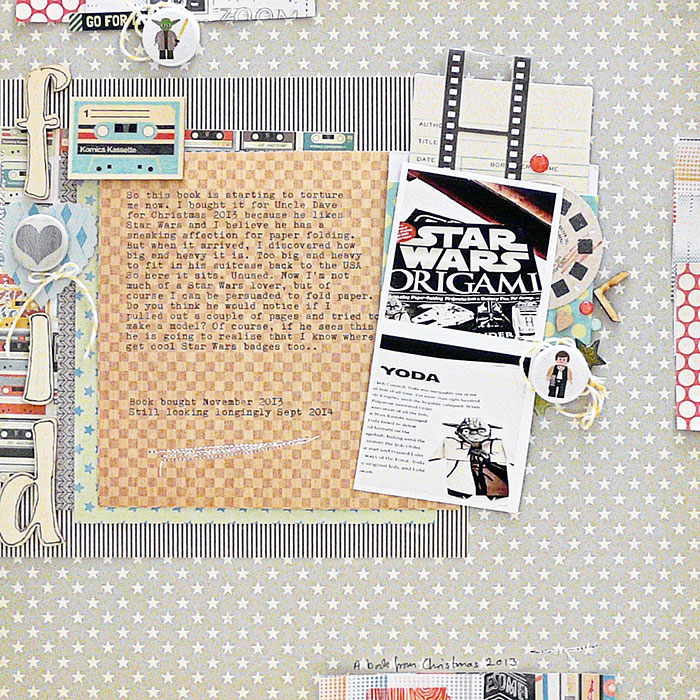
Fold by Sian Fair | Supplies: Patterned Paper: October Afternoon, Crate Paper; Alpha: Pink Paislee; Flair: A Flair For Buttons; Library Pocket: Fancy Pants; Stickers: Crate paper; Diecuts: Shimelle for American Crafts; Glitter dots: Freckled Fawn
Ronnie Crowley says, “The page is about a service project my daughter took part in at college recently. The alpha used has strong lines which are replicated in the use of the two patterned papers especially the darked striped one. This provides cohesion to the layout.”
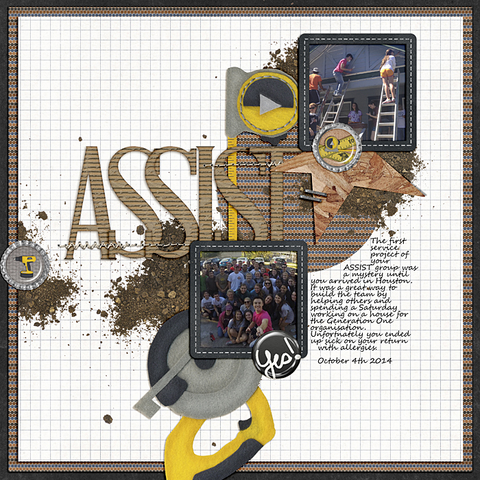
Assist by Ronnie Crowley | Supplies: Studio Basic – Just Another Alpha Pack IV; Chelle Creations – Under Construction; Just Jaimee – Sunkissed, Story Tellers Feb14; Simply Tiffany Studios – 52 template
Marcia Fortunato says, “I recently bought a dehydrator to deal with the abundance of apples on our trees. This layout is about one of my favorite things to make: apple chips.”
“The three pieces of flair that I had to work with seemed quite large in comparison to the photos and other elements on the page. To soften their look and keep them as embellishments rather than focal points, I chose one piece of flair that blended into the background a bit, and I used another as a letter in my title, then balanced them with similar but smaller stamped elements on the page.”
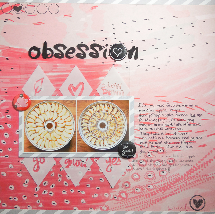
Obsession by Marcia Fortunato | Supplies: Patterned Paper: Ashley G for Studio Calico, Studio Calico; Screen print: Studio Calico; Letter stickers: Amy Tangerine Thickers (American Crafts); Flair buttons: American Crafts, Studio Calico; Stamps: Studio Calico; Ink: Memento (Tsukineko); Pens/Markers: LePen (Marvy), Gelly Roll (Sakura).
Stefanie Semple says, “I saw one of our cats sleeping on my daughter’s bed and thought how beautiful her eyes looked against the green bedding and decided to pose the pink panther with her.”
“I love the yellow emoticon flairs for the dimension and fun they add to my layout, the one word tone on tone title pops with the addition of the camera flair to dot the ‘I’.”
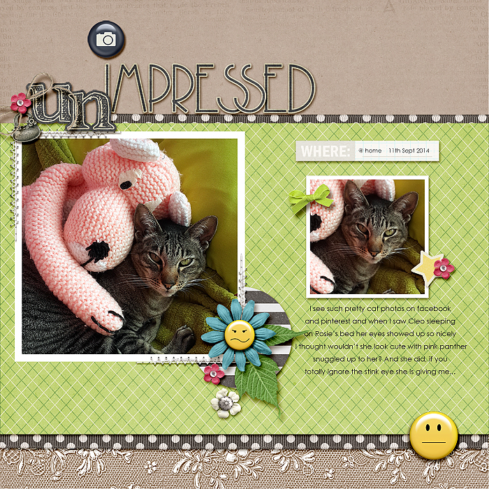
Unimpressed by Stefanie Semple | Supplies: Sugarplum Paperie : Maths in my jammies (kit); Sara Gleason: We are storytellers (date label); Britt-ish Designs : Tack it down (stitching); Anita Designs: Some flairs volume 2 (yellow flairs); Aida Scrap : Purse charms; Bella Gypsy : camera flair; Kimeric Kreation’s : Cream alpha from Autumn Nocturn kit.
Now it’s your turn. If you take this prompted challenge, share in our gallery and/or link us up below.

