 While the expected goal of making a scrapbook page is to get photos presented and stories recorded, there’s lots of creative satisfaction to be had in working with new and trendy scrapbooking product. Product can even be the spur that gets you inspired to make a page. Check out 7 approaches for piling on new and trendy pieces while keeping the story in the forefront.
write and add your journaling before the trendy product
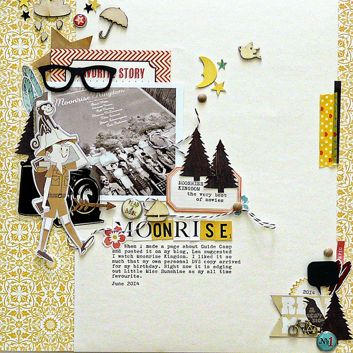
Moonrise by Sian Fair Supplies: Patterned Paper: October Afternoon; alpha, stickers, labels, journaling card and brads all October Afternoon; kraft star sticker: Studio Calico; Camera transparency: Maya Road; moon and stars: Martha Stewart punch; feather stickers: Pretty Little Studio
Sian Fair says, “This is a page about my discovery of a new favourite movie: Moonrise Kingdom”
“I’ve been waiting a long time for this Public Library October Afternoon collection to appear, so I piled on as much of it as I dared and combined it with feathers, wood veneer (especially the glasses!) and washi tape. I think the best way to make sure the story is there is to add the journaling first. I did this by typing my story up on a fresh 8.5×11 page first before I added any embellishment. That way I wasn’t going to add too many embellishments and have no space left for the words.”[hr]
use color to unite a profusion of product
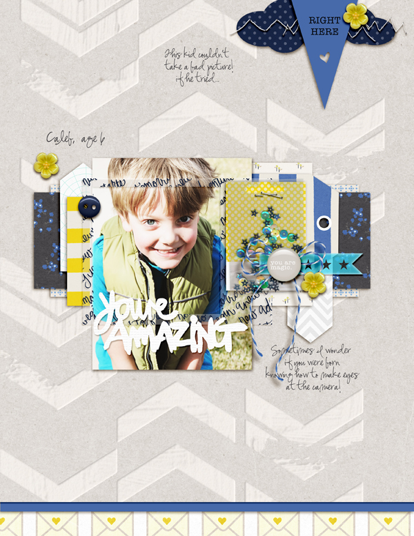
You Are Amazing by Amy Kingsford | Supplies: Paislee Press: Say Yes Collection; Just Jaimee: Cerulean; Sahlin Studio: P.S. I Love You; One Little Bird: This Magic Moment; iHeartStudio: Child Phrases; Southern Serenity: Poppy.
Amy Kingsford says, “This page is about appreciating my son for his photogenic qualities. When I took this photo he was wearing a puffy vest that is two sizes too small for him and gloves on his feet, but the way he looks into the camera you would never know that this was a completely spontaneous photo.”
“I love playing with trends, and finding a way to make them work with my style and story. Here I’ve used trendy chevrons, stripes, die cuts, flair and sequins.”
“I often use a lot of product on my pages, and I have several approaches for keeping the focus where it belongs. Here, I used color as the glue that holds everything together, pulling product from several kits but only in the colors matched for my scheme.”[hr]
get the story-essential pieces on the page and then pile on the trendy
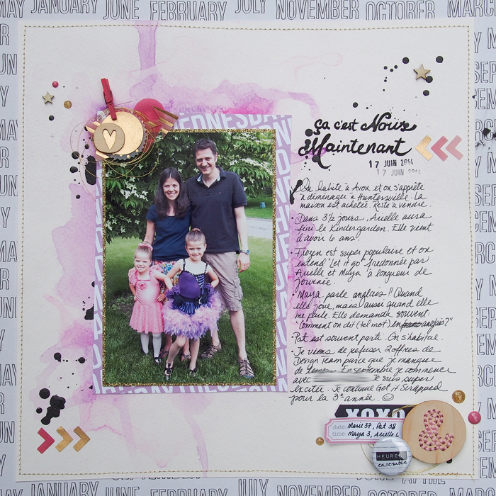
Us Right Now by Marie-Pierre Capistran | Supplies by Studio Calico.
Marie-Pierre Capistran says, “This is a page about where my family is at right now.”
“There are lots of trendy elements here: the watercolor background, gold elements, mini wooden clothes pin, script title, drops of India ink, chevrons, flair and wooden button with embroidery.”
“On my pages, the story always occupies a lot of space. I plan my page with all I want to say in mind and I then build around it. This way, what is important for me is always taken care of first, and then I can just play with all the elements I love, trendy or not, and have fun.”[hr]
pile on the product by making sure it all supports your story
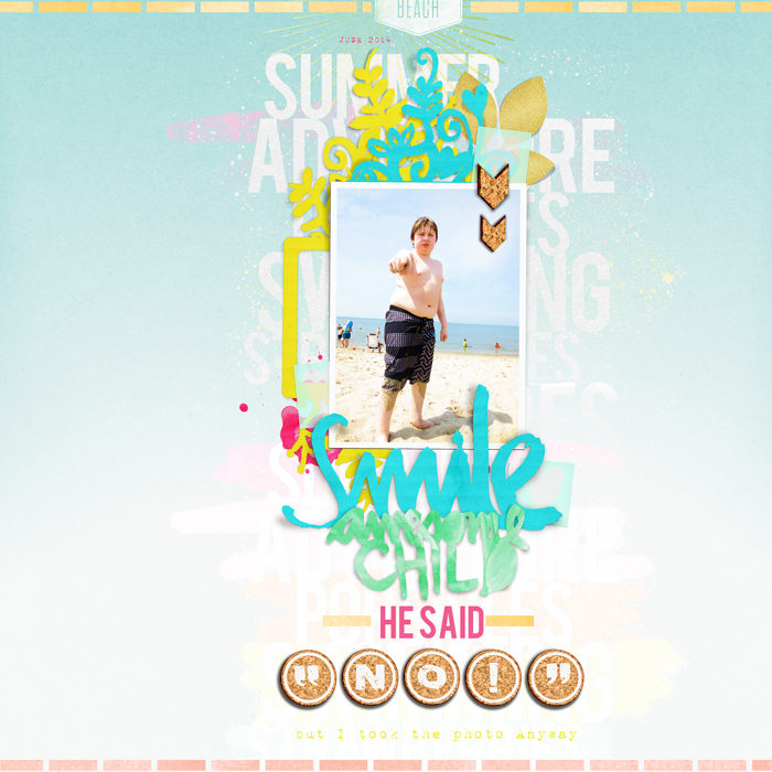
Smile Awesome Child by Carrie Arick | Just Jaimee: Storyteller Collection- July 2014; Heather Joyce: Alpha; Down the Road Designs: Star Quality; Creashens: Summerific Elements; iHeart Studio: Grunge Frames, Friends, Child Phrases; One Little Bird: Guppy Papers & Elements; Heather T: Love Spoken Here Elements; Fonts: Bebas Regular. 1942 Report
Carrie Arick says, “This page documents my son’s unwillingness to smile for his camera-happy mom at the beach.”
“I started with a pastel ombre paper, pairing it with currently on-trend neon colors. I used PNG versions of Silhouette cut files in a trendy brush style. I used cork for embellishing and my journaling/title. I finished the page off with light, trendy gold and vellum accents.”
“I find it’s easy to use trends as long as they support your story. For instance, here the cut files, vellum and colors support the whimsical, loving nature of the story while the cork adds the warmth and texture of a beach. Using a simple design (like a band foundation) lets the trendy items work to create a clear story.”[hr]
combine the trendy with the timeless
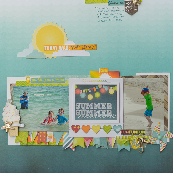
Summer Summer by Kristy T| Supplies: Patterned Paper: Bo Bunny- Lemonade Stand; Paper Embellishments: Bo Bunny – Lemonade Stand; Stickers: Bo Bunny – Lemonade Stand; Pen: Distress Marker; Adhesive: Glossy Accents; Metal embellishments: Unknown; Twine: Jillibean Soup; Enamel Dot: Prima; Washi Tape: Becky Higgins/Project Life.
Kristy T says, “This layout is symbolic of many trips to the beach in Albany whenever we are on holidays in the summer.”
“I used a recent collection of papers, embellishments and stickers. I combined on-trend items (metal embellishments, Washi tape, geotag and enamel dots) with the timeless heart motif. Lots of currently trendy products include text that can be used as page title and as short journaling bits to support the story and set mood.”[hr]
choose and place products to create repetitons with variety
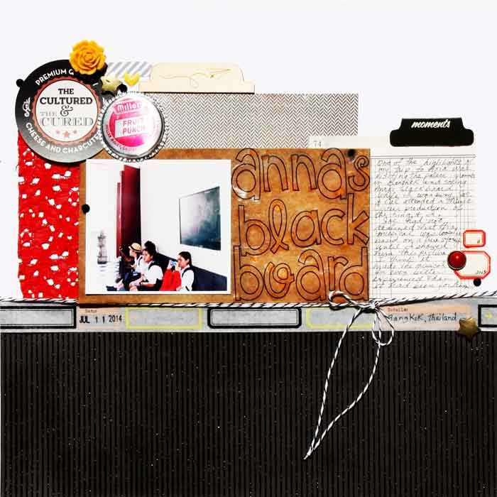
Anna’s Blackboard by Karen Poirier-Brode | Supplies: stash: White cardstock, patterned paper, glitter lace fabric, Black/white Baker’s twine, red brad; local business card – ephemera, Jenni Bowlin: bottle cap, labels, ledger paper
Freckled Fawn: June kit – metal stars, transparency alphabet die cuts, washi tape, May kit – resin flower, April kit – black bling, stamp ; Cocoa Daisy: May Kit – wood veneer, April Kit – Doodlebug sprinkles ; Tim Holtz, Idea-ology: glassine envelope, Staz-On: black ink, American Crafts: pen; Pink Paislee – Portfolio photo tab; Sparco – date stamp
Karen Poirier-Brode says, “This page is about visiting Anna’s blackboard in the palace of Thailand (Siam).”
“I paged through Vogue magazine and saw that red lace is popular and that lace with masculine fabrics is very au courant. Black and white are also on trend. To get my trendy look I used yellow and red with black and white neutrals, and masculine elements like pinstripes, herringbone and office supplies.”
“Using a simple color scheme and solid design techniques like incorporating repetitions with variety lets me use more stuff and still keep the design simple and clear.”[hr]
choose one trendy product to start and let it drive the reset of your choices
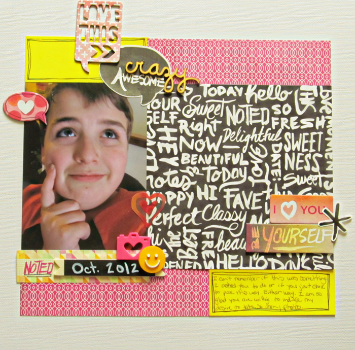
Be Yourself by Christy Strickler |Supplies Cardstock: Bazzill; Patterned Paper, Die Cuts, Chipboard: Basic Grey;Acrylic: Freckled Fawn; Wood Veneer: Freckled Fawn. Basic Grey;Other: permanent chalk marker
Christy Strickler says, “I captured a photo of my son in a silly pose.”
“I used several on-trend pieces including chalkboard-style elements, patterned paper with a brush script, speech bubbles and neon.”
“When using trendy materials, I choose one to start with and then begin compiling the rest of my supplies. Here, I started with the brush-script patterned paper. I chose most of my embellishments and supporting patterned paper from the same collection.”[hr]
More ideas for working with new and trendy product
We’ve tackled this topic in-depth in 3 recent membership classes:
- In Process Play you can see 8 teachers take on a number of page drivers and starting with product is one of those drivers. Teachers are Kim Watson, Lynn Grieveson, Sue Althouse, Leah Farquharson, Carrie Arick, Debbie Hodge, Amy Kingsford, and Tami Taylor. Class includes 8 layered templates for Photoshop.
- In Product Play, 8 teachers cover a whole bunch of product-related topics, including showing you how to pile on the “new and trendy” and still keep story front and center. Teachers are Doris Sander, Corrie Jones, Celeste Smith, Amber Ries, Cindy Liebel, Debbie Hodge, Amy Kingsford, and Tami Taylor. Class includes 8 layered templates for Photoshop.
- Finally, in Scrapbook Coach Product Play, Debbie Hodge presents 4 video tutorials with 2 of these showing you step-by-step how to place lots and lots of product on the page. A membership is packed with ideas and how-tos and is the best way to support all the free content at Get It Scrapped. Class includes 4 layered templates for Photoshop.

