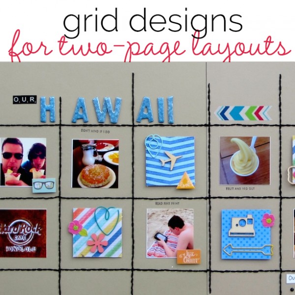
 The grid foundation is one of several layout configurations scrapbookers use again and again when making scrapbook page designs. We’ve shared ideas for single page layouts using the grid foundation. Here, we’ve got ideas for putting those foundations to work on two-pagers.
define a grid with stitching lines
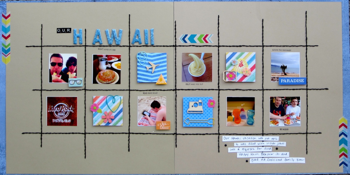
Our Hawaii by Devra Hunt | supplies: Paper-Basic Grey, Simple Stories, BoBunny, Paper Accents, Thread-DMC, Wood veneer-Citrus Twist Kits, Studio Calico, Recollections, Paper Clips-Freckled Fawn, Stickers-Simple Stories, Jolee’s, Freckled Fawn, ink-Memento, Washi Tape-Recollections, Stamp-Kate Spade, Alphas-American Crafts, Glitz Design
Devra Hunt says, “This is a week-in-review of some silly things from our recent vacation in Hawaii. The grid design works well for displaying individual events within the bigger trip. Each element is in its own square, and stands on its own as well as being a part of the bigger whole.” [hr]
make a grid of rectangles with rounded corners
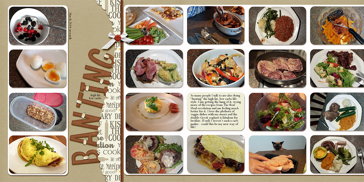
Banting by Stefanie Semple. Supplies: Delicious Designs : Scalloped curved Edge, Chelle’s Creations : Chillin n’ Grillin, Pixel Gypsy: What’s cooking?
Stefanie Semple says, “I’ve started a new diet and have been taking photos of my food. This double-page features meals I’ve had–with breakfasts in a column on the left and main meals in a grid on the right. I used a curvy scallop shape to divide the layout visually and to work with the subject of losing weight by virtue of its interesting, almost feminine, shape. Because there are a lot of different and colorful photos, I kept my embellishment to a minimum and only decorated the title.” [hr]
design with a grid filling a horiztontal band
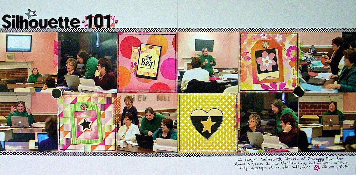
Silhouette 101 by Sue Althouse | Supplies: Cardstock: Bazzill; Patterned Paper, Stickers, Brads, Wood Die Cuts, Photo Frames, Tape Strips: Basic Grey; Alphabet: American Crafts; Ink: Jenni Bowlin; Floss: We R Memory Keepers
Sue Althouse says, “This page is about teaching Silhouette classes at my local scrapbook store. Establishing a pleasing and logical flow is the key to a successful 2-page grid design. To that end here, first the photos are placed so that no one is looking off the page. Then the title and journaling create a diagonal flow from upper left to lower right, spanning both pages. Finally, the embellishments flow in a zigzag fashion to help the eye move up and down both rows in the grid.”[hr]
get a quilted look by dividing a grid’s squares into triangles
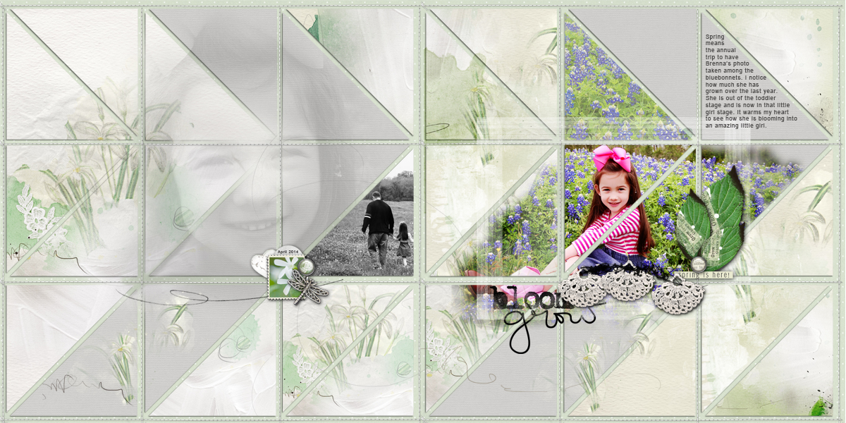
Bloom and Grow created by Terry Billman| Anna Aspnes: Art Play Palette Spring Due, Art Play Palette Elegance, Artsy Kardz 6 X 6 Spring Due, Straight Line Stitched White 1, Art Play Palette Christmas Magic, Art Play Palette Easter Bunny, Spring Word Art 1, Art Play Palette Infatuate, Art Play Palette Skys the Limit, Art Play Palette Great Outdoors; Amy Martin: Project Grids 6
Terry Billman says, “Every spring, my daughter-in-law photographs Brenna among the blue bonnets and these photos are from that shoot.”
“This layout shows how a grid design doesn’t have to be boxy–how it can be the foundation for a creative and harmonious layout. This two-page layout has eighteen same-sized squares each divided into two triangles. I created movement by clipping a solid light gray paper to selected triangles forming an arrow directing the eye from left to right. I varied the intensity of the photos to create movement. A blended black-and-white photo is on the left with the focal photo in color on the right.” [hr]
get a gallery look with matted rectangles and decorative lines below
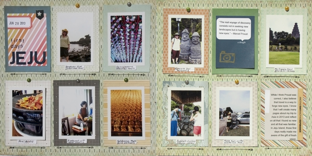
First Days Jeju by Karen Poirier-Brode| Supplies:Patterned Paper: crate paper(Peppermint) and Basic Grey(Carte Postale);; Ink:Ranger, Tim Holtz Distress (tumbled glass), StazOn (Jet Black); Journal Strips: Basic Grey: Basics (trims); Pilot: Pen (G2); Font: Arial; Adhesive: Scrapbook Adhesives; Cocoa Daisy Kits: Ink: ColorBox Chalk (Yellow Ochre), Jillibean beanboard (thin chip alphas in navy), Freckled Fawn Kits: Freckled Fawn+Hero Arts stamp, OhDeerMe: puffy sticker, Pearl Stickers, Studio Calico Kit: NSD kit: journal cards, Shauna Noel: stamp, Color Theory: Alpha (Deja Blue)
Karen Poirier-Brode used a two-page grid design for vacation photos. She says, “I started this page by looking for ideas in contemporary grid design and settled on a design of 3″by 4″ portrait-oriented rectangles with thin double arrows below each. I love patterned paper and used a 6″ x 6” coordinated pad for each of the blocks. I added handwritten location details, stamping and small embellishments because I love texture and layers.”[hr]
arrange journal cards in columns but stagger the rows
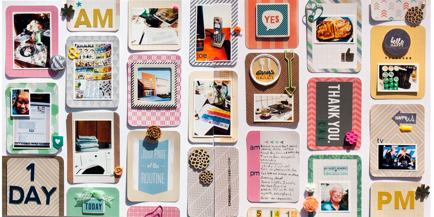
Day 1 by Karen Poirier-Brode | Supplies: Becky Higgins Project Life – Amy Tangerine Cut& Paste Edition, mini kit, Freckled Fawn – May Kit: Freckled Fawn + Hero Arts stamp set, washi tape, wood flowers, chipboard stickers, number rub-ons, pearl sticker, paper clip, resin flowers; April Kit: vellum alphabet sticker set, teal heart paper clip, gold resin asterisks, puffy sticker, Cocoa Daisy – May kit: Fancy Pants as you wish gold alpha stickers,Ki Memories self adhesive metal accent gold, Panda Eight exclusive flair, Evalicious tag set, April kit: Doodlebug sprinkles arrows – bumblebee yellow, Jillibean beanboard thin chip alphas in navy, Studio Calico – NSD Kit: stamp, tiny alpha deja blue stickers, EK Success – Image Tree: antique typewriter lowerabc stamp, Stash: badge, buttons, embroidery floss, ribbon, shoe paper clip, home made Perler bead enamel dot
Karen Poirier-Brode says, “What’s a traditional scrapper to do with a big stash of of pocket page journal cards? Use them to define compartments on a two-page grid design with defined columns–but no rows because of the staggering. There’s a little embellishment inspiration from Kim Watson here, and a little ‘pick-it-and-stick-it’ attitude from Katie Scott. It was fun way to document a day in my life.”
fill it up!
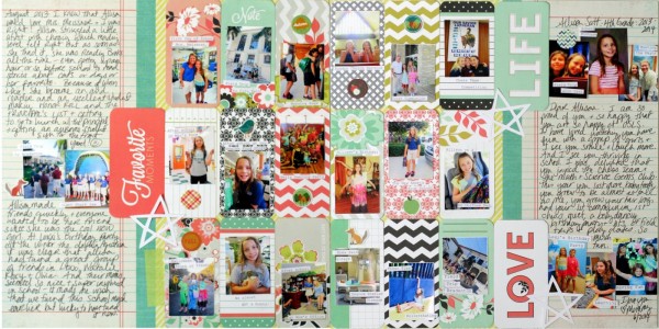
by Katie Scott | Supplies: Patterned paper and journaling cards by We R Memory Keepers; embellishments by American Crafts and Silhouette die cut.
Katie Scott says, “With this page, I wanted to sum up my daughter’s whole 4th grade year on a two page layout.”
“You can use journaling cards like these ones from We R Memory Keepers to help with the grid arrangement and as a resting place for your photos. (The cards are uniform and straight while the photos are all over the place).”

