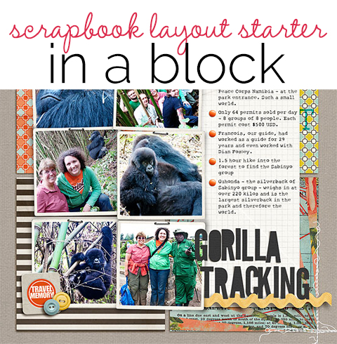
 Working with a starter foundation to begin a scrapbook layout is a good way to make pages more efficiently — and to complete pages that have a solid composition. The key is to use a starter foundation that’s a solid base for layout design. The “in-a-block” (or “on-a-block”) foundation is one of those solid bases.
This “in-a-block” composition is one in which all or most of your elements are arranged in a rectangular block. We challenged our Creative Team to make some “in-a-block” layouts. Check out the wide variety of pages they made, from layouts that are clearly “in a block” to those that start with a block and then get creative.
Learn more about block foundations (and design!) with the Scrapbook Coach “In A Block” class.
place your elements on a well-defined block mat
Stefanie Semple‘s red rectangular block makes a solid and high-contrast foundation for her page elements. It stands out from the patterned paper background and provides a border between that background and the map print that holds a cluster of photo + title + journaling.
Stefanie says, “We visited family in Germany and I was astounded that my hubby chose to join in and have sushi when he prefers chicken and veggies. My inner cluster includes an element that I layered to look like a sushi roll, with the black on the outside and an orange center. The clusters break the borders of the blocked foundation, adding visual tension.”
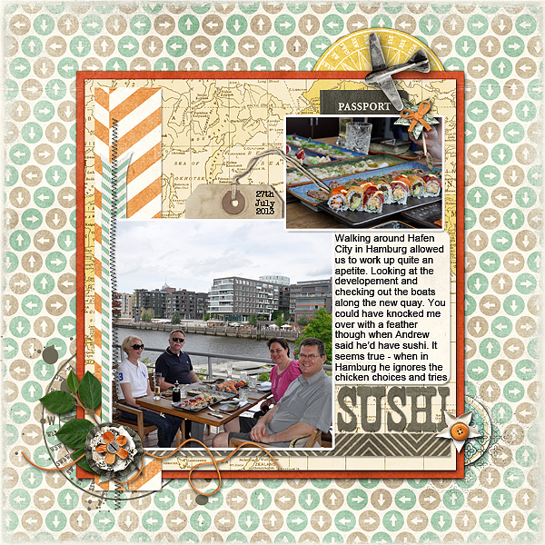
Sushi by Stefanie Semple | Supplies: Scrapyrus Designs – Explore (kit), inspired by Debbie Hodge’s ScrapBook Coach class – in a block.
Debbie Hodge arranged photos, title and journaling in two rows and two columns (the large photo spans both) and them placed them on a patterned paper block. Debbie says, “The result is a sense of a rectangular canvas within my larger square canvas. The shared block mat unites the elements and gives them a home on a page with generous white space.”
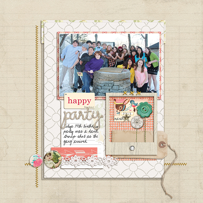
Happy Party by Debbie Hodge | Supplies: Victoria, Magpie, Playful Embellishment Set by Jenni Bowlin Digital; Noted by Celeste Knight; Peachy Transparencies by Karla Dudley; Torquay Elements by Kaye Winiecki; String Me Along Alpha by Zoe Pearn; Sitched by Anna Yellow by Anna Aspnes; Flossy Stitches Yellow by Katie Pertiet; Woodland by Jenn Barrette; Frolic by Traci Reed; World’s Best Dad, Family Edition Flair by Little Butterfly Wings; Stitched Flowers by Gennifer Bursett; Birthday Cake by Sahlin Studio; Pea XOXO, 1942 Report fonts
Kristy T used a light-blue mat on a white canvas as her first, foundational layer. She layered more blocks of patterned paper, photo, cute embellishments and journaling strips to create a cluster within that block. She tucked a scallop and smaller paper pieces beneath her block at top right and bottom left for interest.
Kristy says, “This layout is about my son at three months old and records some of things that I can remember about him at this age. I made my block with subtle tone-on-tone patterned papers so I could layer brighter elements over it and, thus, attention to my photo. I made sure to place elements to break the borders and add interesting dimension. The scalloped piece and the strips of paper on the opposite diagonal frame the block and keep the attention on my photo.”
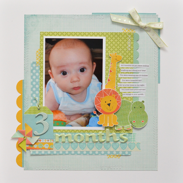
3 Months by Kristy T | Supplies: Card: Artee; Patterned Papers: Echo Park, Kaisercraft; Diecuts: Kaisercraft; Alphas: American Crafts; Washi Tape: Glitz Design, Teresa Collins; Embellishments: Kaisercraft; Ribbon: Unknown.
place your elements on a block made of layers
Debbie Hodge layered several rectangular elements (patterned paper blocks and a stamped chevron block) to create the foundation for “Summer Party. While pieces spill off, breaking borders and giving the piece a more casual feel than the layouts above, still the bulk of the page sits “on a block.”
Debbie says, ‘This photo is my favorite shot from my son’s 14th birthday party. I like how it shows friends chatting on shore, the drink table, and then a floating island full of kids beyond that. Adding the frame is one more dimensional elements that reminds me of the repoussoir challenge we gave our team last year.
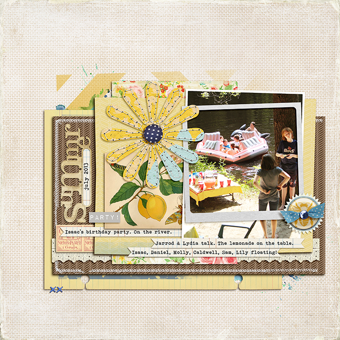
Summer Party by Debbie Hodge | Supplies: Stitched by Anna Borders, Distressed Edges, MYO FotoFrames by Anna Aspnes; Walt’s Parks by Scotty Girls; Giant Chevron Mask by Splendid Fiins; Daydream by Tracy Martin; In Distress by Lynn Grieveson; Oiselet Rouge by Katie Pertiet; Gone Squirrely by Little Butterfly Wings; Spring Sweetness by Just Jaimee; Mellow yellow by Karla Dudley; 2:30 by Amy Wolff; Sunshine ATC Emphemera by Tangie Baxter; Easy Living by Mye de Leon; Haven by Jenni Bowlin; Amelie, Bohemian Typewriter fonts.
place your elements on a block foundation and extend the block shape off the foundation piece
Debbie Hodge placed her elements (mostly) on a block defined by red, grid-print patterned paper. The strip of paper extending off the left edge and the journaling that sits below the block both extend and maintain the shape of a block.
Debbie says, “My son was really happy to get on the 3D Printing team at Tech Camp this summer. These photos are from the last day of camp, with him showing off the lego he designed and printed. I kept the edges of my journaling aligned with the sides of the block patterned paper block. The linear design is loosed up with embellishments and a vellum layer that break borders.”
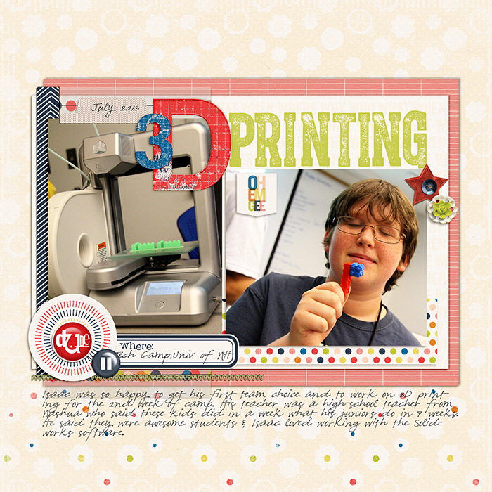
3D Printing by Debbie Hodge | Supplies: Beech Tree by Sara Gleason; At this Moment by One Little Bird; Snail Mail by Valerie Wibbens;Bohemian Typewriter font
Debbie Hodge placed most of her elements on a text-print block of patterned paper. The vertical strip of car print paper is separate from this larger block — and, yet, it extends and maintains the block shape first defined by the larger block. Adding this extra strip separate from the larger blocks adds just a bit of design interest and tension.
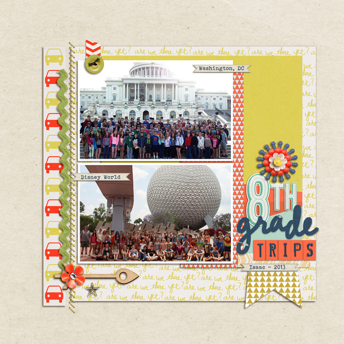
8th Grade Trips by Debbie Hodge | Road Trip by Paislee Press; Click by One Little Bird; Torquay Elements, Torquay Alpha by Kay Winiecki; Itsy Bitsy Alphas 2, Happy Hipster by Amy Wolff; Whip Stitching by Katie Pertiet; World’s Best Day by Little Butterfly Wings; My Hero by Mye de Leon; Word Labels by Anna Aspnes; Bits and Baubles by Ardent Sparrow; Amelie, Bohemian Typewriter font.
add free-form elements around a block of photos
Deborah Wagner organized her photos in a block with a strong underlying grid and then added embellishments and titlework around the block to give the design flow and organic lines.
Deborah says, “These are photos of my sister and her friends last Halloween. I used a digital template for the block and filled it with my photos. To break the borders and add interest, I placed word art and embellishments outside of the block.”
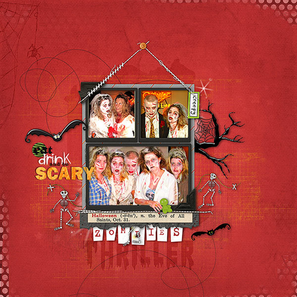
Zombies by Deborah Wagner. Supplies: The Lillypad and Oscraps – Hoppy Halloween Collaboration, Studio DD Layer Works No. 18; Alissa Jones Dam Fine Halloween; Katie Pertiet Little Snips Alpha, Water Washes No. 2, Haunted Twists No.1, Grungy Ledger Grids No.2, Star Glows, No. 1; Anna Aspnes ArtPlay Palette Monster
layer a blocked grouping of elements on top of a blocked grouping of patterned papers
Heather Awsumb grouped photos, journaling and title in rectangular block that she layered on a square block that’s made from four smaller patterned paper squares. Note: the arrangement of the photos + title + journaling is made using an underlying grid.
Heather says, “I wanted to record random, small facts from my experience gorilla tracking in Rwanda back in August 2010. I started with the challenge to layer a block on a block discussed by Doris Sander in her Masterful Scrapbook Design interview for the Grids and Blocks class.“
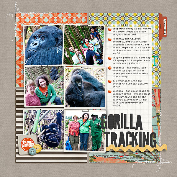
Gorilla Tracking by Heather Awsumb | Supplies: Naturally Krafty No 12, Done with Doilies Photo Clusters No 1, Cardstock Tabs No 2 by Katie Pertiet; You Are Here Paper Pack by Allison Pennington; Stay Tuned Kit by One Little Bird Designs; Elemental Snippy Alphas by Gennifer Bursett
Celeste Smith grouped her photo with journaling to create a small block that’s layered on a block made of patterned paper squares.
Celeste says, “This layout is about my youngest son returning to school and entering 4th grade. I created a block that’s a grid of patterned paper squares to back up my photo + journaling block. I added stitching to the blocks for texture.”

fourth grader by Celeste Smith | Supplies: Robyn Meierotto: Cut It Out Frames; Kaye Winiecki: Making the Grade kit; Kristen Cronin-Barrow & Zoe Pearn: Life Stories School kit; Sabrina Dupre: Hello School kit; Fonts: Underwood Champion and Baffled.
is it a band or a block?
When we talk about layout design and foundations, we identify patterns that work. We often give them names, talking about “clusters” and “bands” and “T” or “crossed” designs. There will be overlaps, though, because this is as much art as it is science (yep, the science of visual perception does influence how your viewer sees your creations).
Here’s an overlap: a canvas-spanning block is also a band, and that’s the design Susanne Brauer used here.
Susanne says, “This page is about an uncle who was a bit of a rascal, or so goes the family folklore. I wrote about his highly exaggerated exploits on the hidden card in the pocket below his picture. I know for certain that he took care of his mom in her old age, which made her happy. Still, with a smile like his, you can see why he might get away with more than he should. I built my block in a rectangle shape, starting with the photo and tucking the lucky flash card next to it. I split my title in two directions in gutters of about the same size and tied them together with the large ampersand. The rest of the block was filled with a pocket for the journal card and some other accents to complete a triangle of black round items. I broke the alignment in several spots to keep it from looking perfectly blocked.”

Racal by Susanne Brauer | Supplies: Pink Paislee and Authentique papers, CTMH Artbooking and Cricut Gypsy Cartridges, Studio Calico tissue tape, 7 Gypsies flash card and pocket, Stampin’ Up stamp, rest from my stash.
unite photos in a block that stands out on a complex background
Marcia Fortunato arranged 7 photos in a block, giving them the unity to stand out on a complex quilted background. Note: the arrangement of the photos is made using an underlying grid.
Marcia says, “This layout, showing pictures I took driving through the central United States, is about the beauty I find in those ‘fly-over states. The pieced-chevron background suggests rows of crops fading into the distance, and the strip of triangles is a flying geese quilt pattern, again supporting the concept of so-called fly-over states.”

Love those flyover states… by Marcia Fortunato | Supplies: Patterned paper: My Mind’s Eye, American Crafts, Echo Park; Cardstock: American Crafts; Vellum: Studio Calico; Alphabets: American Crafts (Thickers), Basic Grey; Embellishments: Basic Grey, October Afternoon, Studio Calico; Other: Sizzix (Tim Holtz die), EKSuccess (Photo Signature pen), Inkessentials (Pop-It Shapes), American Crafts adhesive.
layer a clustered grouping over an initial block foundation piece
Christy Strickler‘s first layer is a stamped rectangular block. Subsequent layers overlap it but are not contained by it.
Christy says, “At a cultural festival, my son had the opportunity to get a Polaroid picture taken of him with two tigers.
I began my block composition by rubbing ink over a 6×6 stencil. I layered my embellishments and photo over this structure, but felt the block was a little too heavy on the right side. I then stitched a larger rectangle to help balance the weight of the layout.”
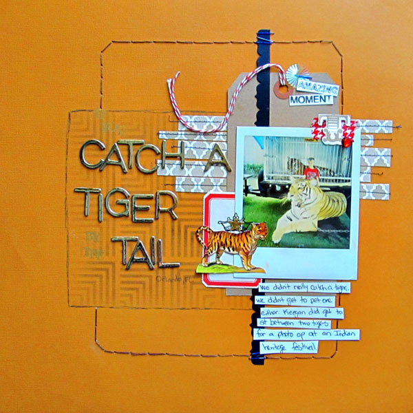
If You Catch a Tiger by the Tail by Christy Strickler | Supplies Cardstock: Colorbok; Border,Patterned Paper: Bazzill; Letters: Jenni Bowlin,American Crafts; Ink: Ranger; Stencil: Crafter’s Workshop; Stamp: Studio Calico; Sequin, Ephemera, Tape, Rub-on: Jenni Bowlin: Other Staples, Tag, Twine
Michelle Hernandez also found it hard to work within the block foundation. She started with a block of tan patterned paper but ended up layered more blocks to created a cluster with lots of angles.
Michelle says “I love this photo of my daughter. She stared at the camera without smiling or posing- it really captures her direct and independent personality. This is a page showcasing block design which I find incredibly challenging for some reason. I find I constantly want to break out of the square. I did that in this page by adding circle embellishments and putting the title in the bottom which softens the lines a bit. I really admire crafters who consistently rock this style- it’s all about attention to detail and good contrast ratios.”
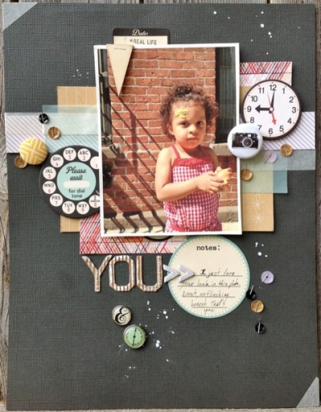
You by Michelle Hernandez | Supplies: Card stock: American Crafts; Printed chipboard and journaling spots: October Afternoon; Paper strips: Studio Calico;
Corrugated alphas: Pebbles; Brads: Crate Paper, Echo Park; Sequins: Studio Calico; Flair: A Flair For Buttons; Paint: Studio Calico.
define a block with element shapes and alignments
The combined shape of the elements on Debbie Hodge’s “Hello, Summer Campers” is roughly a rectangular block. Because of the Gestalt principle of closure, the viewer’s eye understands this grouping to be a block. Pay attention to alignments and the edges of journaling blocks to suggestion a four-cornered cluster. The imprecise edges break the borders here just as Stefanie’s elements extending off her precise red mat do in the first layout above.
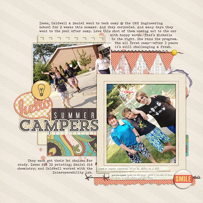
Hey Summer Campers by Debbie Hodge | Supplies: Happiness Within, Puzzled, The Good Stuff This Week Alpha by Mye de Leon; Fine Line Frames by Sugarplum Paperie; Happy Hipster by Amy Wolff; Defined Clilppings 4 by Katie Pertiet; Borders by Sahlin Studio; Coconut by Sara Gleason; Bohemian Typewriter font

