
 Embellish scrapbook pages with clusters and you’ve got a fun way to make both showy and simple additions. We shared 6 kinds of embellishment clusters in an earlier article — and one of those is the SERIES CLUSTER.
With a series cluster, line your embellishing bits up tidily or askew, put them on a straight line or place them along the outline of a shape. See six ways to make a series cluster below.
1. embellish with a simple series of a repeated element
Debbie Hodge embellished with a line of 5 small gold stars on “@ the Pool.” This bit of embellishment is not the most eye-catching part of the page, but it adds interest and continues the line started by the “life is good” sticker.
Debbie says, ‘This is a page is as much about my kids and their friends at the pool as it is about this particular pool which has an interesting history — and which may not be around next summer. I wanted to continue the line started by the ‘life is good’ sticker across the right column. The series of starts let me do that.”

@ the Pool by Debbie Hodge | Supplies: Transparencies Circles, Transparencies Chevron, My Hero, Puzzled, The Good Stuff This Week by Mye de Leon; Sal de Mar by Viva Artistry; In the Loop by One Little Bird; Defined Clippings 2 and 4, Flossy Stitches, Coastal by Katie Pertiet; Going Places by Ardent Sparrow; Vintage Postcards by Amy Stoeffel; Bare Necessities by Creashens; Head in the Clouds by Valerie Wibbens; Worn 8.5×11 Overlays by Lynn Grieveson; Mercury Script, Mercury Ornamental, Centuar fonts
Andrea used three shiny brads to ground her photo and add shine and dimension to this page.
Andrea says, “I wanted to celebrate the end of summer by scrapbooking a favorite photo from the season.” Three buttons lined up vertically ground the photo to the canvas, counterbalance the title work, and add shine and dimension.

Bloom by Andrea | Supplies: Anna Aspnes, ArtPlay Palette Bask, ArtPlay Palette Sun fun glow; Crystal Wilkerson, SVC Stitch.
2. make a series with like but not identical elements
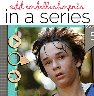
Ronnie Crowley used just three wood veneer arrows here but they add great interest to the page, drawing the eye to her focal point and adding appeal since each includes a circle along with the arrow shape–which is unexpected.
Ronnie says, “This layout is about how my son has made it to Varsity Cross Country Team and what the next goal is for race days.”
“I placed three wood veneer arrows along the edge of the focal-point photo in order to draw the eye directly to my son’s face. Arrows reinforce the theme of the layout since runners often follow arrows around the course.”

Race Day by Ronnie Crowley | Supplies: Karen Funk – Race Day; Patie Knox – Staple Its Clusters; Tracey Martin Designs – Sugar Town Veneers; A Wolff – Botanical; Sahlin Studio – Wood Veneer Arrows; Scrapping with Liz – Double Monthly Challenge Template
Rosann Santos-Elliott‘s series is a vertical line of word bits and stickers (all small rectangles of varying lengths) lined up at bottom right of the journaling block.
Rosann says, “My colleague weighs 100 lbs wet and is the biggest foodie you will ever meet. She announced that one of Bobby Flay’s restaurants was closing and that we must go eat there immediately. And so we did. AND we got to meet Bobby Flay himself.”
Rosann’s series is a vertical line of word bits and stickers (all small rectangles of varying lengths) lined up at bottom right of the journaling block. She also added an NYC-food-themed cluster. Of the cluster she says, “I wanted the cluster to say NYC and food. I included a cityscape, a geotag and a flair that says ‘be merry’ (as in eat, drink and be merry).”

Bye Bye Mesa by Rosann Santos-Elliott | Supplies:Simple Stories: Snap Life 6×6 pad; Amy Tangerine: Bits; Ormolu: Flairs; Studio Calico: Wood Veneers – Darling Dear; Basic Grey: Pyrus micro Mono alpha, Max and Whiskers micro mini alpha
3. mix and stack for an eclectic series
Debbie Hodge combined a variety of elements — most of them circular, but all of them different in motif and color for a funky addition to this page.
Debbie says, “This is a page from our summer trip to VanCouver, BC and includes several photos from the afternoon we spent in Gastown. To go with the funky sights there (Gassy Jack and the Steam Clock and a brightly color tourbus), I embellished with a couple of eclectic vertical series, using mostly round elements, stacking things up, and throwing in the flower and brad prongs for interest.”
“The layout composition is a ‘pieced’ design that I built around a strong horizontal line, adding photos above and below at the start and then building around them with title, journaling, papers, and embellishments. With this kind of composition, I often fill one of my ‘compartments’ with a series of embellishments as I’ve done here in two spots.”

Gastown by Debbie Hodge | Supplies: Uncle Gills Wallpaper Book by Tangie Baxter; Falala by Pink Reptile Designs; Pronuncial Alpha by Just Jaimee; Artist Edges, Artplay Palette No 9, Spiced Jewels by Anna Aspnes; Office Space by Gennifer Bursett; Arizona Autumn by Gina Cabrera; Clock Parts by Katie Pertiet; Bookworm by Little butterfly Wings; Ready by Pixel Gypsy
Ashley Horton added a mixed border of small elements below her photo in three colors that unite the colors of the page.
Ashley says, “I love photos of all three kids together, doing something they love. Watching the donuts being made at Krispy Kreme is definitely one of those moments!”
“I used an embellishment series to create a border below my photo. The border is a mixture of a shaped paper clip, buttons, a layered star, and a flair button. The colors from the embellishments in my series helped tie in all of the colors used on the page. I repeated the star shape from the paper clip with the layered star embellishment and the heart from the flair button on my die cut background.”

Happy Moments by Ashley Horton | Supplies: Patterned Paper: Carta Bella; Cardstock, Thickers & Layered Stars: American Crafts; Buttons & Sprinklers: October Afternoon; Flair Button: The Paper Bakery; Spray Mist: Studio Calico & Color Shine; Tags: Elle’s Studio; Enamel Dots: My Mind’s Eye; Stick Pin: Little Yellow Bicycle; Vellum: Fynmark; Star Paper Clip: Two Peas in a Bucket; Font: CK Cute; Other: Doilies
Audrey Tan added a variety-filled series along the left edge of her photo, choosing motifs and colors that complement the outfits worn by the women in the photo.
Audrey says, “This is about my group of friends wearing a traditional outfit to attend a Hari Raya celebration in Singapore. I used papers and embellishments that complement the colors of our costumes. A mixed series of embellishments (again chosen to complement the costumes) are placed to create a border along the photo edge.”

Friends Forever by Audrey Tan | Supplies: Julianna Kniepp: Woman In The Mirror, Learn & Grow, The Perfect Fan, All The Time; Font: Pea Angedawn
4. add a series with a curve (or follow a shape)
Lise Marianne Alsli used pearls from the pictured outing on her curved series bordering a circular photo. Her elements decrease in size as the curve progresses.
Lise says, “This page is about a really cold day in May when my husband, daughter, sister-in-law, her children, and my mother-in-law went out pearlhunting on a beach. The wind blew, the sea was freezing and we were so cold. After opening a lot of mussels, though, we found the cutest little pearls–and these pearls are a part of the page embellishing.”
“I placed embellishments in a curved series around the photo starting with the roses and continuing with half pearls and the pearls we found in the mussels. To create unity between the roses and the pearls I used a limited color scheme of blue and white. To capture the sense of the ice cold that day I used blue and white not only in the embellishments, but also throughout the layout.”

Pearlhunt by Lise Mariann Alsli | Supplies: patterned paper: Papirdesign; Alphabets: American Crafts (Thickers); Inks: Black pen, Staz on ink; Embellishments: Prima, Kaiser Kraft; Other: Selfhunted pearls.
Sian Fair added a series of three large handcrafted flowers, gathered as if in a bunch.
Sian says, “This page is about an unscheduled stop we made on a trip home from our holidays: we had left ourselves too much time to make our ferry connection, but that meant we had extra to enjoy free time along the road.”
“I wanted to give this page a rustic look, so I decided to make a series of three flowers from book pages. To stick with that idea, I used three photos and a three word title. I machined-stitched freehand circles before I placed my flowers on top, to ground them on the page and to add a bit of color and texture while keeping to a crafty, country feel.”

Stop, See, Slowly by Sian Fair | Supplies: Patterned Paper: Crate Paper; Alphas: American Crafts and Jillibean Soup; Embellishments: Stickers: October Afternoon and Studio Calico, chipboard camera: Studio Calico, button: October Afternoon
5. make a series with one motif in a variety of styles, sizes and colors
Celeste Smith used arrows galore — in different shapes, colors, and styles for great impact. The pointing finger is a great riff on the arrow motif.
Celeste says, “My boys are growing up and of course that brings a little struggle and confusion to the dynamic around here.”
“I placed a series of arrows on the left edge of the photo block. I used a variety arrow shapes, colors, and styles and interspersed a few brads to make the column of arrows feel a little less linear.”

These two by Celeste Smith | Supplies: Valorie Wibbens: A Bit Worn; Studio Basic & Pink Reptile Design Take Note kit; One Little Bird: How It Began kit; Alison Pennington: Away We Go elements, Pop Brads, They Keep Falling elements; Amy Wolfe: Labels; Gina Cabrera: Cork Elements; Echo Park: Note to Self kit; Mari Koeglenburg: Fresh Picks kit, Puddle Jumper kit; Micheline Martin: Trendy Tween kit; Karen Lewis: Snapshots Elements; Robyn Meierotto: In Stitches Neutrals; Fonts: Underwood Champion, Bebas, Mission Script
6. add a layered and mixed series that spans your page (height or width)
Marie-Pierre Capistran made an eye catching series with punched butterflies and hearts that spans her page height.
Marie-Pierre says, “This is a page that shows, at a glance, the big steps of my little Maya from her birth to when she turned three years old. When I made this page I had in mind a timeline but I didn’t want to have the dates on the timeline so I used a ruler border with simple numbers on it. This was enough to give the general idea of a timeline and to guide the eye from top to bottom.”
“I placed several embellishments alongside the ruler to frame the photo and guide the eye vertically down the page. The general embellishment path is made out of pink embellishments and white embellishments placed on a line. In this series I worked some other colors and I placed them in threes. There are 3 orange butterflies and 3 blue-greenish embellishments + a blue green border next to the ruler. I also have a loose path of golden objects along the way to keep the eye moving downwards and to give a little shine, starting with the center of the small flower all the way up, going down to the crown, the heart, Maya’s name stamped in gold, a golden key and a golden gem and finally a pink flower which center is a gold gem. I also placed see-through embellishments (speech bubbles) on the picture so that it wouldn’t be too heavy on the eye.”

Maya’s timeline by Marie-Pierre Capistran | Supplies: Cardstock: Bazzill; Embellishments: Crate Paper, Doodlebug, Prima, Studio Calico, Stampin’ UP!, Elle’s Studio, Tim Holz and other embellishments from my stash; Stencil: Heidi Swapp; Mist: Heidi Swapp Gold Lamé; Stamp: Stampin’ UP!; Ink: Brillance in gold by Tsukineko; Other: Silhouette, Watercolor.
