Use a monogram for embellishing scrapbook pages and you’ll be on-trend. See the scrapbooking ideas below, and then get creative with techniques and materials to make your own one-of-a-kind embellishment.
[threecol_two]
We’ve collected monogram inspiration for you on our Pinterest Boards.
[/threecol_one_last] [divider_flat]
use an oversized die-cut monogram to hold your journaling
Katie Scott says, “I am planning to put this page at the end of an album so I added a ‘by Katie Scott’ tag. The journaling is difficult to read but in it I jotted down my thoughts about why I scrapbook and take all these pictures and how I really should get myself into more of them – since most of my layouts don’t include photos of me.”
“I created a photo collage in Picasa with about 50 photos of me; you can do this in Picasa with the facefinder and select the view of just the face rather than the whole photo. I repeated the 50-photo collage four times.” The journaling is written on an oversized “K” monogram and with red ink for a tone-on-tone effect. Katie also stamped cameras and her name.

K by Katie Scott | Supplies: Supplies: Heidi Swapp camera stamp; DCWV patterened paper; Recollections washi tape; sharpie; Picasa collage maker.
layer a negative-cut monogram block
Alexis Aragona says, “I wanted to highlight how it’s rare that my sister and I are bored together, because we usually take lots of photos together.”
“I used a large negative-cut ‘G’ monogram to anchor the page and my photos, almost literally (because they are stuck together). I built up the rest of the page using digital brushes blended into the background.”
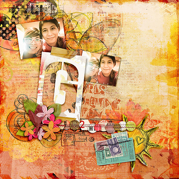
Girls Having Fun by Alexis Aragona | Supplies: Captivated Visions: Sunshine In My Soul, Blend Me Stash 01; Traci Reed: XL Trashed Stencil Alpha; Tangie Baxter: Be; Jen Maddocks Designs: ARTisan Papers Set III; Font: Super Danger
make welded monogram cuts with a Silhouette Cameo
Ashley Horton says, “Our daughter attended a tea party birthday, and we got each of the girls to pose for a photo in a Victorian chair. I thought this photo would be perfect for the monogram technique.”
Ashley cut an “H” monogram welded to a circular frame with her Silhouette Cameo and the added smaller letters to either side for a classic three-letter monogram. The “H” cut is backed up by patterned paper and the smaller letters are cut from washi-covered vellum.”
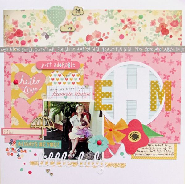
Little Lady by Ashley Horton | Supplies – Patterned Paper: American Crafts & Crate Paper; Tags: Elle’s Studio; Washi Tape & Enamel Dots: My Mind’s Eye; Rub Ons: Dear Lizzy; Wood Veneers: Freckled Fawn; Color Shine: Heidi Swapp; Font: Pacifico
use digital styles to create a beveled monogram
Stefanie Semple says, “This is the first page of our 25th Wedding anniversary celebratory album.”
“I used the monogram in a very traditional way, as the first letter of the text. It’s large and weighty, beveled with a silver finish, dropshadowed, and embellished with a flower and greenery. The heavy monogram is balanced by the ornate and classic photo frame.”

Semple Family by Stefanie Semple | Supplies: kits (Wonder of U by KimBroedelet, Captured with love by LDrag Designs) + Stitching(Super Stash Stithcing from Memory Clips by Ramona)
create a dimensional monogram “broach”
Kristy T says, “This layout is about the Lizzie Brooch which is a Victorian era silver puzzle brooch that has been in my family for generations. Many of the women in my family have had the name Elizabeth and if you look at the brooch carefully you will see the name Lizzie.”
“To create my monogram I photographed the Lizzie brooch and printed it in a large size so that it could be one of the main elements of my layout. I cut the brooch shape from the photograph and then, using tweezers to hold it, dipped it in UTEE, using my heat gun to remove the excess by letting it drip off. This means the brooch shape is dimensional and glossy but you can still its details. I added a cream die cut behind the Monogram so that the details would stand out against their background.”
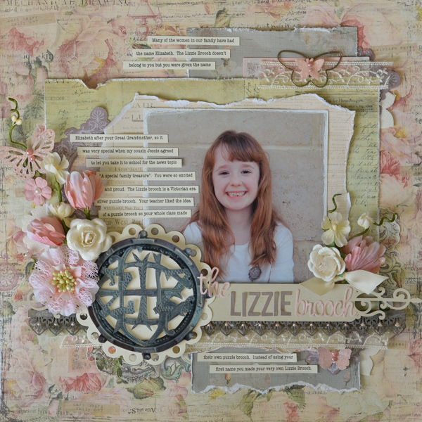
The Lizzie Brooch by Kristy T | Supplies: Cardstock: Artee; Patterned Paper: Prima; Chipboard: Dusty Attic; Flowers: Prima; Journalling Notecard Set: Prima; Punches: Martha Stewart; Alphas: Websters Pages, Simple Stories; Pearls: Kaisercraft; Dies: Spellbinders; Paint: Distress Paint by Tim Holtz/Ranger(Black Soot, Brushed Pewter, Antique Linen); Distress Stickles: Ranger (Stardust); Paperclip: Prima; Flutterbits: Prima; Liquid Pearls: Ranger (petal pink);Lace; Ribbon.
keep it simple with alpha stickers
Brenda Becknell says, “For this photo of my two-day old grandson on his first day home from the hospital, I wanted a soft look, so I used rounded, lower case alphabet stickers for the monogram. I used a baby-themed journaling spot as a base for the monogram, and added some white gel pen dots to the letters, with my grandson’s name written below. I admit to googling “monogram etiquette” before doing this page, to see the format options. I was glad to see that same size letters were acceptable, as long as the format was first initial, middle initial, last initial rather than the traditional first, last, and middle initial style.”
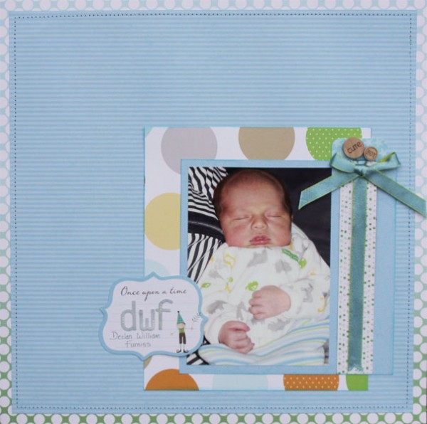
Declan William Furniss by Brenda Becknell | Supplies: Patterned paper: Studio Calico, Little Yellow Bicycle, Bella Blvd; Alphabet stickers: Basic Grey; Journaling spot: Little Yellow Bicycle; white gel pen: Signo
Rosann Santos-Elliott says, “This is the story of my little nuclear family at my son’s kindergarten graduation. It was a happy and fun day. I embellished this family page with the monogram for our family name, ‘E’, placed on a tag.”
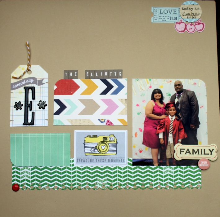
The Elliots by Rosann Santos-Elliott | Supplies: American Crafts- Amy Tangerine: Ready, Set, Go: patterned papers, bits and die cuts; Dear Lizzy: Lucky Charm Patterned Paper, Ephemera Die Cuts;
American Crafts: Black Thicker Stars; Elle’s Studio: Journal spot; Studio Calico: Letter Stickers and accent stickers; Tim Holtz: Grunge Board Letter E; Stampin Up: Brad; Cosmo Cricket: Chipboard Family Sticker.
use Photoshop techniques for a letterpress look
Heather Awsumb says, “This page is about taking cast pictures from the three productions of the amateur theatre company I helped establish last year (called Maseru Players Company, or MPC for short). On it, I reflect on how much MPC makes me happy and has changed my life.”
“To create the monogram I used the alpha brushes from Cathy Zielske’s ‘The Monthly” layered template set because I really liked the slab serif font. I knew I wanted the monogram to have almost a letterpress look to it so I tried a bunch of different blending modes and styles in Photoshop Elements until I got the look I wanted. Even with the beveling applied I thought the letters looked flat when they were filled in with plain white, so I also clipped a solid white paper that had a bit of texture to the brushes.”

MPC by Heather Awsumb | Supplies: Katie Pertiet: Haunted Woodlands Solids, Messy Stitched Rounded Corners White No 1, Surf Lagoon Element Pack, So Fine Linen Buttons,Bead Scatterings, Tag Masks No 1, Scalloped Strip Masks, Ledger Grids Brushes-n-Stamps; One Little Bird: These Walls Kit, Star Gazer Kit; Ali Edwards: This One Brushes & Stamps; Cathy Zielske: The Monthly (alpha); Zoe Pearn: Alphabet Soup Boy Kit
add an ornate border to negative-cut monograms with Silhouette Cameo
Sue Althouse says, “This page is about how my husband and I used to communicate when we were apart. The first letters of our first names happen to be P and S, which reminded me of the song “P.S. I Love You” by the Beatles, whose lyrics reminded me of a story I’ve wanted to tell about how we used to write letters to each other, but now we text and email. To convey the double meaning of the letters, I cut then as fancy monograms with my Silhouette. I also cut a monogram flourish to use as an embellishment. The wood veneer figures and ampersand are further clues. All is revealed at the end of my journaling.”
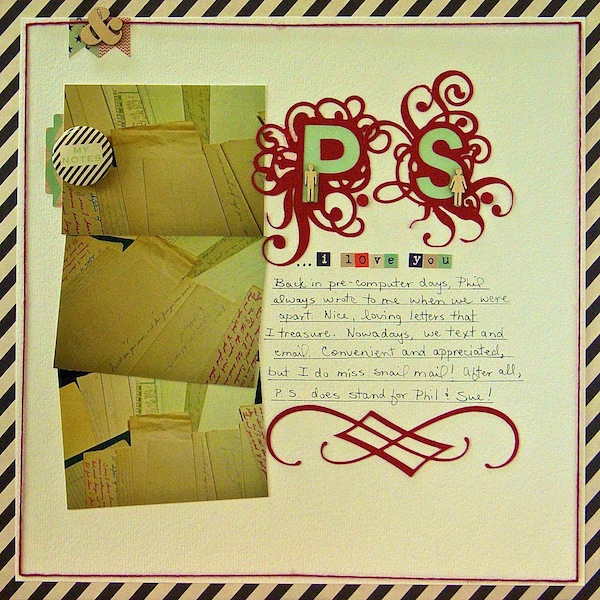
PS I Love You by Sue Althouse | Supplies: Cardstock: Bazzill; Patterned Paper, Stickers, Flair: Fancy Pants; Die Cut Monogram Letters and Monogram Flourish: Silhouette; Floss: We Are Memory Keepers; Wood Veneer: Studio Calico
stamp a monogram and layer text over it
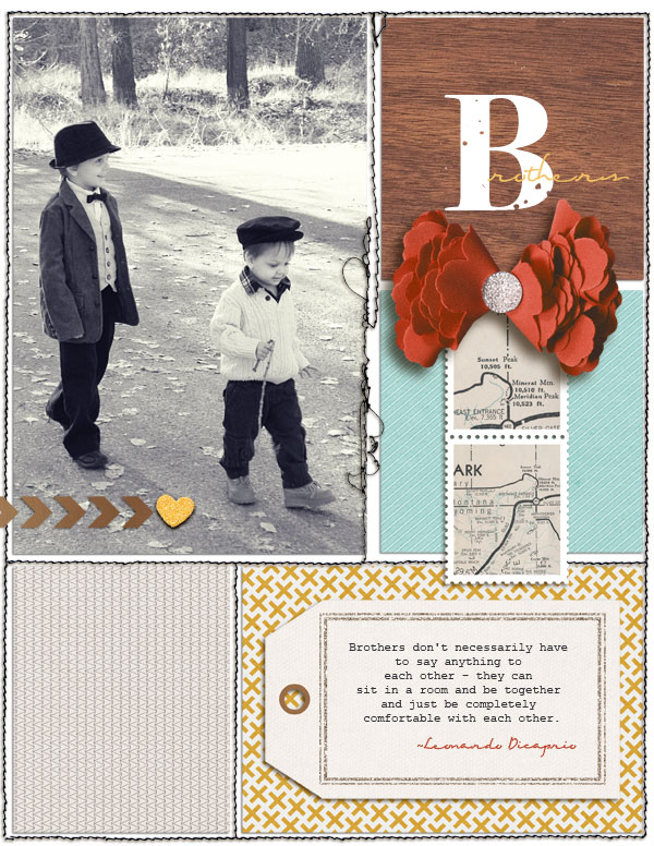
Amy Kingsford says, “This page features an outtake from the Christmas card photo shoot I did with my boys last year and a fun quote about brothers from Leonardo Dicaprio that is so true of my boys. I used a monogram-style title not only make it stand out a little more on the page but also because it fit nicely with the style of clothing my boys wore and the elegant tone of the page. I paired the handwritten script font Eight Fifteen with a bold stamped “B” from the iNKED GOD font.”
[current]

