
 Our minds and eyes like things that come in threes: three coins in a fountain, three-act plays, and The Three Little Pigs. Use this idea for scrapbook layout designs. It will speed up your process and give you well-design pages.
Speech coaches, writers, and comedians all understand that ideas presented in threes are more easily understood and remembered. Consider William Shakespeare’s “Friends, Romans, Countrymen . . .” and “Caeser’s Veni Vedi Vici.” We feel like we’re on solid ground when we’re taking things in in threes. Life feels orderly and stable. In visual design threes can be used to create progression, balance and flow.
Read more about designing with 3s and take a look at layouts our team made with “three in a row” starting points.
- Design to the Power of 3
- Tap the Power of 3 for Your Scrapbook Pages
- Using the Rule of 3 in Your Home’s Design
Three across
Celeste Smith says, “My son absolutely loves the swingset in the backyard, still as he gets older.”
“When using multiple photos in a row I like to mat them all with the same thin white mat. I also like to vary the zoom in the photos with at least one of the photos being a little closer up. I added a piece of vellum behind the three photos to bring them together and the washi tape across the top helps the eye move through the photos.”

Swing by Celeste Smith | Supplies: Little Butterfly Winds: Gone Squirrely Papers; Allison Pennington Anchored Up Papers & Elements; Jenn Barrette: Woodland Wonders Papers; Robyn Meierotto: Cut It Out Clipping Masks, Tag You’re It; Laurie Ann: Reflecting Tickets; Sabrina DuPre: Make It Merry Elements; Valorie Wibbens: Scatterbrain Papers; Shawna Clingerman: Displaced Alpha
Marie-Pierre Capistran says, “This page relates what happened between my daughter, whose name is Arielle, and Princess Ariel when they meet at Disney.”
“I used three photos to illustrate the story. Although they are almost the same in content, they all tell something different in the story and–combined with the journaling–it’s almost like a short movie or a comic strip. I have laid the strip of photos on a shelf and added embellishing on each side to create a context.”

Arielle meets Ariel by Marie-Pierre Capistran | Supplies: Cardstock: Bazzill; Patterned Paper: Dear Lizzy for American Crafts; Vellum: Dear Lizzy for American Crafts; Chipboard Elements: Dear Lizzy for American Crafts; Tags: Dear Lizzy for American Crafts, My Minds Eye; Rub-ons: Creative Imaginations, Heidi Swapp; Ribbons: from my stash; Spray Mist: Heidi Swapp Color Shine; Others: date stamp, sewing machine.
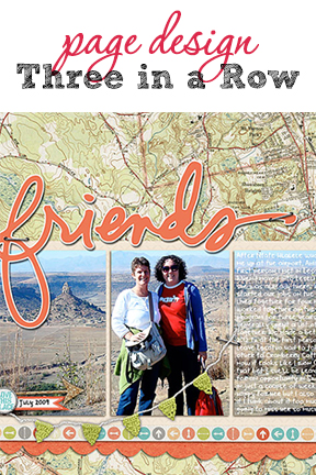
Heather Awsumb says, “My good friend – and the person that I’ve known since the day I moved to Lesotho 4 years ago – just left for another job in Swaziland and I am going to miss her immensely. This picture of us at a historical site in Lesotho from shortly after we met is one of the first (and only) we have together.”
“I created three equally sized blocks and then digitally clipped one photo to the three so it looks like the photo has been split into three sections. I then used the photo as a background for my journaling block. To make the journaling a little easier to read, I blurred the background in that section. I made the left 2/3rds of the layout the focal area by placing the title above it and the banner across those two sections.”

Friends by Heather Awsumb | Supplies: Katie Pertiet: Almost There Kit, Away We Go Kit, Banner Labels No 1, Corkboard Arrows No 1. Maplebrook Studios: Just Tonals No 08; Anna Aspnes: Stitched by Anna Brown; Ali Edwards: Thank You Friend Hand Drawn Brushes; Robyn Meierott: Cut It Out.
Rosann Santos-Elliott says, “This photo of the Brooklyn Bridge was taken on my iPhone. I made background with an enlargement with reduced opacity. I experimented with some of the effects in Picasa to modify this one photo several times, and I arranged them 3 in a row. This layout is meant to be framed and hung in my dining room.”

Brooklyn Bound by Rosann Santos-Elliott | Supplies: none.
Deborah Wagner says, “This page is a remembrance of the children we left behind at the orphanage when we adopted our 2 children.”
“The blended photo is of the orphanage, and the photos of the children waving to us are in the 3 frames. I blended a photo of one of the orphanages brick buildings and placed it in the layer below the 3 frames to give the impression that the frames are windows.”

Faces In The Window by Deborah Wagner. Supplies: Katie Pertiet Creased Card Stock No. 2, Hung Up Frames, Stamped Blocks No. 14, Grungy Letter Brushes No. 2; Anna Aspnes Love From Russia Kit
Terry Billman says, “On a recent visit to Waikiki, we spent the day touring the North Beach. A trip to the North Beach is not complete unless you visit the legendary Matsumoto grocery store for shave ice.”
“Reminded of the fancy version of snow cone., I used a series of diamond shaped blocks for the design. I applied a simple text effect to the title to represent ice and added the sparkles and snow overlay to portray an icy feeling to the text.”

Shave Ice created by Terry Billman | Supplies: Anna Aspnes: Karvella, Art Play Retro Holiday, Art Play Palette Mist, Magic Sparkle Foto Blendz 1, Magic Snow Spray Overlays 1; Patti Knox: Banner Alpha; Lynn Grieveson: A Million Miles
Three down
Lise Mariann Alsli says, “This page is about my nephews and my niece who started their ‘nerding career’ years ago when they were just cute, little things. Today you have to fight the screens and earplugs away from them.”
“I used the repeated hexagon shape to create interest. The patterned paper from Webster´s pages had a lot of flowers in the top left corner and the bottom right corner, but I wanted more dimension so I clustered lots of embellishments on top of the bottom right corner flowers. This grounds and creates balance to a quite top- and left heavy page. I also wanted to soften the sarcastic message with the cuteness of the page. I didn’t want the page to mean anything deep. I just wanted it to be cute and nostalgic.”

Nerding by Lise Mariann Alsli | Supplies: Paper; Webster´s Pages – Modern Romance, Elle´s Studio – Day to day, Bazzill cardstock. Embellishments: Kaiser Craft – collectables marigold, Blue Fern studio – Gabrielle butterfly set, Webster´s pages – Perfect accents Resin embellishments, Webster´s pages – Designer Trim Collection, Prima – Vintage trinkets, Paper binder from unknown manufacture. Alphabet; Webster´s Pages – storytellers. Black pen.
Carrie Arick used her digital scrapbooking software to make three same sized blocks and align them on this page of her son. She clipped her photo to the middle block and two copies of a journaling card the to the blocks above and below. She wove an orange ribbon over and under the blocks vertically and reinforced her “three-in-a-row” design with a series of three buttons next to the title.

Grown by Carrie Arick | Supplies: Sara Gleason: Birch Tree Element Pack; Just Jaimee Nonsense Paper Pack; Sahlin Studio: A Wonderful Day (staples)
Three in a row non-photo
Amanda Robinson says, “I recently moved my Studio from my home to another location, and here I record this change.”
“I used a photo and 2 blocks of paper scraps as my 3-in-a-row items. To unify these different elements, I added chipboard frames that are all the same size and shape, though different print patterns.”

The Studio by Amanda Robinson | Supplies: Kit – JBS Mercantile; Patterned Paper – Jillibean Soup, Basic Grey; Die-cuts – October Afetrnoon, Basic Grey; Stickers – Basic Grey; Chipboard Frames – Crate Paper.
Sian Fair says, “I’m not at all green-fingered, but I do love flowers. This page is about my answer: silk blooms.”
“With the design aspect of “three in a row” decided, this page became an excuse to play with paper and make something pretty. I cut three frames with my Slice cutting machine as the basis for the layout and built around that. With the strong row shape, I worked extra hard to make sure the eye was drawn around the page and not just across it. When I’d finished, I decided I had more journaling to add and framed the page, itself, with my extra words.”

Bloom by Sian Fair | Supplies; Patterned Paper: Fancy Pants, American Crafts and Websters Pages; alphas from American Crafts; wood veneer house from Studio Calico; label sticker from October Afternoon, little girl and frames cut with Slice
Three in a row — on the side
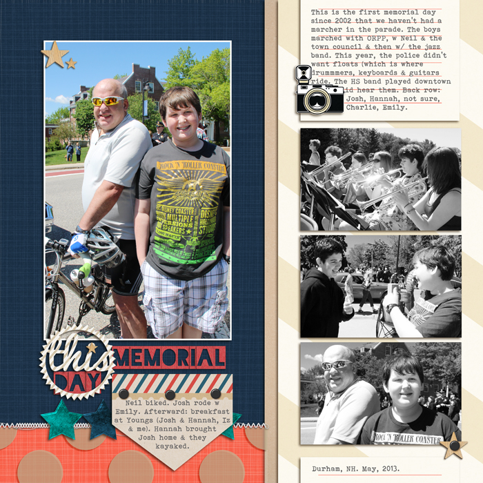
Debbie Hodge says, “These photos are from a Memorial Day concert in our town, with my husband and son in the focal point photo, and the band in the 3-in-a-row black-and-white series. Arranging supporting photos in a series of three across or down is a great way to get multiple photos on one page while making sure one stands out.”
Memorial Day | Supplies: Stargazer by One Little Bird; Gone Squirrely by Little Butterfly Wings; Snail Mail by Valerie Wibbens; Sunday Afternoon by Laurie Ann; Itsy Bitsy Alpha by Amy Wolff; Brad Bonanza by Pattie Knox; Stitched by Anna White by Anna Aspnes; Pacifico, Bohemian Typewriter fonts
Three in a row dividing the canvas
Dividing the canvas into three rows or three columns sets up a great structure for arranging elements on the page.
Debbie Hodge says, “’10 Things in July’ is a page with ‘list’ journaling, and I needed to include ten short paragraphs of text. The text is a key aspect of this design, and arranging it for both clarity and visual appeal was my primary challenge. A 3-column design gave me a way to arrange all those pieces.”

10 Things in July by Debbie Hodge | Supplies: Just Linens No 1 by Maplebrook Studios; Flossy Stitches Yellow by Katie Pertiet; Shutterbug Collaboration by The Digi Chick Designers; Yesterday Alpha by Lynn Grieveson; Journey Back Collection, Apple of My Eye Collection by Vinnie Pearce; Artsy Fotoblendz No 1 by Anna Aspnes
“On ‘To Cambridge in the Rain,’ says Debbie, “I worked with three rows instead of three columns. On this layout, I incorporated 5 photos — of both portrait and landscape orientation. The three rows are defined by a combination of blended transfers, photo frame edges, and paper blocks. Photos and cream colored mats/frames are arranged in a distinct downward diagonal (from top left to bottom right).”
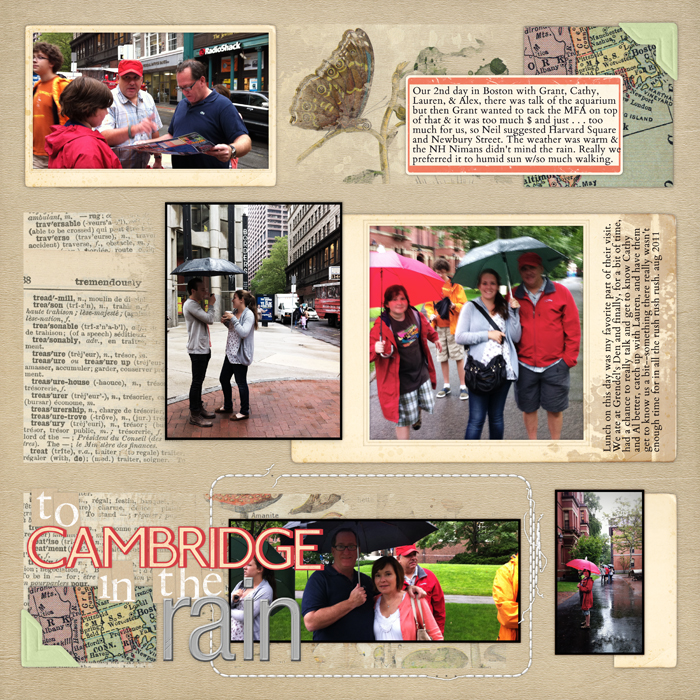
To Cambridge in the Rain by Debbie Hodge | Supplies: Traveler Maps Paper Pack, Vintage Blendables No 2, Messy Stitched Rounded Corners, Vintage Photo Frames No 5, Krafty Bits Alphabet, Metal Alphabet No 1, Photo Corners Colors No 2, Basic. Journal Spots, From My Bookshelf Blendables No 1, Watery Corners and Edgers No 2 by Katie Pertiet; Just Juicy Kit by Lynn Grieveson
[current]
