
A scrapbook page title is key for both telling your story and strengthening a scrapbook page’s visual design. One way to get your title working for you right away is to create a “two-part title,” one in which you break the title content into two parts and then render each part differently.
Two-part titles strengthen design because you can use shape, color, and contrast to create titlework that embellishes and supports flow — in addition to cuing page subject.[hr]If you are using multiple typefaces next to one another be sure that they EITHER correspond OR contrast engagingly and clearly. Avoid confusion.
[threecol_one]

[/threecol_one]
[threecol_two_last] contrast. If your typefaces are going to contrast, be sure they obviously contrast. See several typeface pairings here that contrast well. You could use them for mixed-font titles or for title + journaling. Debbie paired a blocky uppercase punched alpha (“Here” with Blackout font) with a slab serif typewriter font (“2:30” in Bohemian Typewriter) for a title with clear contrast. The color and proximity, though, unites them, creating a a strong block that repeats the woodgrain of the journaling card. It’s placement next to the focal point photo gets the story started and coaxes the viewer into the story told in the journaling. Here at 2:30 by Debbie Hodge | Supplies: Here at 2:30 by Debbie Hodge | Supplies: Sprinkles 9 , Snail Mail; Lost and Found by Valerie Wibbens; Be by Forever Joy; In This Moment by Audrey Neil; Rhinestone Star, Flags and Stars by Jenni Bowlin Digital; Sprinkles 9 by Valerie Wibbens; Jane Bits by Ardent Sparrow; Spiced Jewels, Word Label Template, Artplay Night Before Christmas, Burlap Scraps by Anna Aspnes; Pretty Pieces by Lynne Marie; Retro Mod, Fairest of the All by Sahlin Studio; Peach Clear Cards by Karla Dudley; This Year by Scotty Girl; Stitched Flowers by Gennifer Bursett; These Walls by One Little Bird; Almost There by Katie Pertiet; Pull Out Journaling by Lynn Grieveson; You Make Me Happy by Mye De Leon
[hr]
One little word two-part title
Kristy T says, “This layout is about my son’s costume for his end-of-term dress up party in Kindergarten. I wanted shiny metallic-looking alphas here, so I created my own by hand-cutting mirrored sheet. I coloured in the centre areas using a black CD marker so it wouldn’t smudge. I wanted a cursive font that for contrast but didn’t have any suitable stickers, so I practiced my handwriting and wrote the word ‘the’ directly onto the paper with a silver pen. This is great solution if you don’t have that ‘perfect’ alpha and isn’t too hard to do especially for only one or two words.”

Rob the Robot by Kristy T | Supplies: Cardstock: Artee; Paper: Artee; Mist: Mister Huey’s; Mirrored Sheet: Tim Holtz; Templates: The Crafters Workshop, Dylusions; Distress Stain – Ranger; Assorted Metal Embellishments: Tim Holtz, Prima; Gel Pen: Signo, Kasiercraft Wooden Flourish – Large Cog; Chipboard: Dusty Attic, Scrap FX; Paint Dabber:Adirondack, Jenni Bowlin; Stamp: Kaisercraft; Embossing Folder: Tim Holtz/Sizzix; CD Marker: Pilot
Clustered two-part title
Michelle Houghton says, ” This layout is about a backyard play day in the snow with my two girls. I used two very different fonts to create the title. One is covered in glitter to add the sparkle of the snow and the second is colored to match the cool blues of my papers. Both add to the icy cool feel of the fun day.”

Snow Bunnies by Michelle Houghton | Suppies: cardstock; The Paper Company, patterned paper; Bo Bunny, Patterned paper die cut; Fancy Pants, die cuts and washi tape; SEI, chipboard and sticker letters; Doodlebug Designs Inc., fabric letters; American Crafts, ink; Tsukineko and Copic
Debbie Hodge says, “This page features a group photo from a birthday party my son attended. I combined a vintage card printed with “happy” and a scripty string alpha for contrast and a light tone. This two-part title overlaps both the photo and the journaling. Because the title is the lightest and least-dense area on the page it actually becomes the starting point for viewing it.”

Happy Party by Debbie Hodge | Supplies: Victoria, Magpie, Playful Embellishment Set by Jenni Bowlin Digital; Noted by Celeste Knight; Peachy Transparencies by Karla Dudley; Torquay Elements by Kaye Winiecki; String Me Along Alpha by Zoe Pearn; Sitched by Anna Yellow by Anna Aspnes; Flossy Stitches Yellow by Katie Pertiet; Woodland by Jenn Barrette; Frolic by Traci Reed; World’s Best Dad, Family Edition Flair by Little Butterfly Wings; Stitched Flowers by Gennifer Bursett; Birthday Cake by Sahlin Studio; Pea XOXO, 1942 Report fonts
Ronnie Crowley says, “The strive for perfection in my husbands photography means he will go to great lengths to get the perfect picture. I wanted the page to have an artistic feel and to convey the idea that photography is about more than snapping a picture–it’s about making art. The alpha for “photography” has a hand-drawn feel (jamaistevie). Using it for the whole title would have been overpowering. Combining it with a simpler font emphasized “photograph” and created a cluster with contrast and interest.”

Photograph by Ronnie Crowley | Supplies: Anna Aspnes: ArtsyCameras and EnRoute1; Katie Pertiet: Candid; Yin: Template 169
Heather Awsumb says, “I recently celebrated my Grandmother’s 90th birthday in Arizona and wanted to capture how huge that number is by recording some of the major historical events she has lived through. I combined a scripty and dimensional ‘happy’ with a stamped (flat) serif face ‘birthday.'”
Digital details on making this title: Heather extracted the word “happy” with the heart from a longer piece of wordart. To get dimension on one of her words (and, thus, contrast,) Heather turned the word into a sticker by adding white edging and a drop shadow. She says, “I use Katie Pertiet’s ‘Dramatic alpha drop shadow’ (part of Drop Shadow Styles No 2) on almost all of my titles.”

Happy Birthday by Heather Awsumb | Supplies: Katie Pertiet: Spot Dot Brushes No 4, Vintage Milk Caps No 1, Frame Hangers No 1, Sweet Rose Bay Element Pack, Hey Missy Element Pack, Letter Box Garden Song Element Pack, Ric Rac Basics No 1, Cardstock Tabs No 3; One Little Bird Designs: These Walls Kit, Rise and Shine Kit, Stargazer Kit; Paislee Press and One Little Bird Designs: Dayplanner Kit; Allison Kreft for Websters Pages: Color and Composition Paper Pack; Websters Pages: Trendsetter Alpha; Websters Pages: Citrus Squeeze Digital Jewels; Ali Edwards: With Gratitude Brushes and Stamps; Maplebrook Studios: Noemi Kit; Mommyish: Stylin #48.
Marie-Pierre Capistran says, “This page is about my little girl who is about to turn 5. In the journaling, I listed things that characterize her. The title and journaling framing the page is a song I sing to her before bed time. I decided to use 2 different alphas to write the title because of two things: first, it is very very long, and, second, by using two different alphas (size, font, color, glitters) I made a focal point on the part of the sentence that says “where is the little girl” to connect with the journaling that is about her growing up so fast.”

Where is the little girl by Marie-Pierre Capistran | Supplies: Cardstock: Bazzill; Patterened Paper: Echo Park; Paint: Ranger; Alphas: American Crafts, Fancy Pants; Labels: printed from files I found online.
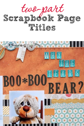
Susanne Brauer says, “I wanted to tell the story of this precious teddy-bear and why he might have a tear in his eye (never fear – it’s a happy story!) My journaling is written as if I were talking to Boo Boo.”
Susanne combined small blue alpha clips because they are small (or baby-sized). They contrast strongly with the rest of the title in size, typeface, color, and shape. These blue alpha with their “Why the tears” message have a light feel that makes the title conversational and as if spoken to a young child. The eye moves from them to the stronger “Boo Boo Bear.”

Boo-Boo Bear by Susanne Brauer | Supplies – Papers – Basic Grey Clippings Chronicle, Basic Grey Paper Cottage Afghan, Alphabets – Echo Park Everyday Eclectic, Scalloped Border – Stamping Up Accents & Elements, Chipboard banners and buttons – My Mind’s Eye Sweetest Thing, Twine – Queen and Company, and a few buttons from stash.
Layered two-part title
Debbie Hodge says “I love this series of photos that show my son’s friends all rushing into be a part of the group portrait. I used flat stamped alphas 5 times the height of the little alpha bits and was thus able to layer the two parts and get a title that reads clearly.”

Me Too by Debbie Hodge | Supplies: Maggie Holmes Collection Papers and Elements (digital) by Maggie Holmes/Crate Paper; Peachy Alpha, Kraft Essentials, Life 365 (flair) by Karla Dudley; Stamped Alpha by Just Jaimee; Stitched by Anna Orange, Warm Photo Glows by Anna Aspnes; Far Away From Here (spritz) by Ju Kneipp; Pinned Tabs No 1, Flossy Stitches Blue by Katie Pertiet; Bohemian Typewriter font
Tiffany Tillman says, “This page features a ‘text within text’ technique. This is an easy look to create with Photoshop:”
- First, I typed my main word, which acts as a home for the long phrase.
- Then I typed the phrase and positioned it over the main word.
- My final step was to Simplify (or Rasterize in Photoshop) the main word’s layer. I used the Rectangular Marquee tool to draw a selection box around the phrase, and hit the delete key. Doing so cleared the a strip from the text behind the phrase.
This look is easy to transfer to paper layouts by either drawing the text with a marker or trimming large alpha letters in half and adding a longer handwritten phrase.

First by Tiffany Tillman | Supplies: Digital Paper: Modern Marvel by Karla Dudley.
Terry Billman says, “Kelly and Craig golf every chance they get. They both golf at the same level and are very competitive. Before each round, Kelly says to Craig: Prepare Yourself. His real meaning is: prepare yourself to get beat! I made the word prepare big and bold with a dramatic drop shadow to accentuate the word the way Kelly places his emphasis. Since I did not want to emphasize the word yourself, I used a slimmer font in a neutral color. The page reminds me of their carefree, friendly, and teasing banter.”

Prepare Yourself created by Terry Billman| Supplies: Anna Aspnes: Art Play Palette Seafoam, FotoBlendz Clipping Mask 8, Art Play 5 Brush Set, 12 X 12 Sand Scratched Overlays 1, Word Label Template 3; Katie Pertiet: Classic Cardstock Oyster, Coastal Staple
Separated two-part title
Marcia Fortunato says, “This layout is about my son’s recent journey to discovering ‘what he wants to be when he grows up.’ Because my son’s major is forestry-related, I used earthy tones along with motifs found in nature.”
“I used the title content and rendering here to emphasize the time and effort that it took for my son to discover his major field of study. I used cursive-type chipboard letters for “finally” and a solid serif alpha for the rest of the title. To unite them, though they are separated in spaced, I colored the letters with a marker. That woodgrain color is repeated in the bird embellishment at bottom right to complete a visual triangle.”

Finally Finding His Passion by Marcia Fortunato | Supplies: Patterned paper: Lawn Fawn, My Mind’s Eye; cardstock: Bazzill Basics; Alphabets: American Crafts (Thickers), Studio Calico; Embellishments: Studio Calico (wood veneer), Hambly Studio (decorative tape); Pens/inks: Ranger (Distress Markers), Sharpie, Prima (chalk ink); Other: stencil: The Crafter’s Workshop; die – Sizzix; stamp: Life-Love-Paper; paper clip (Target); Adhesive: American Crafts, Ranger (Glossy Accents), Therm-o-web, 3M; font: Calibri
Debbie Hodge took a similar approach to Marcia, placing each of the two parts of her title in a compartment in a blocked design. While Marcia united her two parts by giving them a common color, Debbie embellished the first part of her title with colors that are in the second part of the title — yellow and blue.
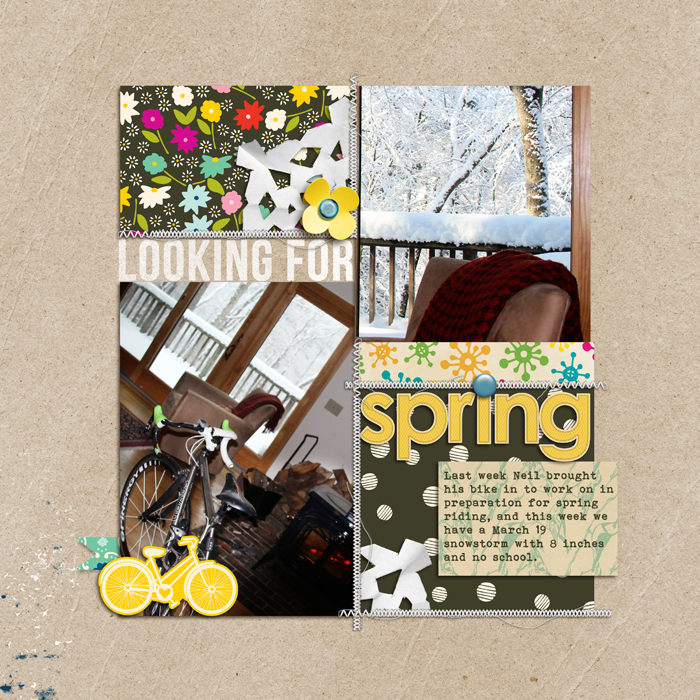
Looking For Spring by Debbie Hodge | Supplies: Patterned Paper: Soho Garden by American Crafts, Sketchbook by Amy Tangerine; Cardstock: Sequoia by Sara Gleason; Journaler: 5th and Folic by Dear Lizzy; Handcut Snowflakes by Valerie Wibbens; Stitching, Banner template by Anna Aspnes; Bike: Amy Tangerine; Flower, Alpha: Spring Day and Sunshine Alpha by Sahlin Studio; Bebas Neue, Bohemian Typewriter fonts.
[current]
