by Debbie Hodge
The asymmetrical cross is a scrapbook layout design that has flexibility for just one photo or many.
Dina Wakley praises this design for its flexibility says, “It’s a great framework on which you can be creative and add many or just a few photos and embellishments. To keep the design fresh, I change my mediums.”
Dina Wakley says, “One of my favorite compositions is the asymmetrical cross. I start with a strong horizontal element. Then I cross it at either the right or the left side with a strong vertical element. On ‘bad hair curse,; the inky blots are my strong horizontal element. The blots traverse the entire width of the canvas. I arranged my three photos, the cheesecloth, the canvas, and the burlap vertically on the right side.”
“I have noticed that I turn to this design again and again. It’s simple and it works. To keep the design fresh, I change my mediums. Sometimes I create an element with patterned paper, sometimes with ink, sometimes with fabrics (as I did on this layout). Sometimes I arrange my page elements to spray out from the framework, sometimes I stick to the framework closely.”

Bad Hair Curse by Dina Wakley | Supplies: Cardstock: Bazzill, Ink: Dylusions
by Ranger, Stencil: Crafter’s workshop, Fabrics: various from the fabric store,
Alphabet: American Crafts, Thread: Gutterman
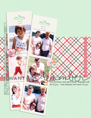
Tara McKernin says, “This is a layout from a day out with my Grandparents who were visiting us from Belfast, Northern Ireland. I believe it was actually the last time my Grandmother traveled from Belfast to see us.”
Tara crossed a horizontal band of patterned paper with multi-photo frame strips. She says, “Running the paper across the page grounds my strips of photos to the canvas.”
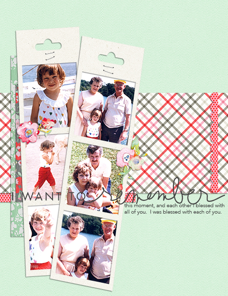
I want to remember by Tara McKernin | Supplies: Template, ChrissyW Digitals; Paper, Karla Dudley and Karen Funk
Leah Farquharson says, “I’ve been learning a lot of life lessons this past year, and one of the most recent is to live from a place of abundance. If we hold on too tightly, all of the things we fear and hold on to tend to come to be – if we instead live fully and abundantly, you’d be surprised how that abundance comes back to you in amazing ways”
“I created my cross foundation with a horizontal band of die-cut blocks layered over a misted band used with those blocks as stencil. I used the hearts punched from the diecut pieces, sprinkled with a vertical title to make the vertical cross band. The use of the negative diecuts along with the “positive” punched hearts supports my theme.”
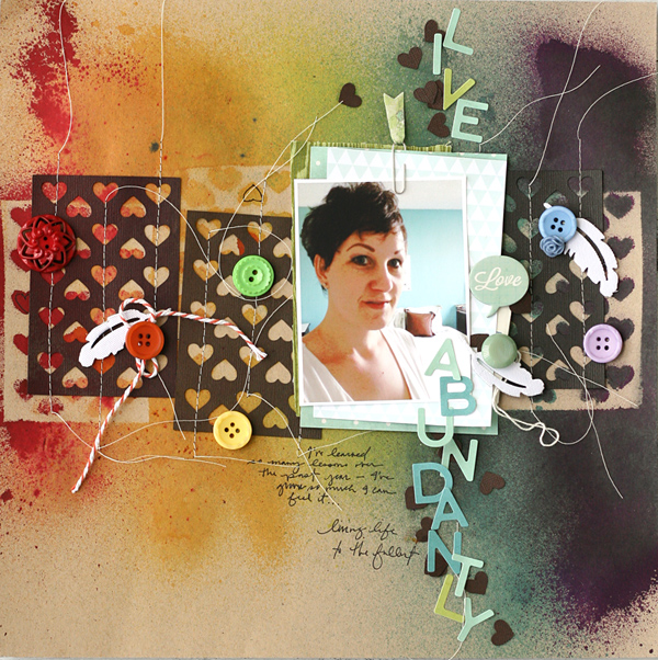
Live Abundantly by Leah Farquharson | Supplies: cardstock: Bazzill. Patterned papers: American Crafts, Fancy Pants Designs. Buttons: Jenni Bowlin, Fancy Pants Designs, Autumn Leaves. Tag: JBS Mercantile kit (vintage find), Letter stickers: October Afternoon. Feathers, chipboard speech bubble, paperclip: Studio Calico. Flower: American Crafts. Twine: Maya Road. Inks: Ranger, Studio Calico, October Afternoon, Maya Road. Diecut: Silhouette Shapes by American Crafts
Deborah Wagner scrapbooked her son and his dog in 1994. The cross is made with an intersection of a portrait-oriented photo and a horizontal band of patterned. paper. She says, “For emphasis, I added the over-sized frame.”
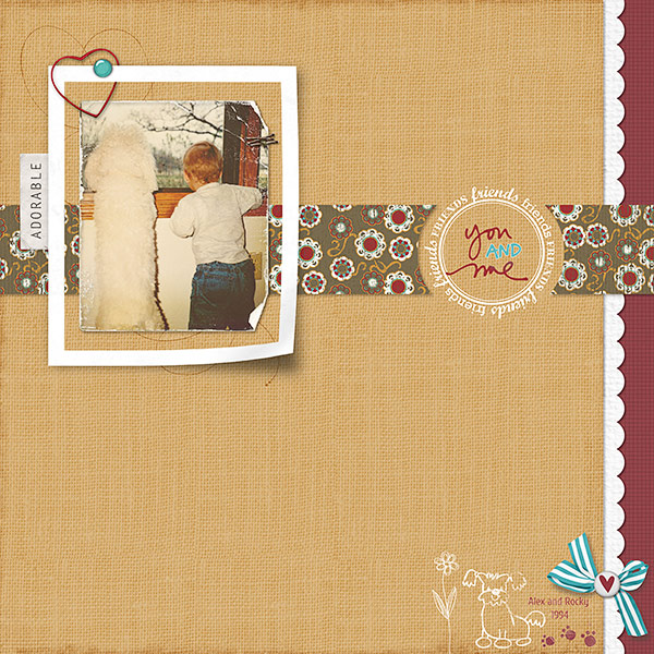
You and Me by Deborah Wagner. Supplies: Katie Pertiet Catana Solids Paper Pack, Classic Patterned: Finest Paper Pack, Hot Floral Mini Kit, Anchors Away Solids, Everyday Pets Borders, Sweet Rose Bay Kit, Loosely Labeled No. 2, Color My Love Kit, Bradded Photo Frames No. 1, Crowning Affair Vibrant Kit, Ledger Grid Overlays No. 1, Winter Woods Kit; Lynn Grieveson Worn Photo Edges No. 5, Ali Edwards You and Me Brush; Pattie Knox Staple Its Clusters; Jesse Edwards Doodled Flowers; Anna Aspnes Heart Loop da loop
Brenda Becknell says, “Now that she’s almost four, my granddaughter has become adept at dodging my camera, so I usually end up with photos of her making silly faces or poses. I scrap them anyway because they are a true reflection of her personality now.”
A horizontal band of patterned paper houses title and journaling, and square photos mounted one-over-the-other make the vertical cross band.

Seriously by Brenda Becknell | Supplies: Cardstock: Recollections; Patterned paper: American Crafts Dear Lizzie “Lucky Charm” collections; Stamps: Technique Tuesday and Hampton Art; Brads: Making Memories; Diecut alphabet: Provocraft Cricut “All Mixed Up” cartridge.
Stefanie Semple says, “I took my daughter and a friend to the local nursery and we loved looking at and feeding the animals. This little monkey was so charming. He wanted to check out my camera and would have made a grab for it if I were a little bit closer.”
“I made a strong vertical band of striped patterned paper and arranged four small photos matted on high-contrast cream in a horizontal band that crossed over it. The circles add more contrast and interest and the colors and motifs were chose to evoke a sense of Autumn.”
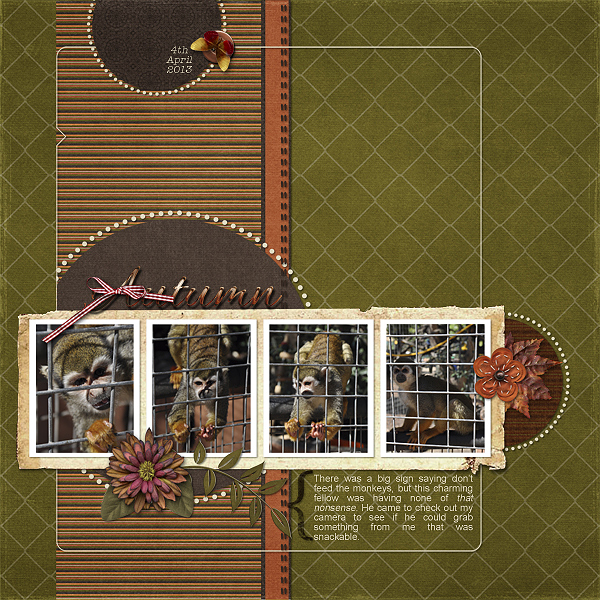
Autumn by Stefanie Semple | Supplies: Jennifer Labre Designs: October Afternoon (kit); Jessica Sprague: Template 1-01(template that I tweaked a little)
Katie Scott says, “My husband gave my 9-year-old daughter signing privileges on a cruise, and these photos show how she enjoyed the independence and bought a stuffed animal monkey.””
“I wanted to highlight one of the photos – the close up of my daughter’s happy face – since it was the best one, but I wanted to include the other photos that depicted what she was so happy about. They are all arranged in a horizontal band. The addition of title and journaling above and below one of the photos makes the vertical band and emphasizes that photo.”
I realize that the asymmetrical cross is really going off the page here but I wanted to get the title in the bottom right which is where you typically write your signature on a document.
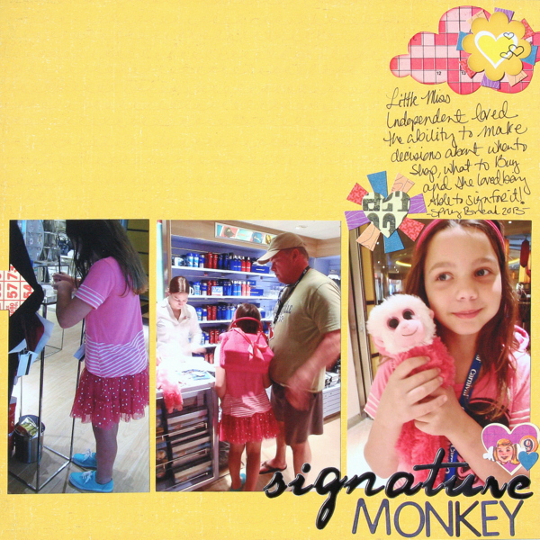
Signature Monkey by Katie Scott | Supplies: Crate Paper paper; Sassafrass stickers; American Crafts letter stickers.
Doris Sander says, “I used a vintage label turned on its side as my strong vertical element and then a polka-dot patterned paper with polka-dot vellum overlay as my strong horizontal element. My vertical and horizontal design areas each take up approximately two thirds of the page. This created a nice structure for the energetic play of patterns that I used on the page. I especially like the way the horizontal portion peeks out from the edge of the vertical portion. I definitely plan on utilizing this design concept again in my scrapbooking.”
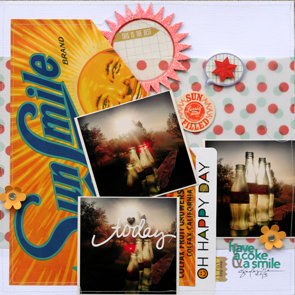
Coke by Doris Sander | Supplies: cardstock – Bazzill, patterned paper – JBS Mercantile Exclusive, vellum – Dear Lizzy, journaling spots – Studio Calico, Chic Tags, stickers – Jillibean Soup (word, alphabets), Basic Grey, flowers – Pebbles, heart crystal – Prima, chipboard sun – JBS, glitter – Art Glitter, label, milk cap – vintage, other – German foil star, pop dot
Amy Kingsford says, “I made this page for my son. He’s at that age where he’s starting to want to be like everyone else and I want him to know that it is okay to be different.”
“My journaling trickles down the page vertically and my photo and accents come across the page horizontally. I love the resulting white space that this composition created and how my key elements intersect to establish a clear focal point.”
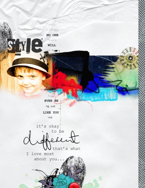
It’s Okay to Be Different by Amy Kingsford | Supplies: Anna Aspnes: ArtPlay Palette City Limits, ArtPlay Palette No. 6, Abstract FotoBlendz No. 5, Finger Prints, ArtPlay Infatuated Chevrons, Urban Stitchez No. 3.
Christy Strickler scrapbooked photos of her son snuggling with his cat.
She says, “I used layers of patterned paper to create the vertical section of the cross. I relied on texture and pattern from the crochet trim and grey patterned paper to soften the heavy feel of the grey and red papers. I made the other section of the cross with wonky lines of machine stitching, adding pearls and jewels with the stitching.”
“The title (chipboard letters covered in black flocking) sits at the intersection of the cross.I like that the layout is very structured but that elements within the structure are allowed to be random and organic.”
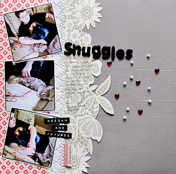
Snuggles by Christy Strickler | Supplies Cardstock: Colorbok; Patterned Paper: Jenni Bowlin;Alphas: Sassafrass; Flock: American Crafts; Tag: Basic Grey; Jewels: Making Memories; Other: Pearls, Crochet Trim, Labels by Dymo label maker
[current]

