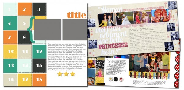
See how scrapbookers Adriana Puckett and Marie-Pierre Capistran used a one-page sketch/template from Amy Kingsford’s August 2012 Sketch/Template Pack on their two-page layouts.
 balance the smaller photos from the original sketch with a enlargement
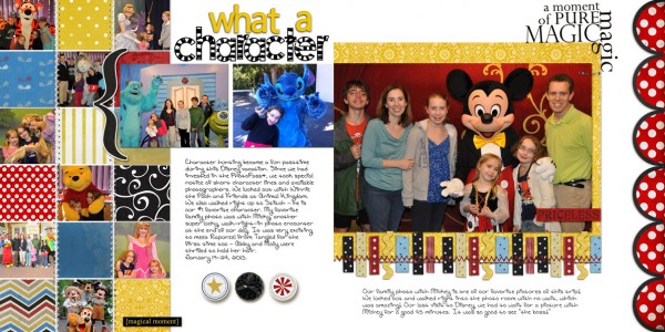
Adriana Puckett says, “We recently visited Disney World and really embraced all of the photo opportunities with characters at the four parks. This template is fabulous to highlight lots of photos in a series. It would work well with pics of collections, birthday parties, and holidays.”
To balance the many small photos on the left, Adriana, used a large focal-point photo, abutting it to the center and the medium-sized photos that bridge the two pages. She says, “I carried the stitching and the color scheme to the second side to create a unified look.”

What a Character by Adriana Puckett | Supplies: Enjoy the Moment Kit and snippettes by Sahlin Studio
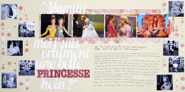
mirror the original sketch to the second page, but off-center for asymmetry
Marie-Pierre Capistran says, “I created this page to showcase all the encounters my daughter had with princesses on our last trip to Disney (the color photos) and also to emphasize all the little things my daughter does that are princess-like: pointing her foot, holding her skirt, holding her hand to the side, etc (the black and white pictures).”
“When I doubled up the sketch, I wanted to continue the row of landscape photos, and I wanted to mirror the smaller, square photos, but I didn’t want the row of pictures to be exactly in the middle of the page. I, thus, shifted everything to the right, splitting one of the pictures in two (when you do that, make sure you’re not cutting someone’s face or neck), and I sewed 5 lines to “hang” my black and white pictures on the left side and only 4 on the right side.”

I’m really am a beautiful princess by Marie-Pierre Capistran | Supplies: Pattern paper: Stampin’UP!, Die Cut With a View; Cardstock: Stampin’UP!; Letters: American Crafts Thickers; Tab: Crate paper; Rhinestones: Doodlebug, Queen & Co.; Punch: Stampin’UP!; Other: date stamp, Silhouette Cameo, sewing machine.
[lovesketches]

