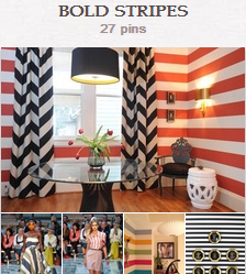
 Following on the 2012 profusion of prints (and even wildly mixed prints), 2013 fashion trends include the bold stripe.
It’s still a pattern but one Stylecaster calls “palette-cleansing. See our “Bold Stripes” pinboard for examples of stripes in fashion, accessories and home decor and a recent post on mixing stripes with punchy florals.
See how our Creative Team has put this trend to work on their scrapbook pages.
Tara McKernin says, “This is from New Year Day this year. My friend captured the photo as we were outside finishing up the sparklers with the kids, our New Year tradition.”
“I used a bold striped patterned paper as my background and let it speak for itself rather than mix it with other patterns. The elements soften the bold paper. The stripes point the viewer’s eye toward the image, and the elements keep the eye circling the page.”
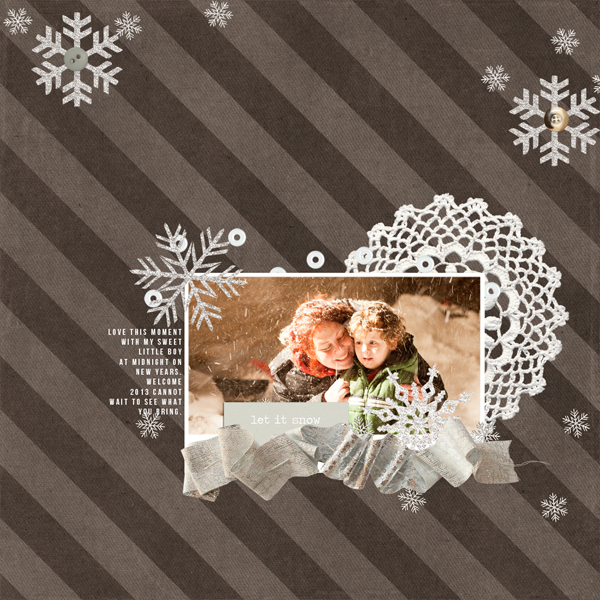
Let It Snow by Tara McKernin | Supplies: Supplies: papers Just Jamie Winter Fresh Stripes, elements from Baers Garten Designs Winter Wonderland Kit.
Doris Sander says, “I used bold stripes to create a repeated pattern down the left side of my page. I then staggered my title along these stripes for a big impact.”
“The stripes mimic my son’s shirt in the photo and play into the sentiment of the title, “You Wear My Heart On Your Sleeve.” I also used a bit of striped washi tape down the center of the page to further enhance the striped motif.”
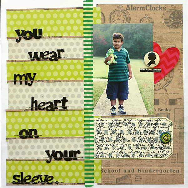
You Wear My Heart On Your Sleeve by Doris Sander | Supplies: pp – Dear Lizzy, cs – Bazzill, Jenni Bowlin Studio, Doodlebug Designs, stencil – JBS Mercantile Exclusive, ink – Jenni Bowlin for Ranger, tag – Avery, flatback – Jenni Bowlin Studio, brad – K&Co., thickers – American Crafts, label sticker – 7 Gypsies, washi tape – Freckled Fawn
Amy Kingsford says, “This page is about my trusty companion in memory keeping: my camera. I’ve used a bold striped background paper and broken it up with blended masks and a few other artsy touches. I love the way the photo of my camera pops against these black and white stripes as well as the contemporary feel they lend to my page.”
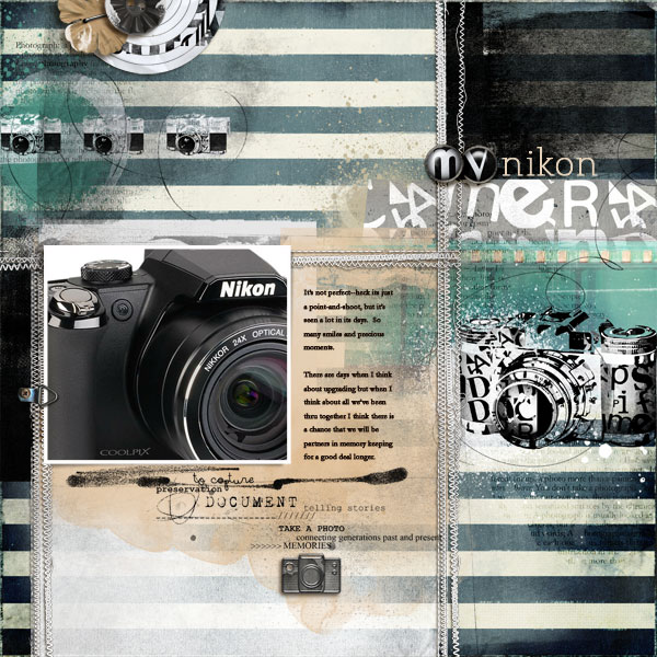
My Nikon Camera | Amy Kingsford | Supplies: Anna Aspnes Designs: Artplay Palette Fotographie; Foto Word mix No. 1; Artsy Layered Template No. 63; StraightLine Stitched White No. 3
Ashley Horton says, “My husband bought a Lego set for each of the kids and they immediately wanted to put them together. I love the colors in the stripes on this Amy Tan paper, and I think it resembles stacked blocks. I paired the bold stripes with a light gray grid pattern that reminded me of an architectural design, another print perfect for my subject.”
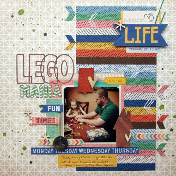
Lego Mania by Ashley Horton | Supplies: Patterned Paper & Flair Button: Amy Tangerine; Wood Veneers & Spray Mist: Studio Calico; Font: Abadi Condensed MT; Date Stamp: American Crafts; Other: Toothpicks, Embroidery Floss & Paper Clip
Barb Brookbank says, “My granddaughter got gum stuck in her (very) long hair just before she started kindergarten and had to get a major haircut! I used a Photoshop tutorial from Jen White on making ‘Wacky Brackets’ to make the framing brackets here. The styling of the bold striped brackets gives the page whimsy.”
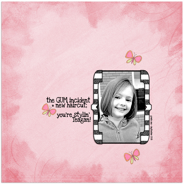
The Gum Incident by Barb Brookbank | Supplies: Paper and elements: Jennifer Barrette “Childhood Friends;” Font: Love Ya like a Sister.
Amanda Jones says, “This page represents the bold and adventurous spirit of one of my cats. I began the page by making stripes with a variety of washi tape prints. Initially, they weren’t as bold as I had hoped for, so I found an old roll of black, polka-dotted tape which stepped up the boldness factor. The boldness of the design perfectly symbolizes Jimmy the Cat’s outgoing personality, and the vertical lines give the page energy.

Jimmy Bob by Amanda Jones | Supplies: Washi tape – Freckled Fawn, Queen & Co, Teresa Collins Designs; Wide tape – Heidi Swapp; Starburst punch – Martha Stewart; Alpha stickers – My Little Shoebox; Tag – Ormolu; Cardstock – Bazzill Basics; Other – Paint, Vintage book paper, Rhinestone stars.
Debbie Hodge says, “One of my go-to techniques for mixing patterned papers is to include horizontal strips of striped paper — with the stripes running vertically. It’s a great way to add contrast and energy to the page. I often use two of these stripes — as I have on ‘Digging Out’ — because I know the eye will follow the lines in the uppermost strip down the the lines in the lower strip. On this page, the vertical stripes worked well with my series of narrow vertical photos.”
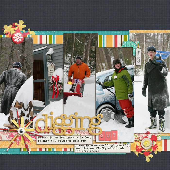
Digging Out by Debbie Hodge | Supplies: Fig Tree (snowflake brushes, beads, flair) by Sara Gleason; The Best Time of the Year (paper), You Make Me Happy (paper) by Mye de Leon; Fall Festival (jewelry tag) by A Stoeffel; Flossy Stitches Yellow, Basic Paper Alpha Yellow by Katie Pertiet; Life365 Alpha by Karla Dudley; Fall In Love (labels) by Robyn Meierotto
[ontrend]

